Second and third in a series of newbie questions… 
Is it possible to automatically add axes to charts or should I just add note markers manually with calculated numbers?
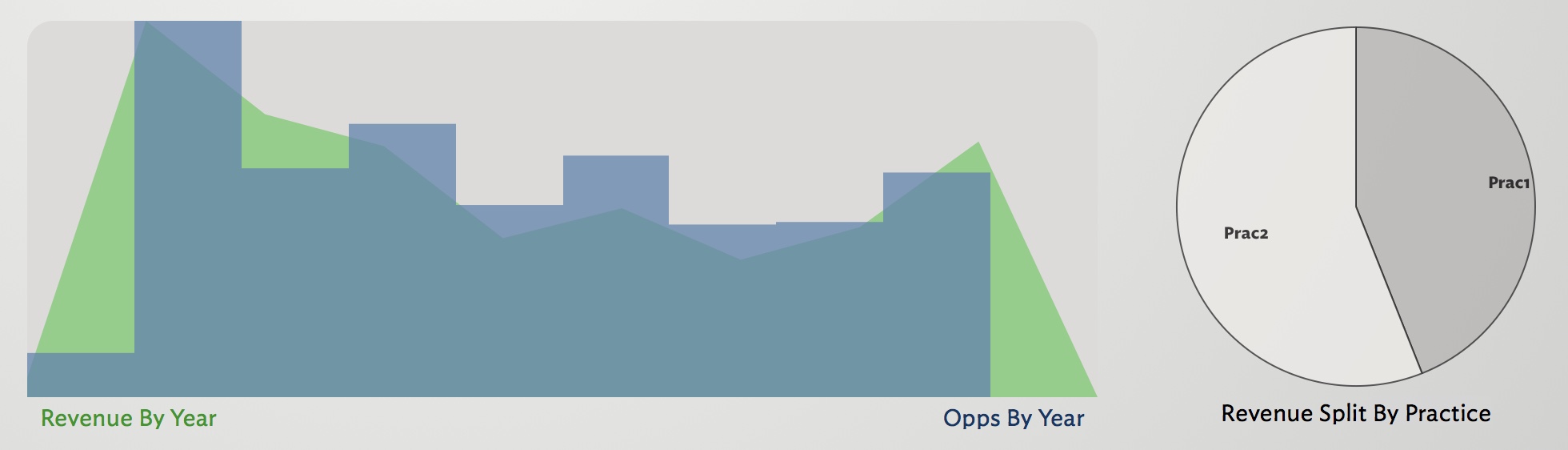
E.g.
I can add notes along the bottom and sides with the axis numbers but is there any easier way?
The other question is that although I can easily sum up the amounts to build the green plot (sum of each year’s amounts) I’m not sure how to do a count of each year’s opportunities. I “borrowed” the expression from the dashboard guide (which is great, btw!) to do “sum(children(original),$Amount)” but whereas sum works on groups, count works on sets/lists. I’m sure this will eventually be second nature but for now I’m not sure what to do.
Thanks, all!
/edit - oh, while I remember, question 4: how do I add colour to the pie chart? It seems to always plot in greyscale. Thanks again!