It is difficult to select links on the map. Most of the time the linked notes with 4 arrows on the side become visible, but cannot get the link selected. Link change in the layout from so becomes quite messy. Not sure what is happening. Did restart Tbox, but did not help. I do not think I had this problem in the past. Any ideas.
If not clear I can put a short screen capture.
I’d start with some expectation management. Tinderbox maps aren’t a drawing tool like Illustrator or Omnigraffle where the design intent is a fixed image. In Tinderbox you can choose between straight or bezier curve link lines, the curved style being the default. Tinderbox sets the link’s position leaving the source and entering the destination, but these can be altered by dragging—as described here.
Bear in mind, the Tinderbox program needs an unambiguous signal as to what you are clicking. In a busy document you may need to zoom in a bit so that other data (e.g. other link lines) aren’t close to your click point. Make sure you are clicking close to where the link leaves (or joins) the note.
If you’re following the descriptions in the linked documents, most like you need to zoom in the map whilst setting link attachment locations so the the app knows which link you are working upon. The process does work but my experience, the busier the map, the harder it sometimes is to click in the right place. You will know it is right when you see the 4 big arrows pop-up.
Sometime’s, like here, you may need to move a note a bit:
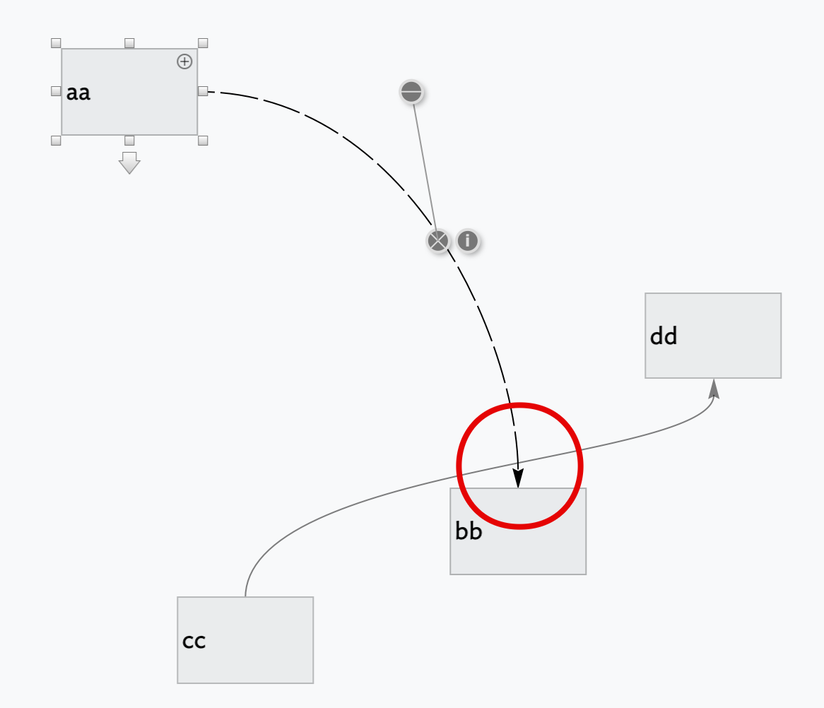
Above, I wanted to select/move the link entering ‘bb’ but the ‘cc’ → ‘dd’ link is detected. I suspect the z-order of the map also plays a part as the latter link was added after the first one. In this case, I can to either of (just tested in v9.2.0)
- move ‘dd’ (temporarily) upwards, thus moving it’s link line away from the ‘aa’ → ‘bb’ link arrowhead.
- zoom in so there is more screen distance between the ‘cc’ → ‘dd’ link and the arrowhead on which you actually want to work.
HTH
†. See the sourcepad and destpad values of the stored likn XML, as described here.
Thanks, that helps. It is indeed a busy map with adornments - that also seem to have influence. It works to move the note away from the busy area. A bit tricky, but it works.
I don’t believe adornments should be an issue, if you are clicking in the right space. I guess, for us as users, is knowing how Tinderbox maps the click-point to the right target. For now, click on to the link-line/arrow-head and not close to it to reduce ambiguity of input.
Next attempt to share short screen recording with behaviour of link that could be considered to be changed.
Attempt did fail.
Do we have a mechanism to share short screen recordings?
Sure, just stick to movie file on any webspace or cloud service you have and post a public link to it. Dropbox, iCloud, etc., provide such links if you don’t have web space of your own. HTH.
Here we go: Microsoft OneDrive - Access files anywhere. Create docs with free Office Online.
Hope you can access it.
Not sure what happens, but the link get changed when clicking on it, while trying to select it.
Maybe have a look to improve usability. I was clicking some links to select, but at the same time these links did change to “a default” so getting into a bit negative spiral ![]()
Yes, I can see it. I observe you clicking and see the re-position arrows, then the note jumps. Not sure what is driving that, though it may be things not obvious from the video (sounds, minor movement/even triggers, etc.)
In re-testing , I’m reminded the task is a click-hold-drag. I mean in the sense that if you click the link and don’t see the link connection placement arrows, you aren’t close enough. If you do see them, you still need to drag to the desired connection point without an intervening mouse-up. Put another way, you don’t click and enter a discrete link connection movement mode. Rather, whilst you can see the connection arrow overlays Tinderbox will accept the currently clicked link being dragged to a new position.
Sorry for that long description. It’s more obvious after the fact. With hindsight, I think I was making a similar error in some of my failed re-positioning attempts. When I saw the arrow overlays I thought I’d triggered a link re-connection mode and let go the mouse. In doing so, I inadvertently exited the mode I was after. Funny how the effort of explaining reveals new hidden assumptions.
Does this help?
Thanks that does help.
I also noticed that I made a mistake by trying to select the link by clicking on the link itself.
I now see that I simply have to click the note from where the link is leaving.
From that moment I can change the curving of the link.
Probably I am too used to OmniGraffle :-).
May I ask, you often have these nice screen shots with comments added to it. What tool you use for that? Snagit maybe or something else?
Screengrabs? I use Monosnap which is available (free!) from the Mac AppStore and have done so since about 2012. Though the app has pay for subscriptions for using some cloud storage services but most users won’t need more than the free version. Monosnap integrates nicely on the macOS menu bar and has sufficient crop/scale/mark-up tools for rapid annotation. I don’t use the video recording side as I have other tools for that. Camtasia and Snagit both seem good (I’ve no personal experience) but are bigger and pay-for apps. That said, the draw of Monosnap wasn’t cost so much as good low–footprint integration. It’s always ‘on’ on my Mac but doesn’t get in the way.
You mention Onmigraffle, re links. A great tool but for a different purpose. Although you can make Tinderbox-like maps (or vice versa). In a tool like OmniGraffle you are essentially in a drawing tool, albeit with some dynamic layout elements, and where exact positioning is important. Tinderbox maps are more fluid and there isn’t a design intent pixel-perfect link positioning.
If you find yourself ‘tidying’ you maps stop to ask why.
-
If the need is to create a final map (image) to show others then it may be you want to use Tinderbox’s Edit ▸ Save View As Image. The data created on the clipboard is vector art. I just tested in OmniGraffle (Pro) v7.19.5 and the data is rasterised on import. If use Preview and make a new PDF using the clipboard, the data is vector but import to OmniGraffle results in a single scalable but not decomposable item†.
-
If just working in Tinderbox, overlook our natural tendency to tidy.Concentrate on the task and live with some inelegance. Over years of Tinderbox map use I’ve found that in all but the simplest work, tidiness and clarity are not as related as one might assume. If notihing else, leave tidying to late in the project or you’ll just keep doing make-work to maintain the look. When at/close to the finish, then tweak for a pretty look. If you can’t get what you want, e.g. exact link line placement, go with the option above and hand-finish in a vector tool.
Sometimes, the ‘Dance’ force-directed layout may help. I suggest trying on a copy of your doc as the process alters the whole map layout.
Also don’t overlook the, albeit limited, range of link visual customisations. These generally apply per-link type but some can be further modified at link level. I think there an inheritance method is akin to attributes, i.e. if you modify a setting at link level and the link type used is altered, this modified link won’t change any locally changed detail.
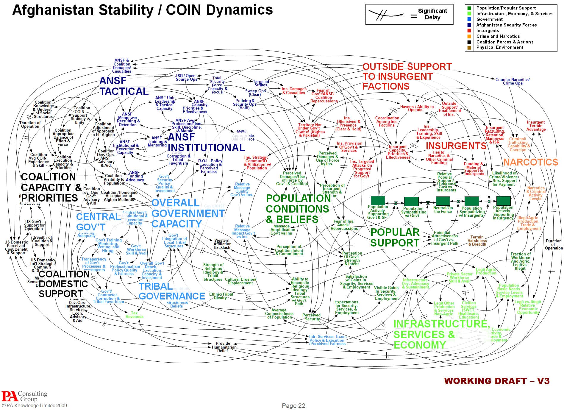
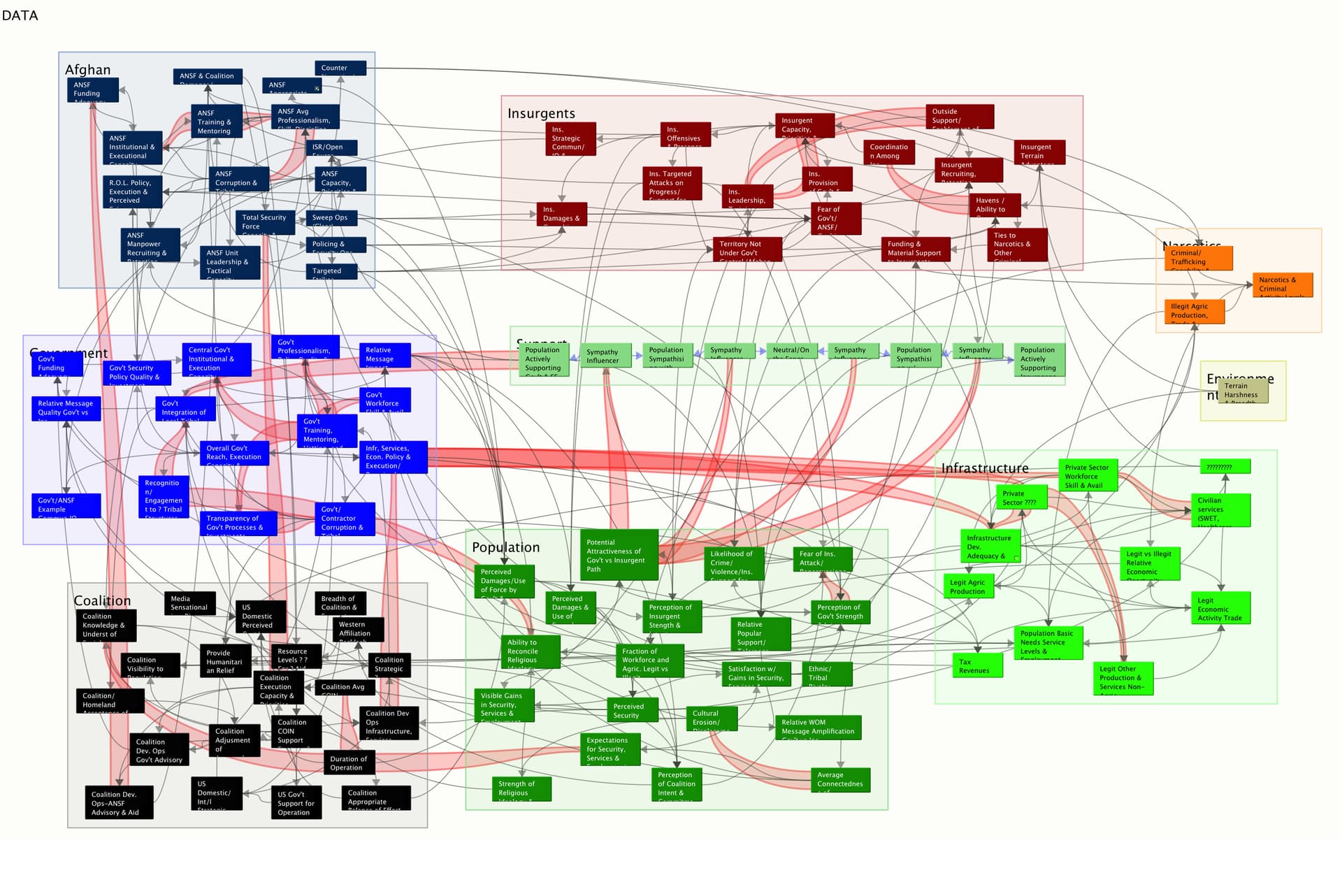
Lastly some diagrams simply can’t ever be made tidy, e.g.:
HTH ![]()
†. OmniGraffle imports SVG but you’ll need a tool to take the clipboard vector art and save it as SVG first. I tried this. The SVG pasted just fine into Affinity Designer (an Illustrator mini-me). The SVG in OmniGraffle looked a mess, but I’m in-exprt with this process so whether the blame is on Designer’s SVG ex[port or OmniGraffle’s SVG import I can’t say.
Thanks for the info on Monosnap - I downloaded and will test, I like the less is more approach compared to Snagit.
Also appreciate the use-case information combining with OmniGraffle.
For me it is valuable you shared your perspective of tendency to become tidy. I have that tendency.
Rethinking for now I will stick to a tidy top page with adornments etc, but keep everything below not so tidy. Let’s see how that works.
1 Like
I hink the desire for visual order is there in us all. In the right place (most places!) it is good, I’ve just realised that often when sweating the details tinking with the visuals can both hamper as well as aid us—which is perhaps a little counter-intuitive. 
1 Like
I think this is a byproduct of working with “puppy-mill presentation layer software.” We’ve been trained by PowerPoint that everything needs to be presentation-ready. So much or our work gets lost on the cutting room floor and washed down the drain as a result of this. For me, I’ve found that I only got to the presentation layer software as a last step, i.e., when I need to share and contribute.
I might discuss this differently.
I used to be a chemist. In the lab, it’s good to work clean and to keep things neat. It’s good to make sure everything is properly clamped. But a good-looking setup isn’t the point of the thing; it’s a means to improve the odds that you’ll get a good result.
I think it’s good to work, now and then, to keep maps organized and pleasing. Maps grow over time; you might need to add some space here and there. You may find that some clusters aren’t really as interesting as they once seemed, and move the whole cluster into a container. You might find that color coding that helped last summer is now a distraction. Things change.
But some maps aren’t simple, just as some topics aren’t simple. And, sometimes, they may be simple someday, but not yet!
Reorganizing maps can be a good displacement activity, something to help you reflect on your data. But it can sometimes be a substitute for reflection, promoting the illusion of productivity. As a rule, it’s more important to generate new notes and discover new connections than to line things up in neat rows.
1 Like
Agreed! To clarify the make-work I alluded to was micromanaging links and icon size/alignment. Of course personal boundaries between ‘a bit untidy’ and ‘unusably messy’ will vary. Things like colour/shape i tend to back off into prototypes precisely so one can act on the prototypes to avoid noodling with each note individually…
1 Like
Thanks for you insights. Very helpful to develop my ways of working.