Agent to calculate notes' Relative Vertex Orders

Thank you very much, @PaulWalters and @mwra, for the — as usual — kind and supportive words.


I don’t believe anything different can be done with the Roadmap, at this time.

IIRC, having the view follow focus, as per the the Inspector has been raised so is on the ‘stack’ of feature requests but there’s no harm in raising it directly with Eastgate so they can gauge interest (there are always more requests that resource to make them).

Thank you for the clarification: I will follow your suggestion and will contact Eastgate directly about it.


The new hyperbolic view, which is still in development might be an answer to this issue. Essentially it is a visualisation of the document’s link network, eliding the hierarchy of the underlying outline.

I had indeed found this view mentioned in aTbRef, but no other details were provided other than it’s currently in Beta testing; I wondered what that view was, so thank you for the additional information. From your words, that view would be particularly useful for my work; I would be excited to test it, but I am sure I don’t qualify as Beta tester…


This next idea wants careful use, but you could make and name your own custom colours; they could even be the same colour as existing one. IOW, you could make a new colour that is the same visual colour as, for instance, ‘bright red’ but you might call your ‘point-two’ (I’d suggest not using numbers ). Now, the note would remain the same visual colour as above but is you use those new colour instead of the existing ones your AB view grouping would list groups like ‘point-two’ rather than ‘bright-red’. Whether you use different colour shades for these groups or simply use same colour but different name I leave as an exercise for the reader.

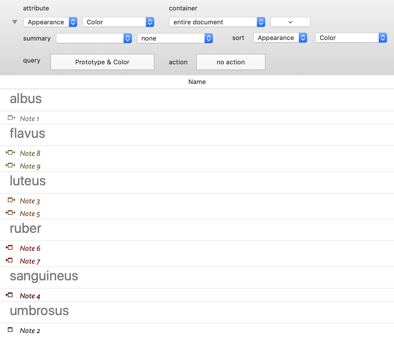
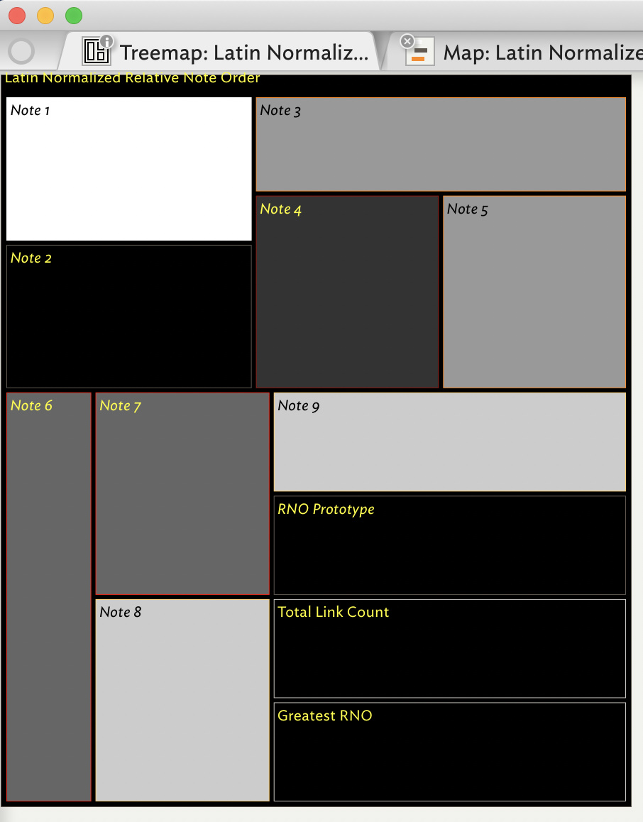
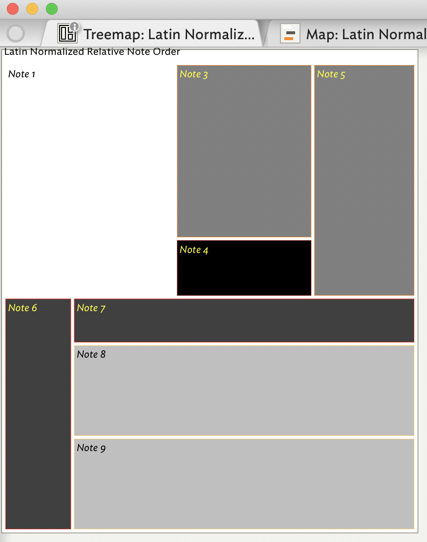
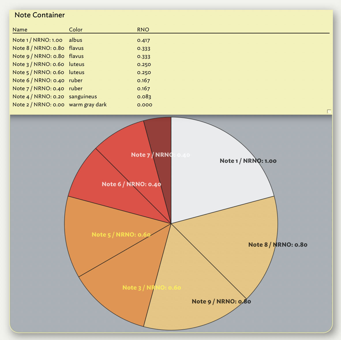
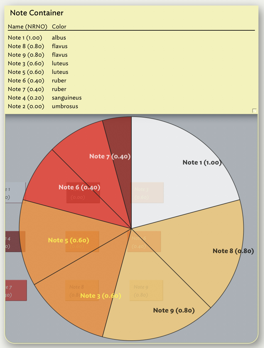
Thank you for the creative suggestion, which I have implemented in the attached file (“Latin Normalized Relative Note Order”; please see also the screenshot “Latin Normalized Relative Note Order - Attribute Browser View”) by adding new colors that have the same hex code as “white”, “poppy”, “orange”, “bright red”, “red” and “warm gray dark”, but that I called “albus”, “flavus”, “luteus”, “ruber”, “sanguineus” and “umbrosus”. I had to be creative with the name of the colors (e.g., I used “luteus” for “orange” as opposed to “aurantium”), and I used Latin to distinguish it from the language of the software (English) and to be politically correct (no-one speaks or writes in Latin on a daily basis anymore, so no-one can feel excluded by my choice). I realize the general usefulness of my implementation is questionable, and that to some it may seem nothing more than an exercise of wit, but I find it more useful than the original, so thank you for the inspiration.


Binning results by color is sometimes difficult to interpret unless the meaning of each color is immediately obvious. In this case I could imagine putting the file aside for awhile then coming back to it and not remembering what those colors denote. If I were doing this, I wouldn’t bin the results by color, I would do it by the word or phrase that denotes what that color means.

That red, orange, yellow and white visualize increasing quantities is immediately obvious to me (the black/red/orange/yellow/white and the black/blue/green/yellow/white are the two most commonly used look-up tables assigned to images to visualize signal levels, so they are engrained in my brain), but again I realize the general usefulness of that color scheme is questionable. Most important, however, your suggestion catalyzed the crystallization of why I had been feeling as if something was missing from the principle underlying the Relative Note Order.

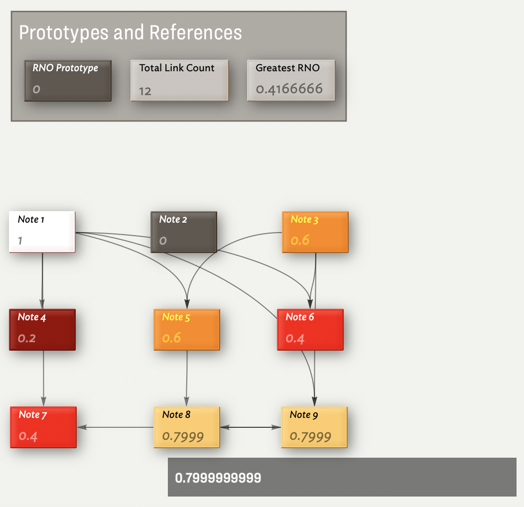
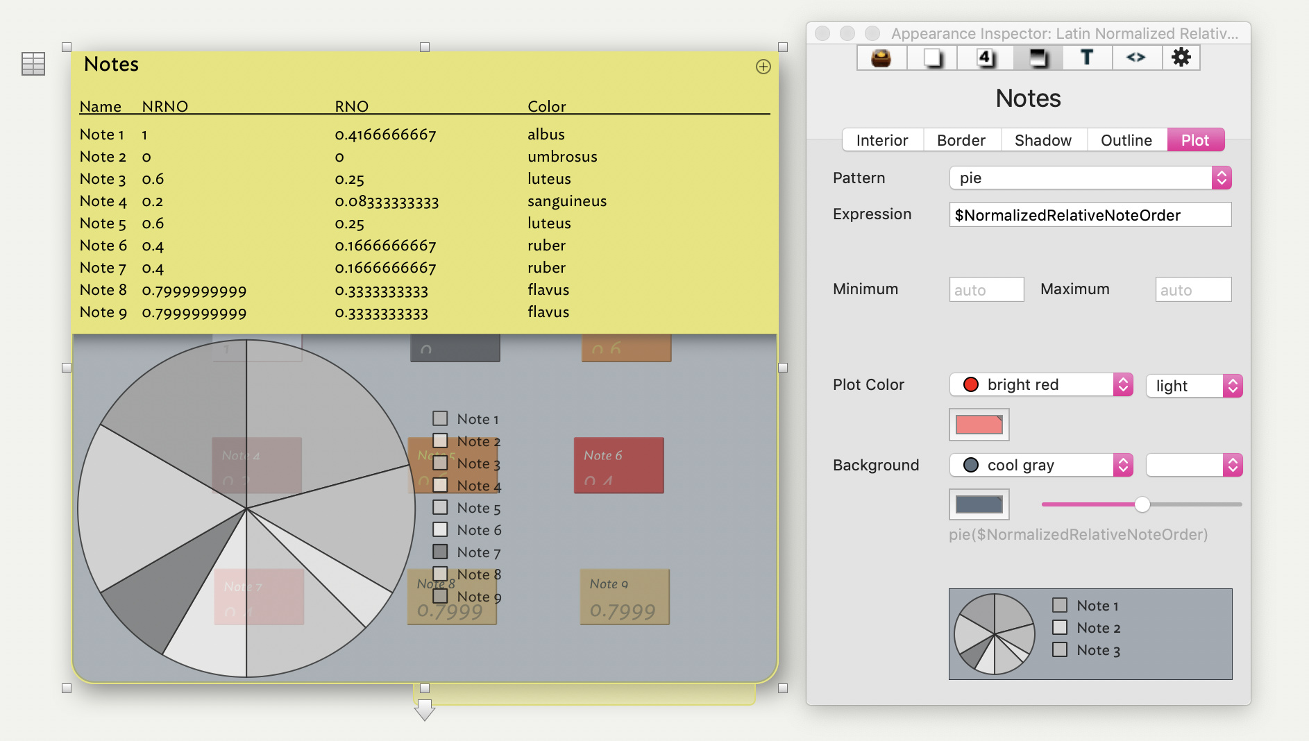
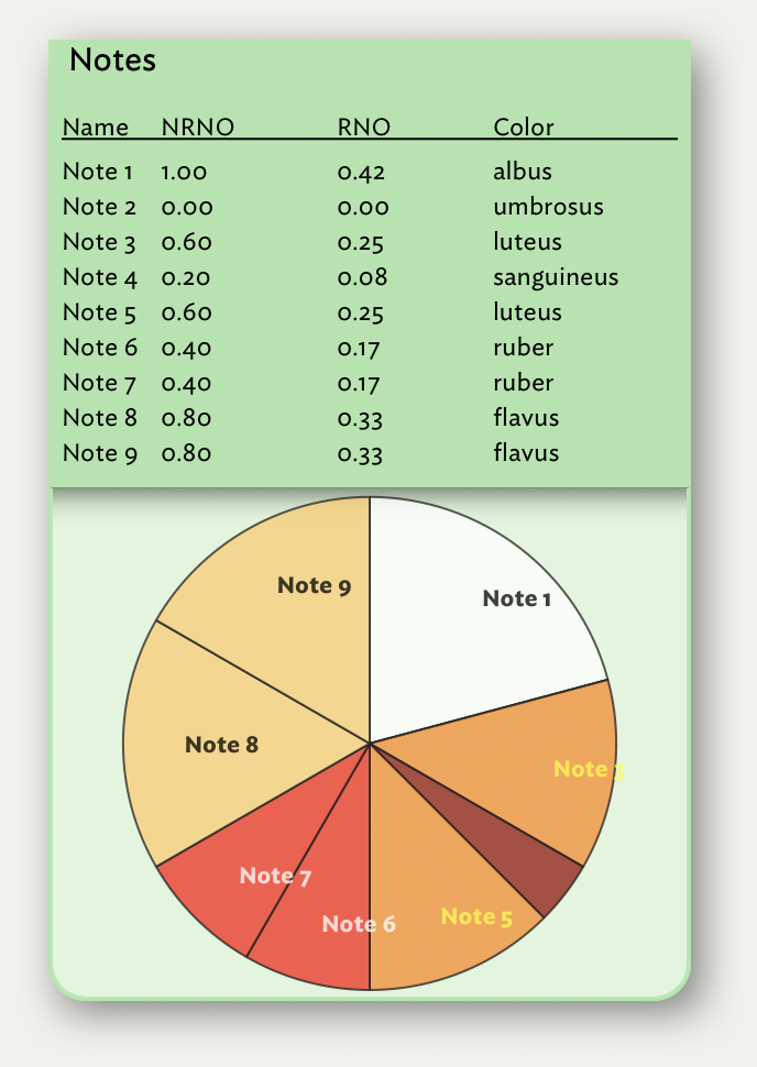
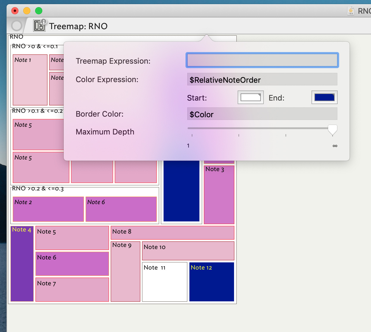
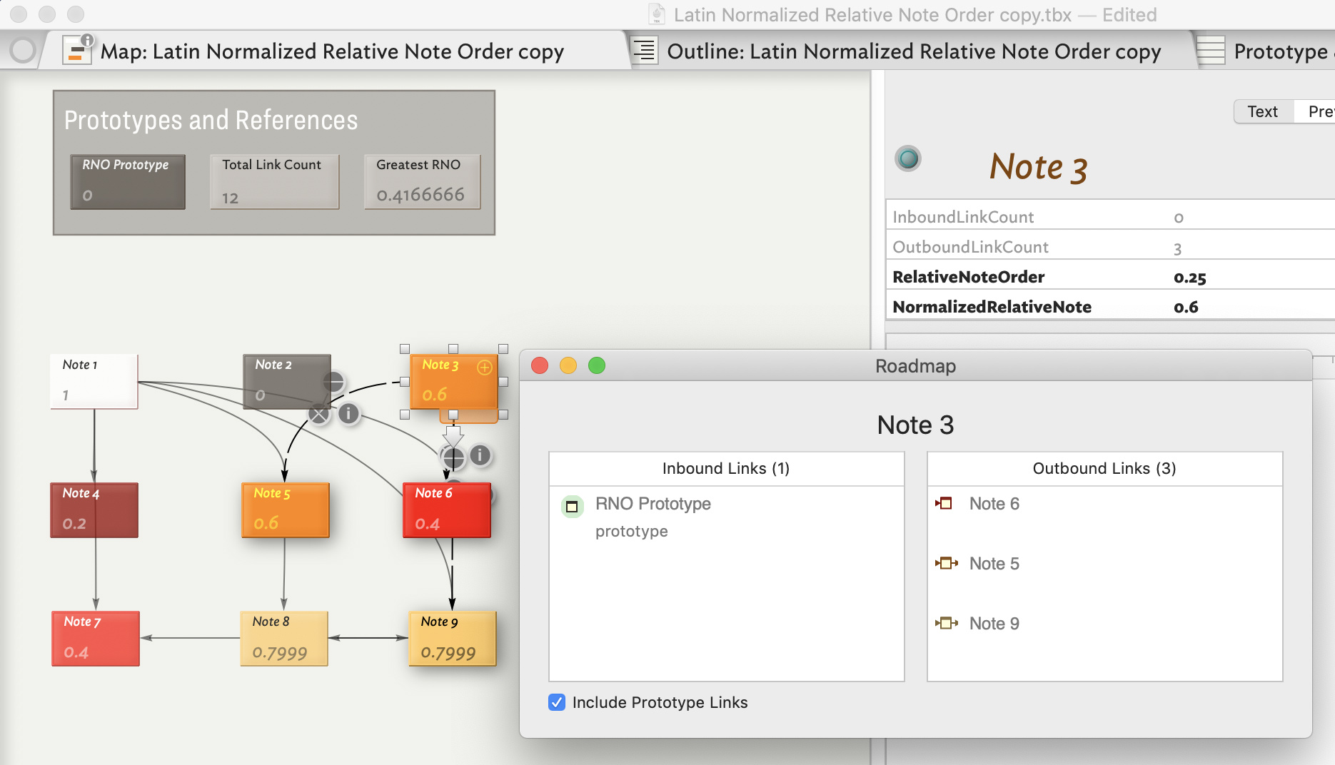
I now think I have addressed this incompleteness in the attached file (“Latin Normalized Relative Note Order”; please see also the screenshot “Latin Normalized Relative Note Order - Map View”) by creating a new Attribute: the $NormalizedRelativeNoteOrder, which, by dividing the notes’ $RelativeNoteOrder by the $GreatestRelativeNoteOrder in the note network (calculated only in the Reference note “Greatest Relative Note Order”, to which the Prototype then refers), makes the Normalized Relative Note Order an absolute quantity, independent of the size and complexity of the note network, and therefore directly comparable across note networks of different size and complexity. Further, the $Normalized RelativeNoteOrder eliminates the need to define network-specific Relative Note Order intervals to which assign different colors. Instead, now, for all note networks, one can divide the 0-to-1 interval of the Normalized Relative Note Order into whatever quantities they find most informative and assign different colors to them, confident that these quantities will have the same meaning across networks: e.g., in any note network, an interval of 0.8-1.0 will always collect those notes with a Relative Note Order in the top 20% of the Relative Note Order. In my example, I have divided the 0-to-1 interval of the Normalized Relative Note Order into equal 20% intervals, but the intervals could be made smaller to increase resolution, or resolution could be specifically increased in a particularly informative part of the interval of the Normalized Relative Note Order; e.g., to increase resolution in the lower part of the interval: 0-0.05, 0.05-0.15, 0.15-0.30, 0.30-0.50, 0.50-0.75, 0.75-1 (but one could be much more sophisticated than that and use, for example, a Fibonacci series).

Once again, I thank you for your continuous patience, encouragement and support; I hope that in the (distant) future I will be able to help others as you helped me.

Best regards,
Enrico

Latin Normalized Relative Note Order.tbx (70.7 KB)

3 Likes

I love the choice of new colour names (my Latin studies at school weren’t entirely wasted). Taking the time to give such a good explanation of your process and to give a sample file is a real help. I know well this sort of thing takes more time than the casual reader may imagine. So on behalf of fellow users, a big thank you!

1 Like

I second @mwra’s reaction – I like the way this is going very much! Very interesting.

I played around with some additional visual capabilities of Tinderbox. By placing the core notes in their own container, a summary table can be added to the top level container for those notes, and a plot to help with visualization. The Plot Expression is simply your $NRNO attribute – other plot types and expressions can be experimented with as well. More about the “pie” plot here.

Latin Normalized Relative Note Order_with plot.tbx (72.1 KB)

1 Like

Interesting. Note that for the pie() plot the default colours can be custom set via $PlotColorList. The default value (as in the grab above) uses the built-in numbered colours 0 to 9 which are shades of grey. But, you could substitute your own, e.g as per the custom named colour above. As $PlotColourList is an attribute you can set different list values at note level (in this context, for a container). I don’t believe $PlotColourList’s list size is constrained; i.e. you can use fewer than ten items in a custom list or indeed more.

Note: embarrassingly I’ve now found quite a few of the aTbRef pages relating to container plots and patterns have misplaced links (, e.g. here, beta breakage from long ago) or lack good cross-reference links. Do please feel free to report such glitches if you see them so I can correct them, lest they confuse newer users of the resource. I won’t be put out at all. (and thanks to @PaulWalters who has been most helpful in this task).

1 Like

Applying @mwra’s $PlotColorList suggestion, and cleaning up the formatting of the NRNO and RNO display expressions in the container’s table display. Also moved the notes out of the way in the container’s viewport. Tinderbox’s ability to apply this sort of chrome to a map is helpful in the final stages of analysis, and makes the report useful for presentations.

To get the proper mapping of $PlotColorList to the calculated $Color of each note, for the pie chart, use this $Rule in the container note:

$PlotColorList=collect(children,$Color)

this yields albus;umbrosus;luteus;sanguineus;luteus;ruber;ruber;flavus;flavus in the case displayed, which is of course dynamic and will change as NRNO changes when the link assignments in the document change.

The downside is that a container with a lot of notes eventually create an incomprehensible pie chart. So, this is somewhat in the “because we can” vein of experimentation.

Edit: I am not sure if the $Rule suggested here would be universally accurate in every document – or whether it just happens to work here because the notes were entered in the container sorted by $Name.

3 Likes

Great idea. Love the fact it will automatically update if the range of colours used in the target container changes. Plus, once this aspect of the documents structure is stable (and if colour change is likely to be infrequent), the action can be migrated from a rule to an edict. Enjoying this thread, for the positive outcomes therein. :grinning:

Edit: fixed several aTbRef pages relating to this topic for misplaced link anchors and/or additional links]

2 Likes

Dear @mwra, Dear @PaulWalters,

Thank you very much for your kind words of support and for your precious feedback and improvements. Unfortunately, my MBP — my only non-iOS device — has been with Apple for almost the whole past week for an issue with the display; I was hoping to get it back today and thus be able to integrate your suggestions, but it looks like I will not get it back for at least another week. I apologize for the interruption in what for me is a very productive and stimulating thread; I promise to get back to you as soon as I get my laptop back. Meanwhile, I thank you very much again for your continuous help.

Best regards,
Enrico

1 Like

Sorry to hear of your ailing Mac - I hope it’s back soon. Anyway, the thread will still be here along with fellow user to discuss the subject with you.

Reading through this thread, it occurs to me that in addition to the attribute browser, treemap might be a useful way of seeing this information, especially as the document gets bigger and hierarchies start developing (or if you decide to use note color to show something other than link density).

In Treemap, setting either the Treemap or the Color expressions (found behind the “i” button on the treemap tab’s icon) to $RelativeNoteOrder will color or size the notes in the view the way your agents do now. There are two important difference: 1) treemap colors only appear in the treemap view; but 2) you can see notes across the document hierarchy. So the view could allow you to free up the $Color attribute to serve other purposes if you need it to, and it gives an overview of which notes are becoming link hubs across the entire document. (Reading the “Actions and Dashboards” pdf under help, p. 61 it seemed to me that you might even be able to set ranges for where color shifts break in the view—but I’ve never used that before…)

Anyway, all of this is just an alternative method for doing what’s already working in your posted doc, but reading the previous ideas made me think of it, so I figured I’d share.

2 Likes

Interesting. Perhaps if there were a (‘color’ type) system attribute $TreemapPlotColor, that would default to the same #FFFEF9 at the ‘start’ colour in Treemap properties. alternatively an action code operator to get the treemap plot colour for a given note. Putatively:

$Color = treemapColor(this)

…which would set $Color for the current note to the value currently used to plot it in the parent container’s treemap view. If the latter is not configured, the value would be #FFFEF9 for the same reason as above. The only problem I see with this latter method is that depending on the $OutlineDepth of a note in might have a different value in differently scope (ancestor) treemaps. Perhaps, for the action code approach the default scope if the parent container, but an optional second parameter might define a specific scope ofr the plot being interrogated. Again, putatively:

$Color = treemapColor(this, "/Some/Scope/Path")

Whatever, I think @bcrane’s post above raises some interesting analytical affordances to be (potentially) accessed form other view contexts.

Treemaps need a Start and End color to define the segment of the spectrum that colors that Treemap – which can be set directly in the Treemap properties box, but it might be interesting if $TreemapStartColor and $TreemapEndColor would be available system preferences to set for the parent container of notes displayed in a treemap. If we could fix the color or hex values of the range of the Treemap’s spectrum, then we could possibly use a given note’s $Color as an “index” to display its color value. ^^

^^ I think one would want the color values used in something like this Relative Vertex Order analysis to also be in the spectrum range bounded by $TreemapStartColor and $TreemapEndColor.

Interesting. I hadn’t imagined a scenario where $Color and treemap colors might be coordinated. Now that I see it, it makes sense that that might be useful in light of the original posts. I only use the view in very basic ways though so I don’t have a thought about whether action code control of the colors would be useful.

My original thought was more along the lines that, if the specific color assignments were purely utilitarian (i.e. not essential for the rest of the doc or were meaningful only for identifying distinctions), then the heavy lifting done by the agents in the demo file could perhaps be offloaded to automatic processes embedded in the treemap view. The idea would be that a treemap tab could be left open and flipped to when the link info was needed and the map–with colors no longer defined by the agents–could be used for other purposes that emerge as the doc grows.

For this to work, I imagine that ensuring that the color breaks that are currently defined by the agents would need to be preserved as the breaks between colors in the treemap. (I’m talking about the way the agents define the ranges for the results of the calculations not the way they set $Color.) If the colors are breaking at arbitrary (or worse, mutable) points, the view probably isn’t helpful. Page 65 of “Agents and Dashboards” talks about “look up tables”–which I haven’t used–and that seemed to offer a way to set and preserve those specific breaks points as the breaks between colors on the treemap. I haven’t tried to make that work though.

Anyway, treemap interests me but I find it a bit mysterious too. So it’s nice to try to think of what to do with it.

1 Like

About Roadmap

Upon further review, I find that a torn-off Roadmap window does update after a link is created or deleted. Is this not what you observe?

Dear @bcrane, @eastgate, @mwra and @PaulWalters,

I finally got my laptop back (thank you for your kind words, @mwra), and I was able to test all your very helpful suggestions, for which I thank you very much.


@eastgate:

I suspect we are talking about different things when we write that the Roadmap view does or does not update; here is what I mean (please see attached screenshots). When I select a note (Note 3 in the attached screenshot) and open its Roadmap view, I can see a list of all the inbound and outbound links for that note; if I then select a different note (Note 6 in the attached screenshot), the Roadmap view, irrespective of whether I had detached it from its location, fails to update its content to the list of all the inbound and outbound links for that newly selected note.


@PaulWalters, @mwra:

You are of course right, when you write that a pie chart would lose its usefulness when applied to a document/container with many notes, which is indeed my case; however, I do not need to work with all my notes at all times: for any given manuscript, I will only work with a subset of them, in which case I could collect that subset in a container – though I think it would be better if I collected aliases, as opposed to original notes, so that the same note (by means of multiple aliases) could simultaneously be used for multiple containers (I am always working on multiple manuscripts at the same time).

At any rate, I was able to replicate all you did – thanks to your sample document and your clear instructions! – (please see attached file and screenshot), but I could not figure out how you rounded the RNO and NRNO… I had been looking for a way to do that for a while because an NRNO rounded to two decimal places is sufficient to me; could you please be so kind to point me in the right direction?

Plotted Latin Normalized Relative Note Order.tbx (72.6 KB)

On a related note, I read in aTbRef that pie charts can be applied not only to notes in containers but to notes in documents, i.e. notes that are not part of a container; however, I was unable to figure out how to do so. Once again, I was wondering whether someone could be so kind to point me in the right direction?


@bcrane, @mwra, @PaulWalters:

Thank you also for the suggestion to use Treemaps. However, if I use size to encode the NRNO in a Treemap, the difference between the notes’ NRNO becomes more difficult to visualize – at least to my eyes – because the NRNO is displayed as a continuous variable – which it is – as opposed to a discrete one, into which my color-binning transforms it; therefore, I encoded the NRNO as color in a Treemap (please see screenshot and attached file). I used black and white as start and end color, respectively, because we are able to recognize more shades of gray than of any other color.

In a first attempt I assigned NRNO=0 to the start color; 0<NRNO≤0.2 to a color that is 20% of the way along the linear gradient between the start color and the end color; 0.2<NRNO≤0.4 to a color that 40% of the way along the linear gradient; 0.4<NRNO≤0.6 to a color that is 60% of the way along the linear gradient; 0.6<NRNO≤0.8 to a color that is 80% of the way along the linear gradient; and 0.8<NRNO≤1 to the end color:

if($NormalizedRelativeNoteOrder=0){0}else{if($NormalizedRelativeNoteOrder>0 & $NormalizedRelativeNoteOrder<=0.2){0.2}else{if($NormalizedRelativeNoteOrder>0.2 & $NormalizedRelativeNoteOrder<=0.4){0.4}else{if($NormalizedRelativeNoteOrder>0.4 & $NormalizedRelativeNoteOrder<=0.6){0.6}else{if($NormalizedRelativeNoteOrder>0.6 & $NormalizedRelativeNoteOrder<=0.8){0.8}else{1}}}}}

In a second attempt, I combined size and color to encode NRNO. Because notes with NRNO=0 are assigned size 0, I could divide the linear gradient in 25% steps, as opposed to the 20% steps of the previous example:

if($NormalizedRelativeNoteOrder>0 & $NormalizedRelativeNoteOrder<=0.2){0}else{if($NormalizedRelativeNoteOrder>0.2 & $NormalizedRelativeNoteOrder<=0.4){0.25}else{if($NormalizedRelativeNoteOrder>0.4 & $NormalizedRelativeNoteOrder<=0.6){0.50}else{if($NormalizedRelativeNoteOrder>0.6 & $NormalizedRelativeNoteOrder<=0.8){0.75}else{1}}}}

Latin Normalized Relative Note Order with Treemaps.tbx (74.4 KB)

Of course it would be better if those colors were the same as in my other views, but at least I was able to turn a continuous linear color gradient into a set of six discrete, though related, colors.


Thank you very much for your continuous help and encouragement.

Best regards,
Enrico

1 Like

The way Roadmap is designed to work, in my understanding, is you use the Roadmap to ‘select’ a new note by double-clicking the relevant link. The target note is selected in the document window and the Roadmap updates to show the new selection’s links. So, if the roadmap is open on Note 3, double-click the link to Note 6. Note 6 will be selected and Roadmap updated. But note that:

The current window’s main view will update to the selected note, if it is in scope ; note that if the pop-up is torn off the text pane stops following focus of the view.

FWIW, you can have more than one torn-off Roadmap dialog open, though note that follow focus only works as a pop-over. Multiple dialogs can be useful if comparing the links in two notes as you can’t tear-off Browse Links to do a comparison I’d advise against having lots of such Roadmaps open if only because I doubt such a configuration will have been heavily tested, ergo you might be the first to discover issues.

See Pattern: pie(). When used as a note’s $Pattern, the result is a circular pie-style progress bar.

Untitled%202019-02-02%2016-42-51

For your purposes, you need to be using pie() in the context of a container plot.

1 Like

Edit the column’s expression in the TableExpression pop-up, e.g. use$RelativeNoteOrder.format(2) instead of $RelativeNoteOrder.

See also Number formatting.

1 Like

Have you tried using $Color as the Expression in the treemap properties. I know the treemap defaults to using $Color as the item’s border not it’s fill. Perhaps there’s a feature suggestion here somewhere?

Just a few tweaks suggested in the pie display. I would sort the container by NRNO and use a $DisplayExpression that includes NRNO. Sorting by NRNO puts same-bucket pie segments next to one another, and the $DisplayExpression puts the values on the pie so it’s clearer what is going on.

Here, I eliminated the column for NRNO and used this display expression:

$Name + " / NRNO: " + $NormalizedRelativeNoteOrder.format(2)

(Geekish comment: there’s an anomaly in Tinderbox 7: in a container table using $Name does not cause $DisplayName’s value to appear in the Name column – you have to explicitly tell the container to use $DisplayName. But, in the pie chart, the segment labels will only use $DisplayName and nothing else.)

2 Likes

Thank you, @mwra, for the clarifications on how to format numbers and how to use pie charts on non-container notes.

Have you tried using $Color as the Expression in the treemap properties. I know the treemap defaults to using $Color as the item’s border not it’s fill. Perhaps there’s a feature suggestion here somewhere?

Yes, I did try it, but it failed to give the desired result. Are you suggesting that I email @eastgate with such a feature suggestion?

Thank you also for elaborating on the use of the Roadmap view. My comment, however, was meant to clarify a possible misunderstanding between @eastgate and me: in a separate email, written to Eastage as per their request further above in this thread, I explained what I would wish the Roadmap view could do and why I would find that feature invaluable to my work. Their response by email seemed to indicate that we were talking about the same thing, but their response above in this thread seemed to me to indicate otherwise. Normally, I would have continued my conversation with Eastgate by email, but because they replied to me about that in this thread, I thought I should do the same. I apologize if I instead used this forum inappropriately; I will re-send my reply to Eastgate by email.

At any rate, thank you for the suggestion to simultaneously use different detached Roadmap views for different notes. I realize not many people have tried this and that I may encounter issues; should that be the case, how would I report them? In this forum or directly to Eastgate?

While I hope Eastgate will take my feature request for a modified Roadmap view into account and/or as wait for the hyperbolic view to become standard in Tinderbox, I found an inspiring response by @PaulWalters to a different post here: in the meantime, I will work with that and see where it takes me…


Thank you, @PaulWalters, for those tweaks, which make perfect sense to me and improve data visualization. I modified your improvements only slightly, only changing their “semantics”, as it were, but leaving their “syntax” intact.

By the way, I was wondering whether you could be so kind to share how you remove notes from containers’ viewports: automatically? Manually?


As usual, thank you very much for your continuous help and support.

Best regards,
Enrico