The colors on my installation of Tinderbox are totally off compare with those published on the tbref (see the attached example)
Any suggestions?
The colors on my installation of Tinderbox are totally off compare with those published on the tbref (see the attached example)
Any suggestions?
maybe I can beat myself to the answer… it’s because the default theme of Tinderbox 8 uses a different color scheme than the one in tbref…
Hi. Welcome back to the forum.
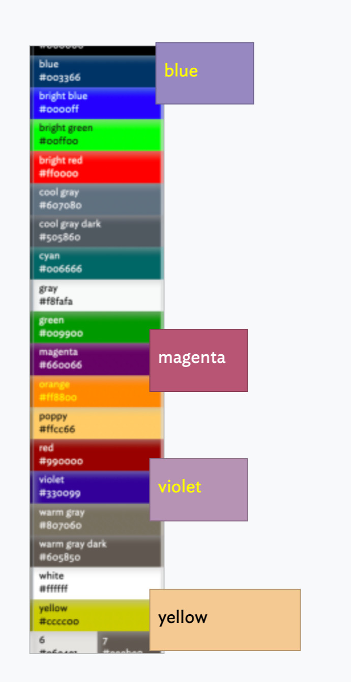
The idfference is because the grid is based on the ‘7 standard’ palette whereas the default v8 document uses (IIRC) the ‘modern’ palette for OS light mode and ‘dark coral’ for OS dark more (see more). The latter with uses the same colour names as the standard but sets a different actual colour, so ‘blue’ is actually more like a shade of purple.
That might seem odd until you realise this allows you to easily change colour palettes. If you look at the ‘Colors’ tab of the Document Inspector and select each listed palette in turn, you will see an image of the palette’s colours. Each palette uses the same standard colour names, but defines a different render colour value for that name.
aTbRef only illustrates the standard colours, but I’ve made a not to make that a little clearer. Palettes change over time and may not always be documented, so I’ve just updated the aTbRef page on the colour chart to reflect that is shows the standard colours. Refresh your browser and scroll the page to see the explanation below the picture.
I don’t intend to do such a chart for every palette. It’s a fair amount of work for little gain. But, if you want to make you own, by all means grab the aTbRef TBX from the aTbRef home page and copy the method I use. You’ll be looking for the container at “/A Tinderbox Reference File/Visual Styling/Tinderbox defined colour map” in the TBX.
Got it. Thanks. I have modified the modern theme colors to match version 7. At least I get predictable colors.
Thank you as usual
One other colour-changing effect to watch for is here. I use outline a lot and ‘darker’ colours makes the colours muddy, hard to distinguish and narrows the range of usable colours. YMMV!
As regards the doc’s colours, you don’t need to edit the colours in your doc, you can just select → apply a different palette here.