Tinderbox has always been designed on the assumption that maps and outlines would typically have a light background color.
Some people do prefer dark backgrounds! If you use Tinderbox views with a dark background color, I’d like to see examples — either here, or by email to bernstein@eastgate.com
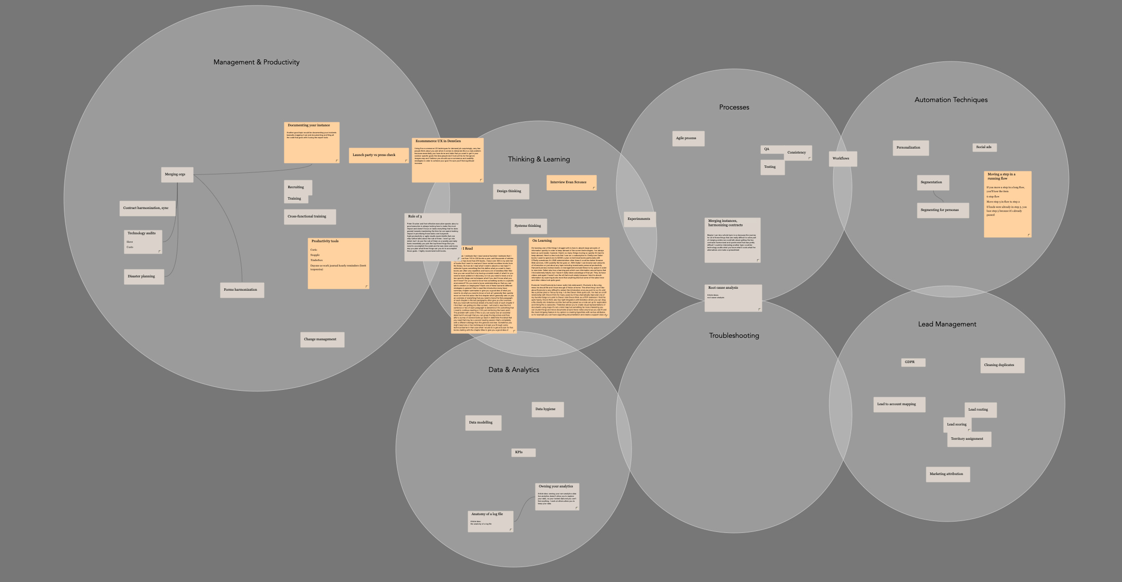
Here’s a closeup of the ‘Fortune’ area, which includes work, side projects and some industry article notes. I had this broken down to more specific areas, but classification decisions created too much friction, so I lumped them all together.
The problem comes when I want to use the outliner. The map background and outline background appear to share the same attributes, so using a truly dark color becomes a problem.