ISTM that implementing the Roam concept is essentially adding different view type. As noted at the top of the thread, the app represents a graph. What gets overlooked is Tinderbox maps don’t have to be an explicitly linked graph. Strong, useful views can be used without a link in sight (and I don’t mean just that they are there but not drawn). That’s doesn’t argue again the ideas discussed above but I do think if taken forward that they don’t damage Tinderbox’s wonderful current map view.
The hyperbolic plane representation notwithstanding, Tinderbox’s hyperbolic view seems a better home for a Roam-like view—or at least a better starting place—than changing maps. Hyperbolic view is graph-based. It shows all linked notes, with the view being centred on the selected note (outlined in red. Once opened, the view’s centre/anchor note can be changed separately from simple selection for viewing in the text pane.
I agree that the hyperbolic view is closest to this notion of “local network” I was talking about. It even adds to Roam’s functionality because it shows the meta network, links to links
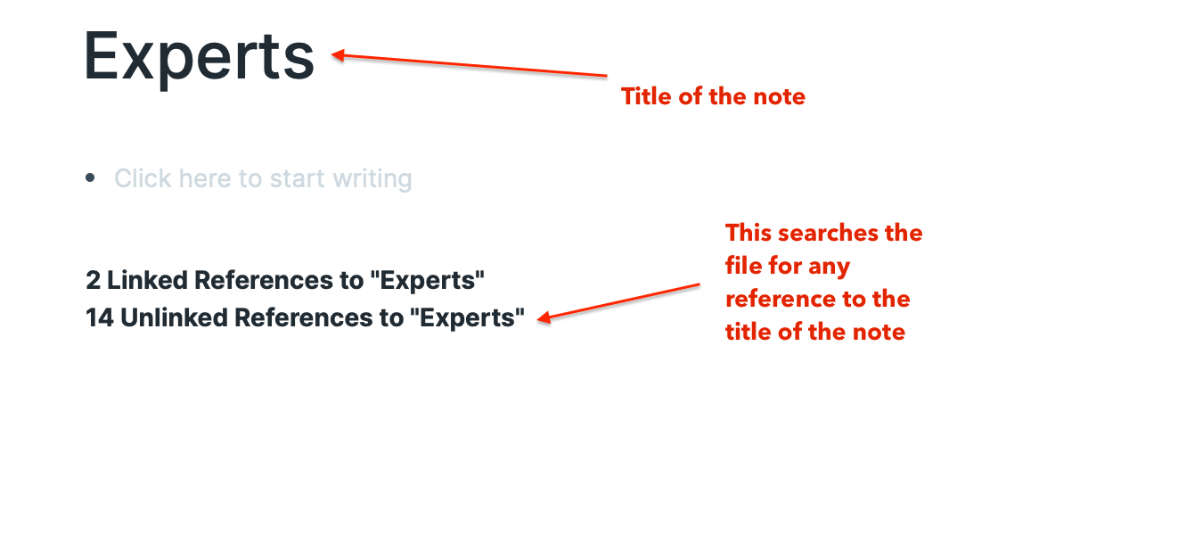
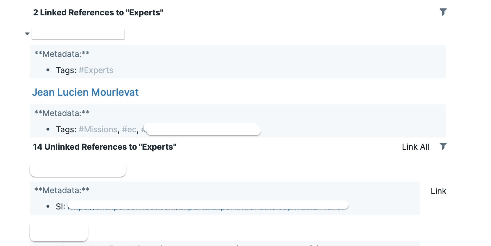
The one thing Roam does is add this “unlinked references” piece which is useful when interacting with ones data:
I’m trying to look at the network of information I have about a customer. It’s useful to me to be reminded that I’ve referred to this customer in a meeting note yesterday, but I haven’t physically made the link yet.
Currently you can programmatically bold a string with string.bold and then concatenate that bold string into a larger string to make part of the text bold. My (admittedly not particularly thought-through) idea would be to add a string.link function that would take an $ID or a URL, and an optional link type, and make string the anchor text. With this you could add back links to $Text with the following edict:
For this and the current formatting functions it would be nice to have a $MyRTFString attribute to be able to format substrings programmatically before concatenating them into $Text. If we had such an attribute, it could store the formatted text and we could eliminate the duplication in the action code above.
It’ s the reason Roam (and @galen’s) solution tack the values onto the existing text of the note … although I can see all the engineering problems to solve. Maybe you could simply add the list to a $UnreferencedLinks list, but then we would be missing the simple click and link interface of Roam…
Looking beyond look-alike feature parity, which may not suit Tinderbox’s architecture (or indeed other groups of its users), it seems the feature request is to have a link list of in/outbound links, embedded in $Text. Hmm, ISTM a kinder approach for other users be that such a view perhaps be a (hideable?) panel at the bottom of the text pane, i.e. below the $Text. I’m not sure I’d want the app adding links into all $Text just for Roam feature parity. Plus, how does this look when you 10s of links rather than just one or two.
I think there is a use for being able to generate $Text links via action code but I’d see that as a separate feature request from a Roam UI replication. The latter involves note UI space to links already in the text which isn’t useful in all cases. Perhaps if the link table was in a collapsible section of the text pane, though I suspect that makes for some complex UI. Isn’t it simply to use the Roadmap in stand-alone windowed form, perhaps with a means to slave the link lists to the current text selection.
Agreed, the linking feature is independent of this, and is actually something I’ve wanted for a long time for other reasons.
I love your idea of a collapsable link pane beneath $Text. I understand there’s some overlap with the Roadmap, but I personally find the Roadmap UI so clunky that I almost never use it.
For me, the big thing about the Roadmap is that it’s implemented as a pop-up window that goes away if you move focus away from it. And if you tear it off so that it’s persistent it becomes tied to a specific node. So it doesn’t lend itself to being an integrated part of the UI because for it to function as I want it to (in its pop-up form), it inevitably covers part of the UI that I’m interested in seeing, and when I click back to the main UI it goes away. To me this gives the impression of the Roadmap as being heavy duty, so I only break it out for big jobs when there’s really no other choice, because chances are high that I will have to reposition the main UI to get the information I need.
If the Roadmap was seated in a collapsable frame at the bottom of the Text window I would find this an immense improvement in usability. That way it would never cover anything unexpectedly, it would always be tied to the currently selected note, and all incoming and outgoing notes would be immediately visible. Additionally there might be enough space that other contextual information could be included, such as subtitles, the first few words of $Text and so on, depending on how the design goes.
Are you thinking of another tab in the “Text Pane Selector” set of tabs?
Instead, is it feasible to add a panel that can slide up from the bottom of the text pane? It would be better to be able to see text and roadmap simultaneously.
Perhaps gilding the lily here, but if that panel let me see the text of the linked notes somehow, and perhaps even edit it, that could be amazing (maybe I don’t want to open the note in the main view just to recollect its contents). Bonus points if I can drag from the note to create a new link on the map/outline view.
Or, also, to reference a discussion elsewhere, could be cool if this panel could also show recent notes, or notes recently viewed in conjunction with the currently selected note, then let me link from the text of the open note to these “recent” notes.
The text pane is getting piled quite deep — key attributes view, text pane, and now a roadmap pane. The roadmap inherently needs a fair amount of vertical space.
Tinderbox is already rich in ways to view and manipulate existing links. Tweaking the roadmap view may be interesting but to come back to an earlier point: the way in which Roam “unclicked” things for me was the ability to frictionlessly manipulate “potential” links, not the limited map viewing UI.
Being able to:
create a linked note “on the fly” with a wikiLinks functionality
visualize unlinked but similar notes for context and potential linking
would give me the local network context and agency I’m looking for.
ISTM that allowing programmatically generated links is “simpler” way towards enabling the second feature (“simpler” in the sense of less onerous on the UI front; I’m under no illusions for the coding part …). In effect, if a user wants to add the “unlinked references” section to the $Text of an agent or a prototype, they can … but others don’t see a change. And reviving the wikiLinks functionality would be nice (again, no illusions as to the design / coding issues to solve …)
and I see: the line where the text appears, and the title of the note.
I can then choose to actually link this note in, or visit it, or leave it alone.
The reason I keep bringing this up is that for me, in the metaphor of “tending your garden” dear to TB, it’s useful to keep being (gently) reminded of existing context …
Let us not overlook that Tinderbox already has a similar notes feature, in this case as a sub-tab-in Get Info.
So I think the heart of the issue is less a case of new features as UI configuration to leverage already existing features/metadata for this particular type of workflow. Given how complex the text pane is already, iIt feels to me like a new view type with some combo of current Roadmap, Similar notes and map (or hyperbolic?) view.
The upside of using a view is it creates no overloading of the text pane for users of others sorts of workflow. Given that different sub-sets of Tinderbox users engage with the overall feature set in different ways and we wouldn’t want improvement for one group to lessen utility for other groups.
That’s interesting. Am I correct in thinking that the only way to generate a list of notes similar to the current note is to examine ALL notes in turn and check if similarTo(this) is true?
That sounds like a very time consuming task.
Since it is already done by TB to populate the similar feature, is it not possible to just get the data from TB instead of computing it again?