I’d welcome a feature in Map view that would allow an adornment and its contained notes to be swivelled into a three dimensional orientation, allowing both depth and horizontal orientation to convey additional meaning. For example, consider a stack made up of layers like a pancake (conceptually, for example, “connectivity” at the bottom, with a “device” layer, then an “applications” layer, then an “analytics” layer, then an “insights” layer…), where each layer has constituent notes (about, say, a range of relevant IoT devices in the “devices” layer) that are oriented into what could be considered a map “slice” with its own set of symbolic meanings. I am thinking about an arrangement where each layer of that vertical stack would contain notes that had meaning based on their note size, and/or the distance of the note from the core of the stack layer, and/or the landscape of contours and colors built/layered on top of the note. I’m thinking about simulating in Tinderbox the kind of spatial collaboration environment of something like Microsoft Hololens. It reminds me of an atavistic graphic in Mark Bernstein’s book that is attached. Cheers, JR

This idea sparked a random thought about composites. I always turn them off in my documents because they make layering/overlapping nearly impossible. What they offer in return never seemed to add value to what I was doing. (For similar reasons, I sometimes (not often but sometimes) wish there were a $NotContainer attribute I could click for individual notes.)
My sparked thought: in a 3-d (x,y,z) map composites seem to have a useful function: establishing a fixed and stable spatial relationship within a single plane of a deep map that signifies as a unit in relation to other overlapping layers.
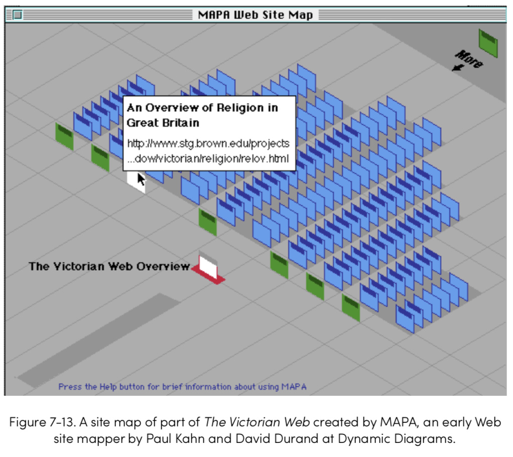
I know the people who did the MAPA view, which I’ve always admired. (I was sitting next to Wendy Hall, now Dame Wendy, at the Montpelier conference where this was first shown, and remember whispering that “I have no idea what that visualization means, but it’s gorgeous!”‚
That said, the base MAPA view is another hierarchical view, and we’ve already got outline, chart, and treemap. So it’s been on the roadmap, but it’s been crowded out for a while.
I can’t help wondering if an extra dimension helps or just adds extra cognitive load. Slightly tongue-in-cheek I offer Keiichi Matsuda’s ‘Hyper-Reality’ as an example of how 3D does—or doesn’t—necessarily make things easier to understand.
The isometric (faux 3D?) view of the MAPA example above is nice though.
Looking up MAPA led me to this interesting page about info spaces
For those with access to the ACM library, the paper on MAPA (at ACM Hypertext’98) is here. Separately this on isometric views looks interesting (link is on the internet archive so no login needed).