Anyone care to discuss Tinderbox for planning fiction?
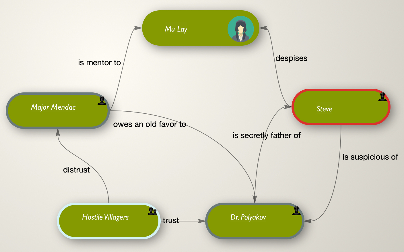
For example, one conventional way to see a story is to think up a group of intriguing characters and then establish some tensions and relations among them. See Jason Morningstar’s ingenious Fiasco for an entertaining look at this applied to the Caper movie.
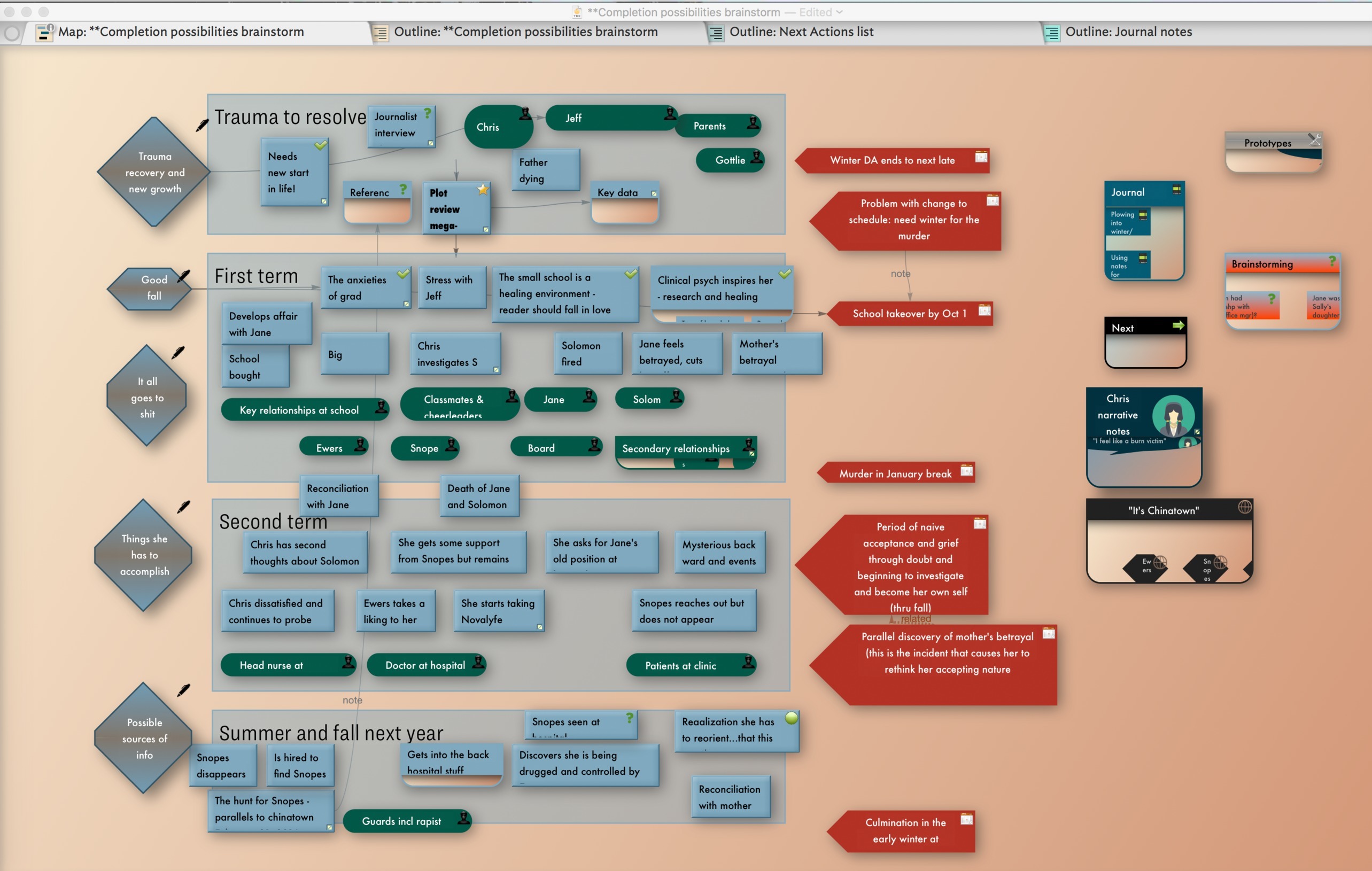
Yes! A million uses, particularly using map views. One thing I like to do is use some colorful adornments as ways of organizing timelines, with possible scenes or developments inside. Here (if it isn’t too big!) is a view of a set of notes on a sequel to my novel Dark Analysis (publishing as “JT Gregg”). It’s tentatively organized over an academic year with the adornments representing quarters. The diamonds on the left are the major problems to resolve in each section. The red notes on right are notes on the timing of key events. Notes are possible scenes or plot developments, questions that have to be pondered and so on. Other notes in containers on right include of course a journal of writing and an imaginary “journal” of the protagonist about what’s going on. Links between notes can at times be followed in a sequence, like “this then that but then this happens so that happens…” etc.,), if you build those in. Lots of interesting colors can help stimulate you emotionally sometimes or at least keep you awake in the coffee shop.
A side point the two images above remind me of is links don’t have to be visual. Link visibility can be set at link type granularity. That could mean toggling out various types just while viewing a map or planning types as deliberately not visible. Such links are still entirely functional in all other senses (actions, export, etc.), they just aren’t drawn in maps.
By default all links types are on. As a doc/map design matures, it may be worth making some link paths not visible to avoid a cluttered map. Or, for certain tasks, toggle out some types - the downside there is remembering to turn them back on.
Speaking of colors: image adornments and custom badges can be handy image references. I’m leery of being prematurely concrete in thinking about characters, but sometimes concrete is just what one needs – either to keep people straight or to keep an interesting character from sliding into a stereotypical rut. Don’t overlook the new custom badge well in the Appearance Inspector, and keep $BadgeSize in mind.