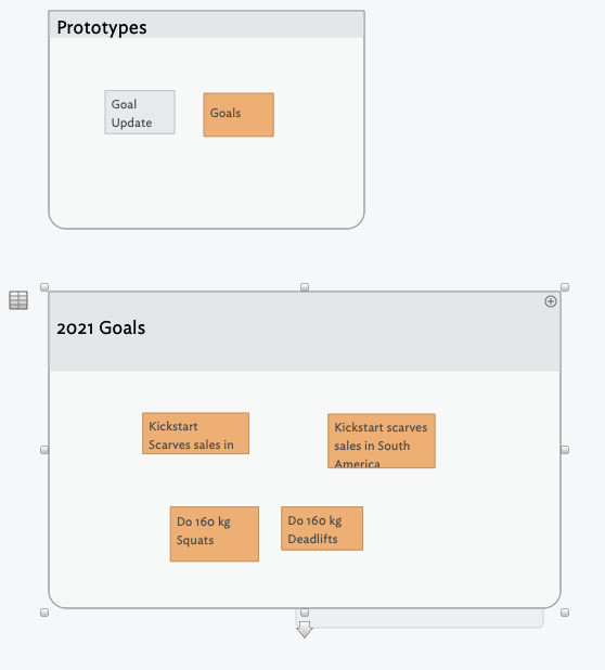
So you have quantitative and qualitative goals. So, it seems likely they need visualising in different ways and so a single prototype won’t likely suite the style/code needs of both, but you could:
- Have an
IsGoal boolean attributeto easily find all goals.
- Have goal prototypes
pGoalQuant and pGoalQual. These prototypes might both have, for example, the same $Shape and $Color, but otherwise differ to reflect the qual/quant nature of the goal tracked.
- Have weekly report prototypes
pWkGoalQuant and pWkGoalQual. Again, these prototypes would vary according to the type of data being recorded.
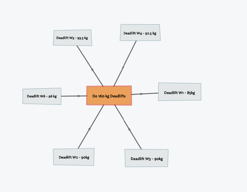
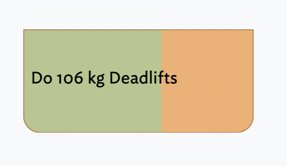
Visualisation. For your quantitative example (deadlift), a progress bar makes more sense. In your hyperbolic view the reports are neither radially sequenced in week order or results, which erodes sense. But if the weekly reports are child notes, we can make the goal note as a progress bar in map view with this code:
$Pattern="bar(collect(children,$Weight).max,0,160)";
With a result like so (I’ve increased $TitleHight to hide the container child map viewport):
You could always add more info to the ‘label’ either via a Display Expression or a Hover Expression.
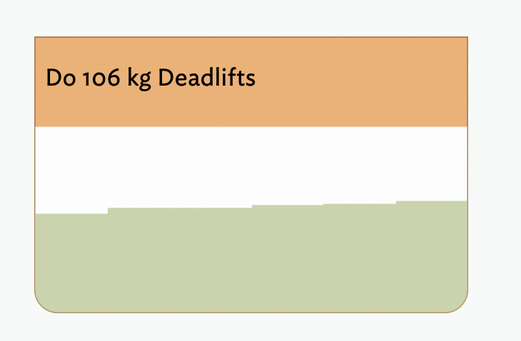
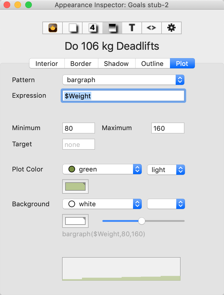
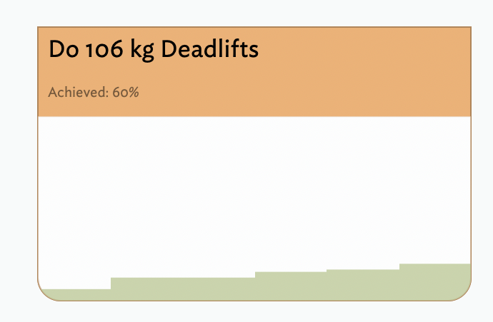
Or we could use a container plot:
$Pattern="bargraph($Weight,0,160)";
To give a less shallow increase, we could set the plot minimum (manually via Inspector) to 80, i.e 5kg under the lowest report. To give actual progress, well add a subtitle. This is computed using a $Target Number attribute added so the quantitative goal note can record the numerical goal via this edict:
$Weight=collect(children,$Weight).max;
$Subtitle="Achieved: "+($Weight/$Target*100)+"%";
Thus:
For qualitative goals you might just want a progress bar—in some qual cases, but perhaps not all.
Note no links used at all for review. But you might want to link for other purposes.
Rather than just ditch my test doc, which I’d not done with intent to share, here it is: Goals stub.tbx (84.0 KB)
Consdier that you may be making a form of dashboard.