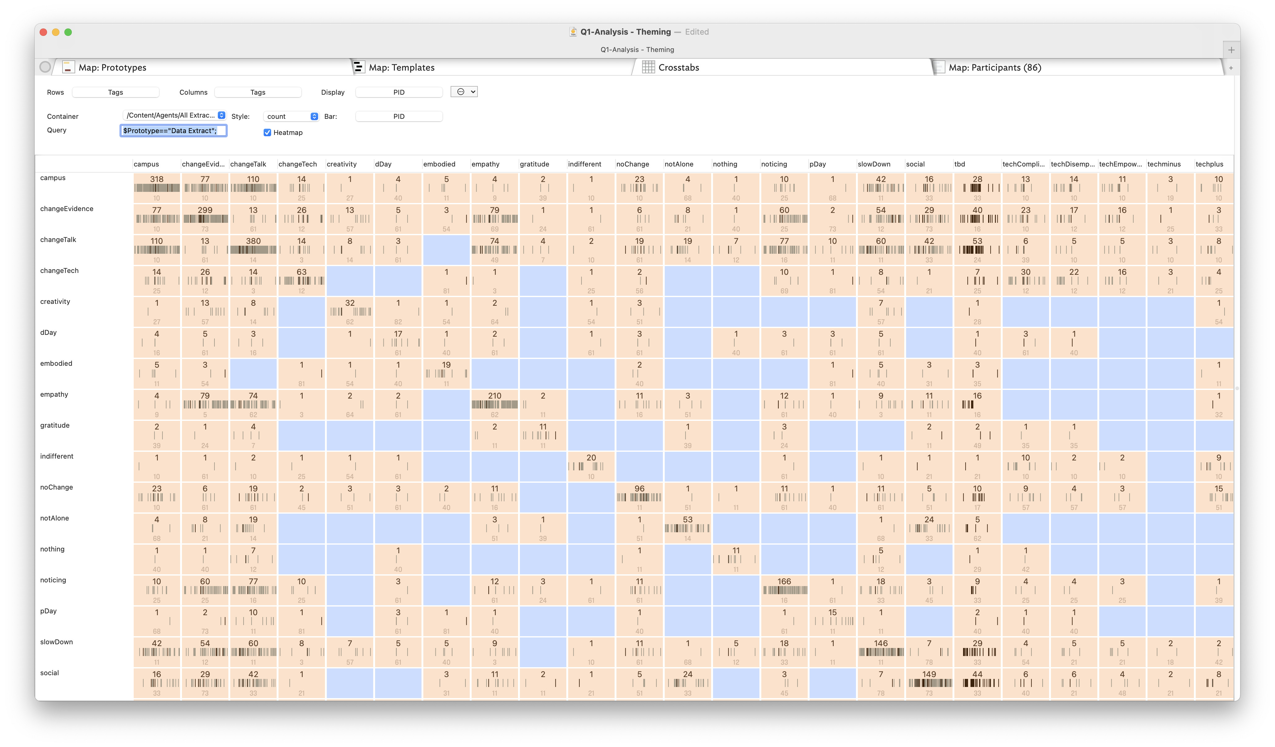
A tick-box offers the optional of a Heatmap that will colour cells in proportion to the number of notes they contain, using the system accent colour ($AccentColor) for sparsely-populated cells and the complement of that colour for heavily-populated cells.
But in my experience, it seems to be more like a color indicator if the value ≠ 0. Example:
Is this possibly a settings issue w/accent color? Or maybe a misunderstanding of the feature? Or is it not working as intended? Do others experience this?
Are the two images using the same colour palette? I’m not entirely sure how to map one to the other. Do you have a specimen file that shows the problem, and so we can experiment? (Late here in UK, so likely tomorrow).
low values use $AccentColor (used to be called $Color2), so above “dark warm gray dark”.
higher values use ??
What this shows is the graduation is based on zero to max value (?) gradient. In your sample, we seem no grey cell as no cell is close to zero. I think the colouring of empty cells using a more saturated colour than data-bearing cells makes the heatmap far less clear. Plus it would help to have a stronger min-max gradient.
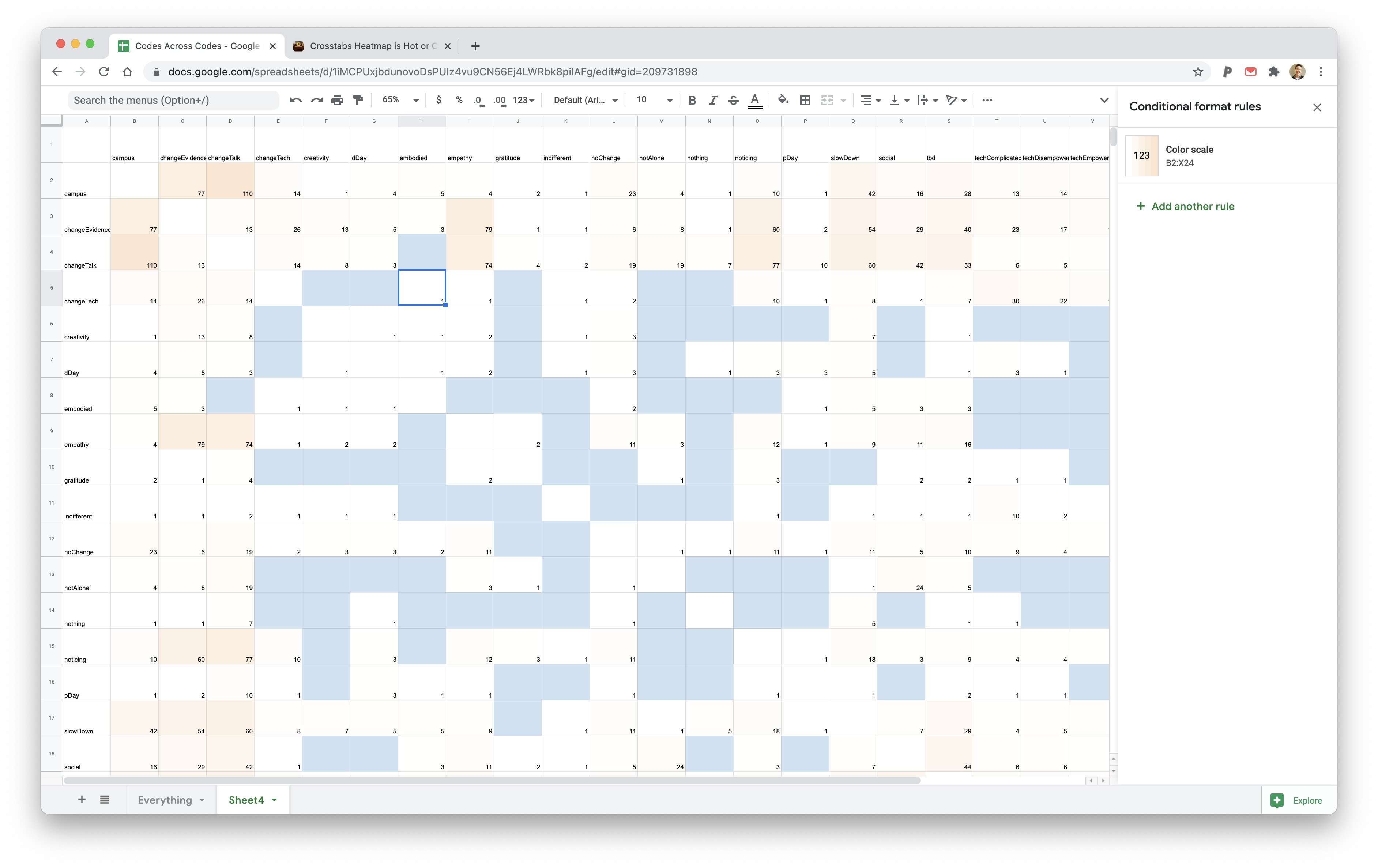
If I change $AccentColor and refresh the view, e.g. I changed the grey colour to red, the low value cells stay grey and the colour gradient doesn’t change.
ISTM the following would be beneficial:
no no colour empty cells. Use the view background colour (less visual noise for cell with no data)
consider an option to set the colour gradient for min to max as opposed to the current zero to max.
allow the user to set min-min max colours, or at least the colour used to produce the tint.
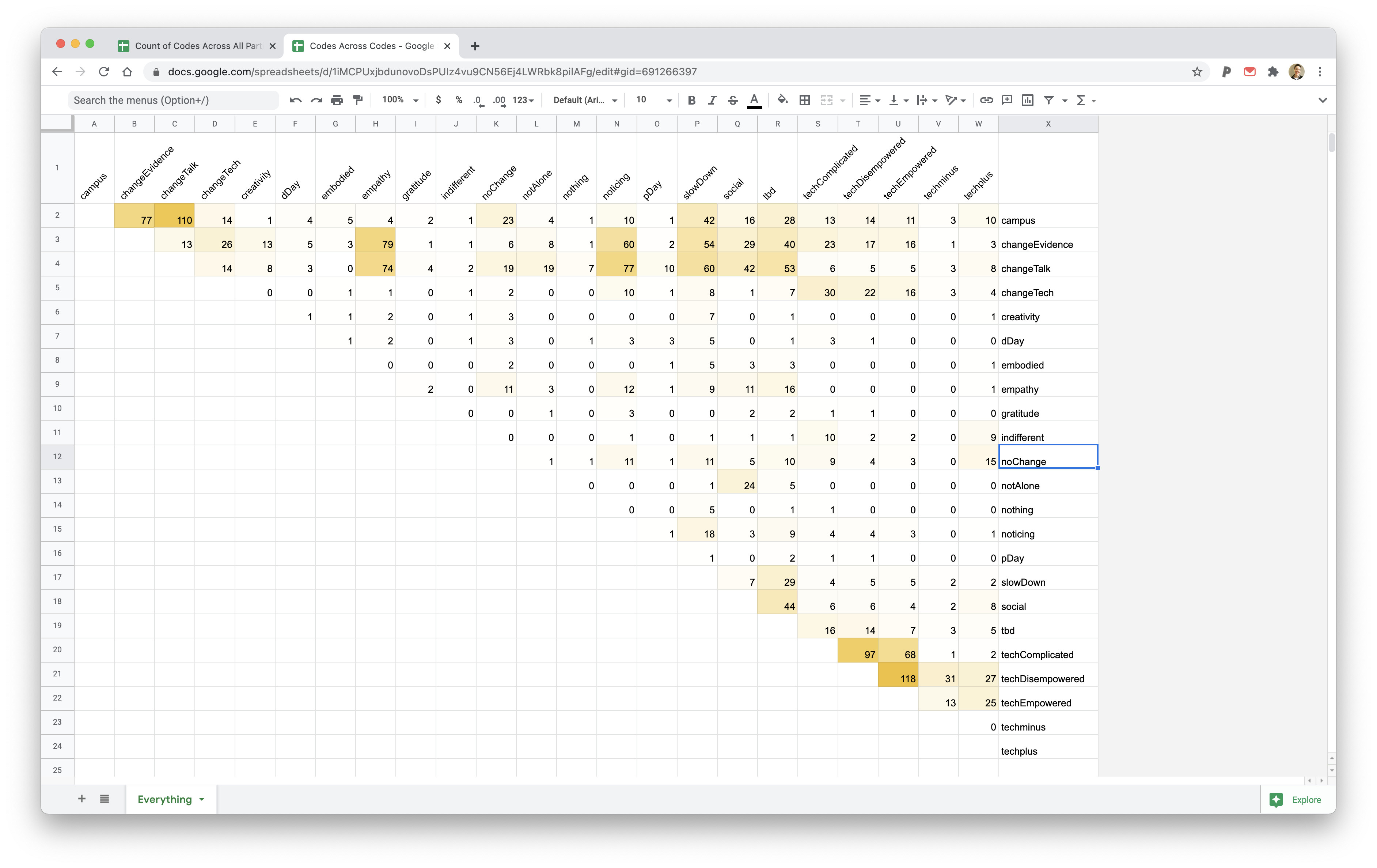
I’ve done some investigation on my side. It seems to be linked to Tinderbox different treatment of attribute types as I get a different heatmap behaviour depending on the choice of string or number as input attributes.
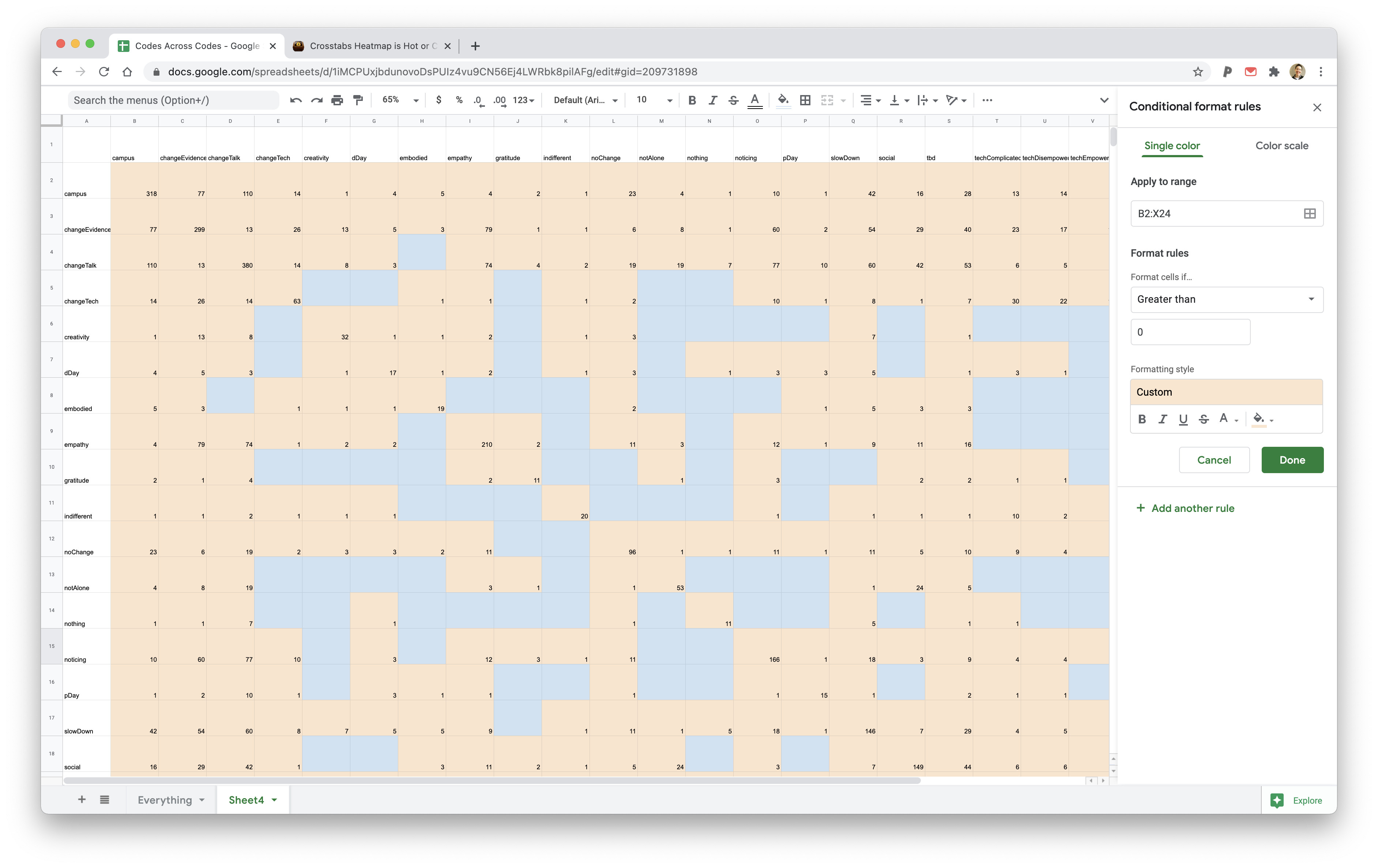
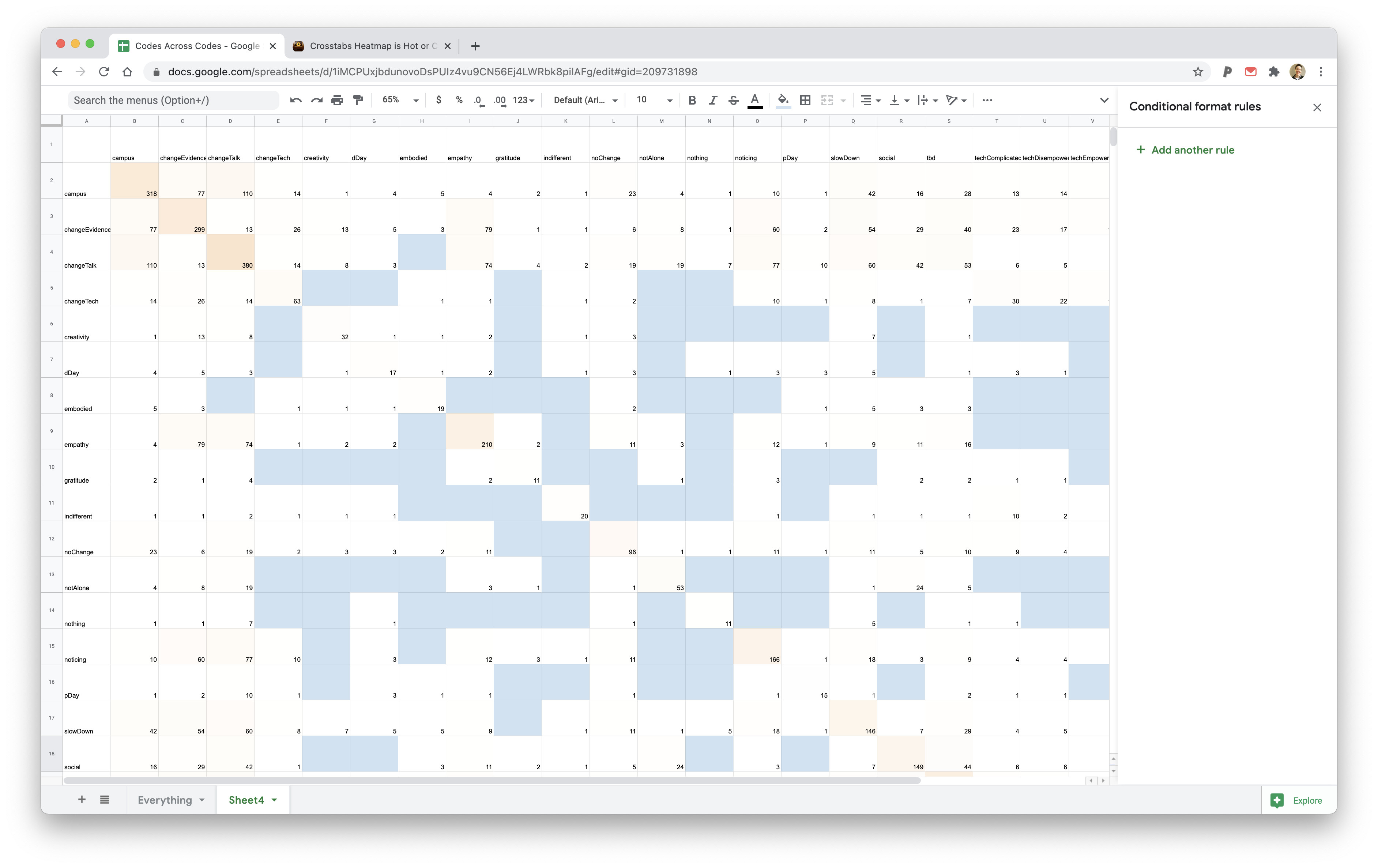
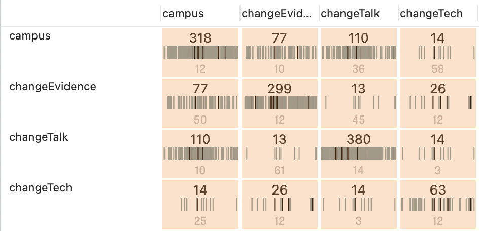
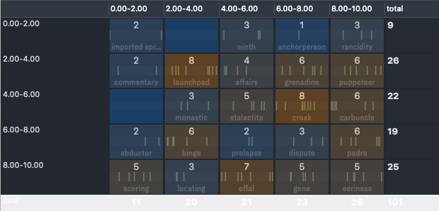
First generating a cross-tab heatmap using number attributes (let’s call them $Num1 and $Num2), which range in value from 1-10, I get the result below. This is more or less inline my expectation e.g. a gradual change from blue, grey and brown depending on the number of notes collected in each bin.
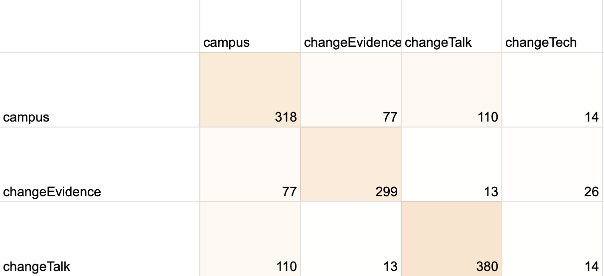
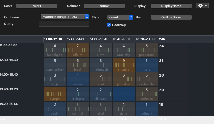
I repeated the experiment to check whether adding 10 to the attributes would change the heatmap to be sure that the scale is not hardcoded to start at 0 or 1 but instead at the minimum value. Now the range is from 11 to 20 and the colours/values are the same which is what I was hoping for.
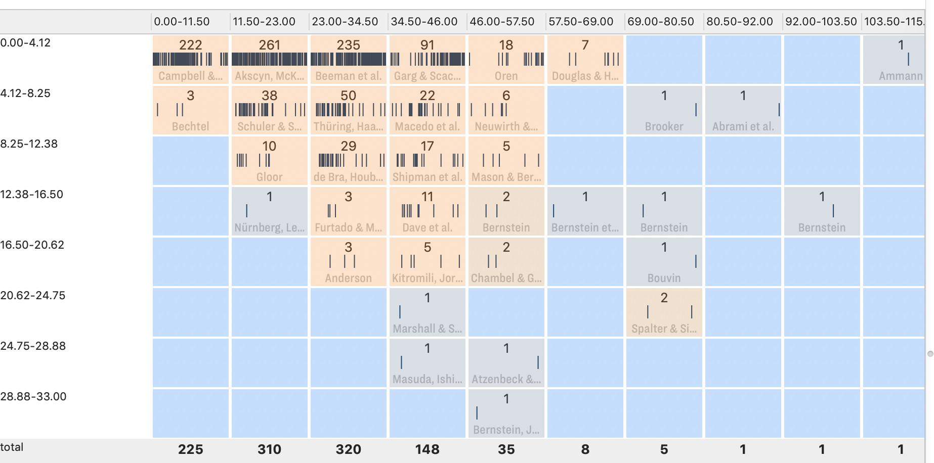
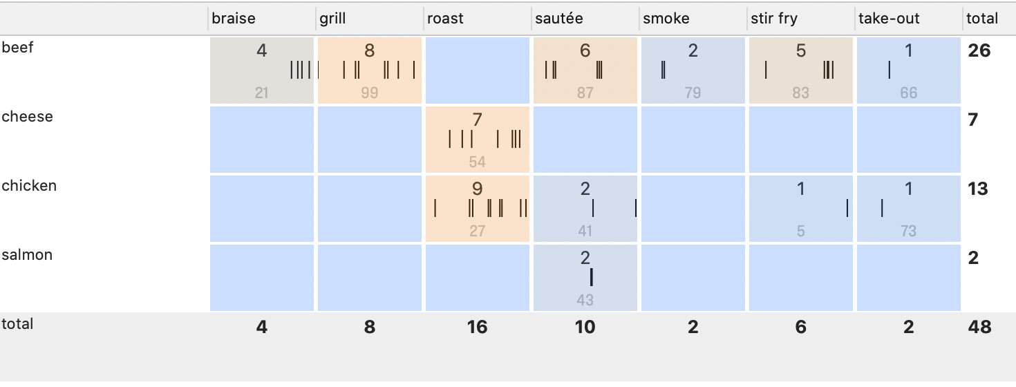
The situation changes when I repeat the process using string attributes to be closer to @beck’s user case. Now, like @mwra and @beck I only get three colours (blue = zero notes, grey = one note & brown = 2 or more notes).
Interesting, in my example FWIW, both attributes were number type.
The colour spreads, is that last are noted as being inconsistent with documented design intent (I’ve reported this via other channels). It remains to be seen what is incorrect documentation and what is unexpected outcome.
What I find interesting is the second grab in the last post where there are ‘blue’ cells (with is not $AccentColor AFICT) with data.
It may just be this is incorrectly documented. The source for (my) aTbref notes is app release notes—reviewed during beta—my own explorations of gaps in the description plus the observations of fellow testers. However, aTbRef is generally more complete and up to date than the app Help (as I can update outside release schedules, though data does flow back into the manual). Still, newer/lesser-used features—within a big toolbox— are not always as exhaustively documented as we might choose so threads like this are useful in revealing inconsistencies. What may feel like a glitch or bug is often an unexpected outcome due to a hitherto undiscovered edge-case or insufficiently close documentation of the design intent.