Displayed Attributes pop-over

Hi everyone,

Perhaps my question is too simple, and I apologise in advance for that. I did not find an answer on aTbRef, thus decided to ask here.

Is there any possibility to change the size of Displayed Attributes pop-over, or at least reduce the size of it upper part that contains list of attributes to be displayed for the note? The issue which I experience is as follows: when I select to many attibutes in the upper part of the pop-over it size continues to increse until it fit all the size of the pop-over by reducing the lower part. As a result - the lower part becomes unavailible. And I did not find any possibility to ā€œdetouchā€ the popover (make it a floating one) in a way similar to Info pop-over.

I wil be gratfull for the answer or link to the topic on this forum if it was already discussed earlier. Thank you!

I believe this is the issue? If so, No, there is no workaround (as at v10.1.2)

Dear Mark, thank you for the responce. Yes, exactly, this is the problem as you visualised it. Would it be convenient to have this pop-over resizable? Is it reasonable to request a feature from the developers? Or maybe this is just my specific case and other users didn’t need this before?

I’m just a fellow user, so the request is best sent to the developer. How many attributes are you needing to show? Bear in mind that however many you set for $DisplayedAttributes, you can only see 20 (max) at a time in the text pane: you have to scroll the Displayed Attributes table in the text pane.

My experience is having very many Displayed Attributes is a sign I’ve not really thought through my document structure (as was the case in the document on which the above image was based.)

Thank you again for your reply. That’s a wise observation, I agree.

I was concerned that not all attributes that I assign values to for a given note are visible in the Displayed Attributes table. However, as I understand it, all attributes are also accessible via the Get Info pop-over (for example, those that are set only once when creating a note). Accordingly, it makes sense to include only those attributes in the Displayed Attributes table that are really important to see.

However, if the Displayed Attributes pop-over could be expanded in size, I think this would enlarge the possible use cases.

It would be interesting to hear the developers’ opinion on how realistic and feasible this is.

What the table shows is stored in … an attribute: $DisplayedAttributes. you can see this by making $DisplayedAttributes one of your Displayed Attributes!

As I recall Tinderbox will display up to a maximum of 20 of the notes (total list of) Displayed Attributes. If you have set >20 such attributes, you need to scroll the table to see item(s) 21+ in the list. As $DisplayedAttributes is List-type, the order they list in the table is the order in which they are stored in the $DisplayedAttributes value.

If you have a big list and need to see mote text, you can hide (collapse) the table using the chevron control just above the top right of the table:

In the current macOS it is a chevron, in some older OS versions the control may be a filled triangle (like the outline container expend/collapse icon).

Another Displayed Attributes tip. Whilst working on a project, it is common to add more Displayed Attributes as you go but not remove any. However, you may not need all those attributes present at all phases of the work. Given that $DisplayedAttributes is use a stored list value, you could use one list for initial work and that loas a different list into $DisplayedAttributes for working at a later stage.

Also, don’t forget the Get Info pop-over is always available via either view or text pane. It can even be ā€˜torn off’ as a stand-alone window so you can keep using it even when shifting the selection to a new note.

HTH :slight_smile:

Dear Mark, thank you for the comprehensive clarifications.

I followed your advise on the reference to the $DisplayedAttributes value. As such, I added two new user atributes - $DisplayedAttributesLongList and $DisplayedAttributesShortList containing respectively different scope of the attributes to be displayed. I filled in the proper values of these attributes in the prototype of the notes.

Then, I just apply a stamp to a particular note in the format: $DisplayedAttributes=$DisplayedAttributesLongList
or
$DisplayedAttributes=$DisplayedAttributesShortList
when needed.

This solves the problem for me. Thank you once again!

2 Likes

Great, glad that helped give you a solution.

1 Like

I see the problem, and will look into it.

But it might be preferable, as discussed, to limit the Displayed Attributes to those that are most important; it’s hard to find information in tables of more than 7-9 items, and especially so if you don’t know exactly what you’re looking for.

1 Like

Dear Mark Bernstein (@eastgate), thank you for the reaction.

I would like to add some more points relevant to the discussion.

First of all, I admit that I fully support the position on the careful selection of the attributes for the note. This is a good approach that is in line with the general concept of the TBX application, as I understand it.

At the same time, I can provide some examples of scenarios where the flexibility of the Displayed Attributes pop-over makes sense.

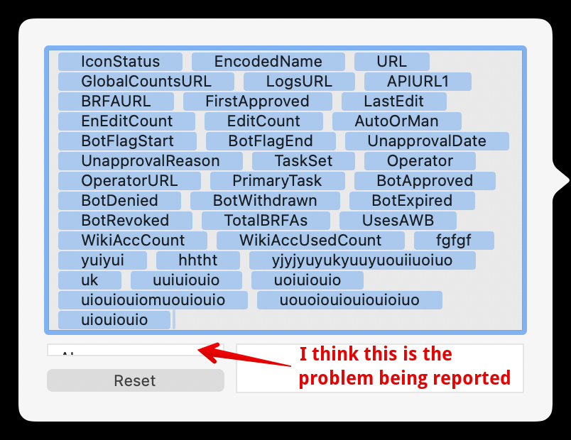
The upper part of the pop-over can contain 12-15 attributes, depending on their length. If we need more inclusion - the upper part will expand until it absorbs the whole internal space of the pop-over. Moreover, the increase occurs not when you add a new attribute that goes beyond the visible space but with the addition of the following such attribute.

The first scenario is the one I use the application for at the moment - studying based on the media files.

I built a workflow based on the excellent learning material from Michael Becker (@satikusala) and his 5c knowledge management resource.

In short - I have a prototype of a note that contains information about the media file located on disk, with a set of attributes for separated parts of the path (i.e. folder, sub-folder, extension, etc.) plus additional information like start and end time of the video, page for the PDF file, etc.

I also developed, again using recommendations from Michael, a set of export templates with some additions of js code that allows me to view/listen/read the file depending on its type and particular intended use of the note. This allows me to have either video or video and PDF/audio presented on the same page in preview mode.

Then, after creating a note and assigning values to the attributes, as I already said, I can easily view the note in the Preview pane and manipulate the media there (i.e. jumping to another note by using links, scrolling the video from the necessary part, etc.).

Would I need to change the location of the files - I just change the values of the specially created global note and apply stamps to update attributes for the parts of the path to the files for all relevant notes in the scope.

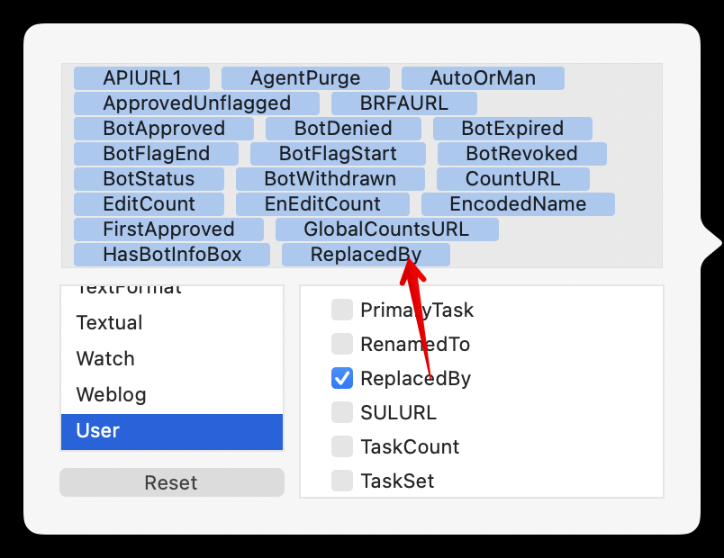
As such, I need more than 20 attributes to be displayed for the note. I put the most relevant attributes at the top of the list (usually - 5-7 of them), but I still need to see what the values are reflected in other attributes of rare use. Scrolling the Displayed Attributes table is not a problem and causes no inconvenience.

To be honest, I realize that this is not the scenario the TBX was designed for. Still, TBX is the best (and in my experience - the only one) application that can deal with such a task in a highly flexible manner (neither of the other applications that I use, such as Obsidian, DevonThink, Curio, Scrivener, allows to develop such a studying workflow, but they could be easily connected with the TBX).

The second scenario reveals when you use user attributes with long names. I like very much the idea that I guess I take from the aTbRef resource – to keep user attributes named as self-explanations. I noticed that sometimes the names become quite long (e.g. $DisplayedAttributesListShort). When you have one of such kinds on your list, this is not a problem, but three or four in a row will result in the increased size of the pop-over upper part.

In my opinion, there is no need to change the external size of the pop-over, but only in limiting the expandability of the upper part size in a way that all attributes in the list that go beyond the allocated space continue to be added to the end of the list ā€˜invisible’ but with a possibility to scroll the complete list to the bottom.

I hope this explanation will be helpful for the community and developers.

The grab below is from some current research where there are more Displayed Attributes than I’d recommend†. But the file is for me only, I’m on a 24" screen and most notes using these Displayed Attributes have a paragraph or less of $Text. Also, if the attributes are in the way I simply collapse the table—.

Meanwhile, another overlooked feature of this pop-over is you don’t have to type in the attribute name in the top box (or remember the spelling to do so) as in the bottom part of the lane you can choose an attribute group (here, most likely User attributes) and tick them to add them to the list. Here, I’ve just ticked ReplaceBy in the lower part of the pop-over, and by doing so added it to the list.

Possibly quicker/less error-prone than (mis-)typing attribute names—depending on your recall of attribute names and touch-typing ability.

I do question whether there is ROI for the user community in fixing this edge case, I’m less sure—and I write that as someone has (see up-thread) over user Displayed Attributes. Does this edge case warrant the work (dev cost) given that there are other ways to set very large numbers of displayed attributes.

†. I can’t stress that strongly enough. Showing 30 attributes all the time just in case you might alter one is poor planning. Even if you’ve inherited a model made by someone else, your needs are likely not their needs. If making a demo r library for others, consider this and whether the maker’s needs (for attribute display) are actually those of the user of the TBX. I’d wager they are different.

—. Don’t forget, the show/hide state of a note’s Displayed Attributes table is itself an attribute: HideDisplayedAttributes. So you could use a stamp to toggle the Displayed Attributes table visibility for one—or more—selected notes.

Aside from system attributes, you don’t have to use long attribute names if these get in the way. In most cases the attribute name only need to make sense to use, so abbreviating parts of the name you might otherwise spell in full makes it simple to have shorter attribute names.

Thank you very much! I think we have covered all the important points for this issue. As I mentioned earlier, the solution of using stamps to display different number of attributes for different needs suits me.

1 Like

The next backstage release ensures that the categories list will always be able to show at least one line.

1 Like

When updating for that I’ll put a cross-reference to other methods of setting Displayed Attributes (Quickstamp, actions, manual entry to $DisplayedAttributes).

Thank you for taking this to attention!

1 Like