Feature Request: Screenshot Tool for Map View Visual Context

Hi all,

I’ve been using the Tinderbox MCP server (thank you for creating this!) and finding it very useful. I wanted to raise a discussion about a gap I’ve noticed that affects users who work primarily in map view with visual/spatial organisation.

The Problem

The current MCP tools work beautifully for outline-based workflows. The get_notes tool allows for searching/querying which works well when your organization is captured in the outline hierarchy. (or when you’re looking for a single note).

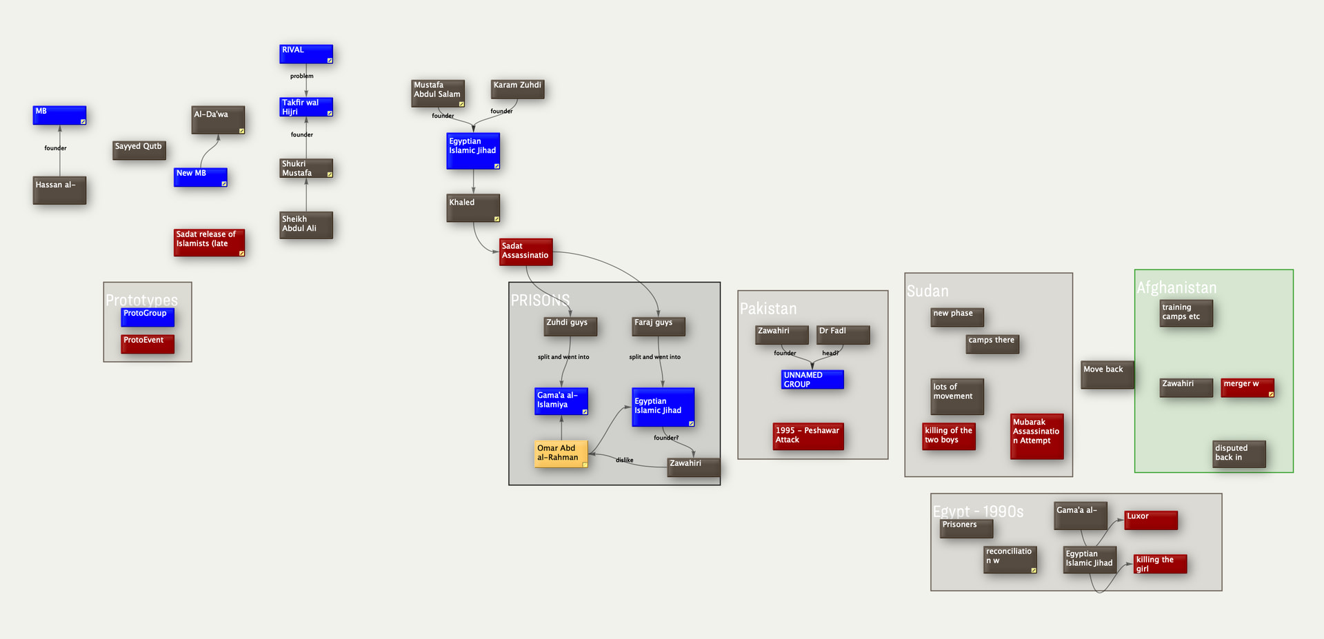
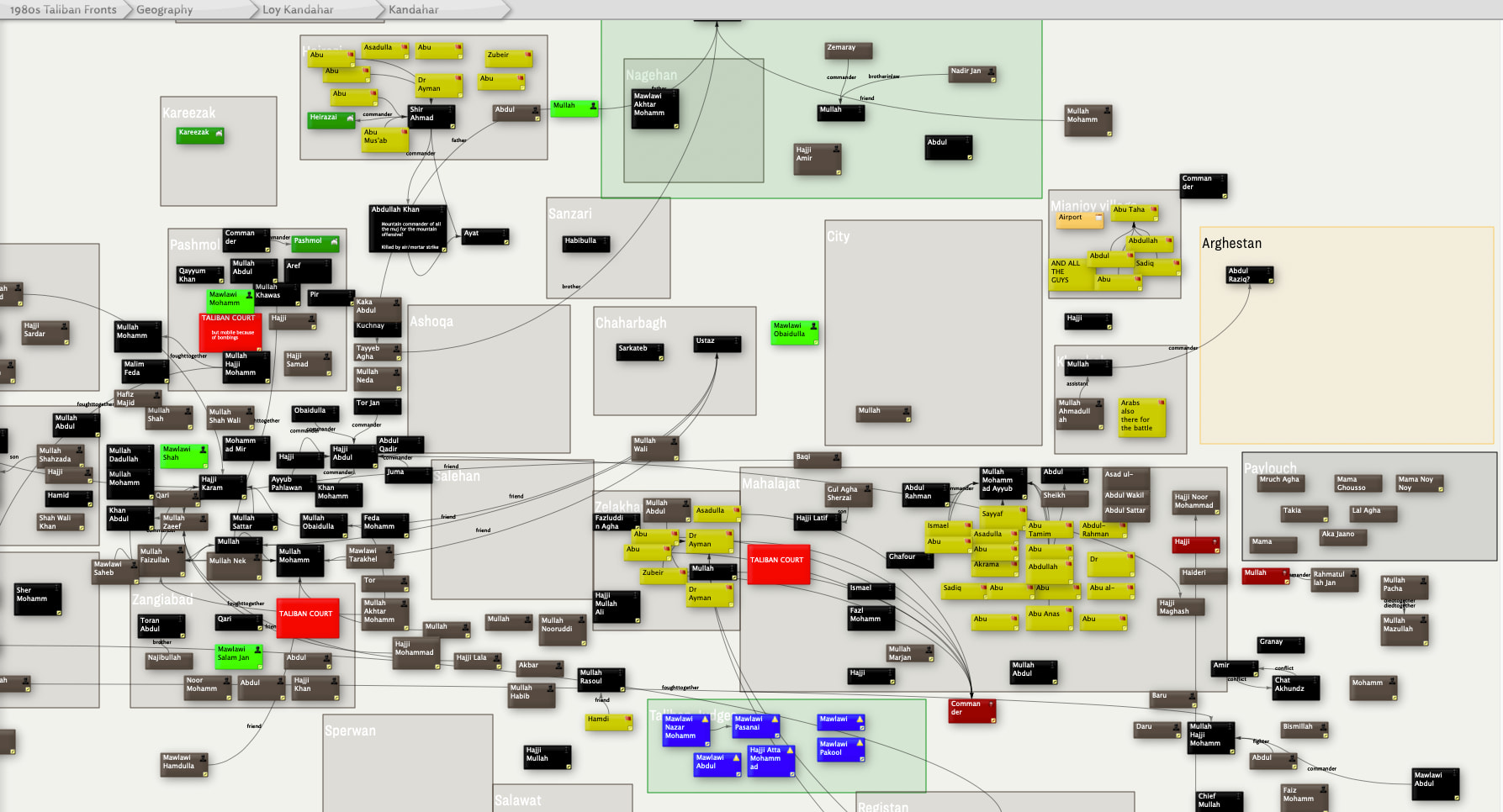
However, I use Tinderbox primarily as a visual thinking tool. My workflow typically looks like this:

  • Create a container (or use an adornment) for a topic

  • Add notes inside it

  • Arrange them spatially in map view—grouping related ideas, creating visual flow, using proximity to show relationships

  • Use color, badges, and note sizing to add semantic meaning

  • Refer to this visual layout while writing in another application

The crucial point: the meaningful structure exists in the spatial arrangement, not in the outline hierarchy. When I’m in a container with 50+ notes carefully arranged on a map, the outline view just shows me 50 flat siblings with no indication of the conceptual clusters, flows, or relationships I’ve created visually.

Current Workaround

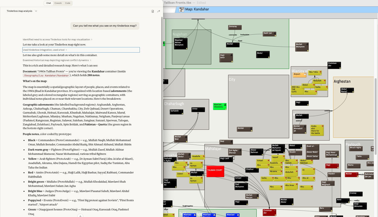
Right now, when I want Claude to understand my visual organization, I:

  1. Take a screenshot of the map view manually

  2. Paste it into Claude (Desktop or Claude Code)

  3. Then use the MCP tools to query specific notes Claude can now identify from the visual context

This works, but it’s clunky and breaks the flow.

Proposed Solution

Would it be possible to add a screenshot tool to the MCP server? Something like:

get_map_screenshot(container_path, zoom_level?)

This would capture the current map view (or the map view of a specified container) and return it as an image that the LLM can process visually.

Technical Considerations

I realize there are some complications:

  • Resolution/zoom: If you zoom out too far, note titles become unreadable. Perhaps there could be a zoom parameter, or the tool could capture at a standard zoom level where titles are legible

  • Map size: Large maps might need multiple screenshots or some intelligent cropping

  • What to capture: Current view vs. “the map for container X” (they might differ if the user is looking at something else)

I’m not sure exactly how the MCP server is implemented, but since Tinderbox can generate images for export, perhaps there’s a way to leverage that?

Why This Matters

The visual/spatial arrangement in Tinderbox maps carries semantic meaning that’s invisible to text-based tools. Features like:

  • Proximity: Notes placed near each other are related

  • Clustering: Groups of notes on adornments or in spatial regions represent concepts

  • Flow: Left-to-right or top-to-bottom arrangements often show sequence or progression

  • Visual hierarchy: Larger notes, different colors, or prominent positions indicate importance

All of this is lost when the MCP can only see “here are 50 sibling notes in this container.”

Question

Are there any plans to add visual/screenshot capabilities? Or if this isn’t on the roadmap, would this be a welcome contribution? I’m happy to help test or provide feedback on what would be most useful.

Thanks for all the work on this! It’s already basically my gateway back into using Tinderbox heavily again. I stopped using it as much because it was incompatible with my team at work etc, and exporting back and forth between Notion or whatever the team uses was too disruptive, but with the MCP server I have no such problem any more. I can live in Tinderbox (as I prefer to do) just fine and then my MCP client can pull things out as I need.

1 Like

This is interesting, and I’ll second the proposed snapping of a screenshot of a map to send to the MCP server.

That said, a couple of comments. I haven’t had consistent success in getting Claude to fully understand and evaluate an image. The models are built around working with text tokens. If you’re had consistent success, Alex, great!

Second, since we’re thinking about what Claude can do, I asked Claude if it works best with a screenshot or some with some other representation of a graph of nodes and edges (i.e, a Tinderbox map).

Claude says:

A mathematical representation beats a screenshot every time for analysis.

Why? I can’t actually extract useful structure from images of concept maps. I’d see boxes and lines, but parsing text in various orientations, tracking which edges connect to which nodes, and understanding the topology is unreliable. You’d essentially be asking me to reconstruct the data structure from pixels - possible but inefficient and error-prone.

For mathematical representation, canonical triples (subject-predicate-object) work well and are standard for knowledge graphs:

  • (Note A, "relates to", Note B)
  • (Note A, "is example of", Note B)
  • (Concept, "contradicts", Concept)

But depending on what you want analyzed, consider these alternatives:

Edge list - If directionality and labels matter:

Source → Target [Relationship Type]
Kant → Hume [influenced_by]

Adjacency representation - If you want me to spot clusters, centrality, or structural patterns

Hierarchical/nested structure - If there’s a clear tree or ontology

The “best” format depends on your question. Want me to find logical inconsistencies? Triples with typed relationships. Want to understand information flow or importance? Edge list with direction. Want to see if your taxonomy makes sense? Hierarchical representation.

What are you actually trying to analyze?

So, maybe a feature where Tinderbox sends canonical triples based on the map would work better than a screenshot (bunch of pixels)?

1 Like

I’d say that by my experience the visual understanding of something like Sonnet 4.5 or Opus 4.5 is pretty excellent. I can give a semantic map and it does really well at parsing out what it’s about. But it all depends how powerful a model you’re using with it. But in 2026 I’d say that isn’t at all a problem.

In the end, you want to give Claude what most closely relates to its training data. So images are fine since it’s trained on semantic reasoning over images quite extensively. You can and could represent the data as a graph (like you suggest in your reply etc) but that assumes that TBX is able to represent one of my maps as a graph. That only works (easily) if I’ve done stuff like linked a bunch of items together etc. But in my map views I very rarely explicitly link things together. Usually I just cluster, or I make a row or a column of items, or multiple rows etc etc. You get the point. So it would be hard for TBX to create a graph-type structure (your ‘canonical triples’) without already having to have parsed that from the map view.

I personally don’t like the idea of a screenshot tool because those screenshots eat up the context window, but beyond the hack of pasting in a screenshot, not sure how else to enable this.

It sounds a bit like you’re wanting spatial parsing as was done in things like VIKI and VKB some while back. How abstract are the relationships? Is the AI finding relationships you don’t see or is it simply identifying structure you’ve not systematised beyond visual stylings? For instance, finding all the blue lozenges that also has exactly two flags.

It’s worth noting a little-discussed action that I presume the AI can access which is distance(startItem, endItem) that measures the (map unit) distance between the centres of any two objects on the map.

1 Like

I think it’s basically that the LLM is parsing out structure that’s implicit in how it’s presented visually. I’ll post some examples tomorrow (with ‘receipts’ showing how LLMs are able to parse a screen of notes organised in some visual way etc), but basically if we have chapter titles as blue notes, let’s say, and then some light blue ‘subsection’ notes each organised in a row etc, then stuff like that is very easy to implicitly understand what’s going on.

Because absent that image, those maps are basically worthless in the context of the MCP server. All it can see is notes and hierarchies. I’m not sure if it has the ability to do an action, but I’d probably assume that the amount of tokens it’d chew through to get all the distances between all the items on a 50-100-item map would be much larger than the # of tokens it’d take to parse a screenshot.

This is fascinating. I’ve done some preliminary experiments at spatial reasoning, calling Claude’s attention to Xpos and Ypos and have it arrange notes and such, but of course this is a bit like blindfold chess. (Then again, when I consult Claude for planning dinners that’s also blindfold chess, but it’s really quite sensible on things like wine pairing.)

Note that Claude can get the colors, sizes, and positions of notes from the note attributes. What would be fascinating would be to compare whether giving it images improves performance. Claude can certainly do excellent reasoning about images, but images must consume a fair amount of tokens. It will be interesting to learn what presentation of spatial hypertext works best for Claude.

There’s a good study to be done, there; do you happen to have a spare doctoral student?

This will require some work, and things are a bit frenetic right now. But it’s definitely feasible.

:slight_smile: no spare doctoral students here unfortunately.

I guess we live in Claude’s world, so I assume the most concise representation of the spatial semantics would probably be in some sort of graph textual format similar to what it’s seen in the training data, but creating that representation would be all on the TBX end I suppose.

More tomorrow and I’ll paste in what I had in mind from the image. I think I’d mostly worry about Claude having to make 100 tool calls to assemble its visual representation.

As promised, though a little late, I got round to showcasing visual understanding. I picked two fairly complex map view screenshots, and also talked through the ‘Notes’ chapter of ‘The Tinderbox Way’ which is perfect context about semantic mapping across the visual plane. Here are two images and corresponding analysis that Claude was able to extract. Each also includes what would be lost by only looking at the raw files list (i.e. when you don’t have access to the visual aspect).

At any rate, these are both images that I used while working on a book (long since published). Hoping we can see about getting a screenshot tool somehow in the Tinderbox MCP server with this evidence :slight_smile:

1 Like

I hear you! Maybe a week?

2 Likes

Interesting stuff, especially the surfacing of the temporal axis in the first example. It’s a interesting idea to get Claude to surface the temporal axis to the subject matter.

For quick/simple map use generally results in one link per note pair, possibly with a visible label (link type). But richer linking is possible, and by making some link types invisible. This retains the visual clarity but should give AI (Claude, etc.) more to get its teeth into.

I wonder if Claude is able to ‘(thinks’ to)read the <link>data directly.

1 Like

Links are exposed by get_note. I’m not sure that guard fields and link types are exposed, but they will be.

1 Like

Two questions for @strickvl and everyone else:

  1. Thinking about this get_view tool, we could either show the current view or the map view of /path/to/container. I am inclined to the former in order to reduce opportunities for confusion, in which the AI is working in container A but the person thinks they’re in container B. But what do you think?

  2. Does anyone know how many tokens an image typically consumes? What format should we prefer? Does it help to offer a smaller image?

For question 1, I think the current view I think is the one to go for, for sure.

For question 2, the tokens consumed differs from harness to harness. Here’s what Anthropic says about that, for example:

But each MCP client (claude desktop, claude code, codex, chatgpt etc) will treat these images differently. They also sometimes implicitly resize them if the input is too big, so I think the risks are relatively low. The main thing is just that the text should be legible and then at the lowest resolution that enables that.

From the sidelines, but informed by decades of assisting users with maps, very few users really understand the path-to-map relationship (i.e. the map is just one outline container). That’s not critique, as frankly most users don’t need that level of understanding.

Ergo, the ‘current view’ seems good logic. ‘Power AI users’ might still want to specify a path, but I’d treat that as a stretch goal for now. Probably closer interest, given variable token cost/availability, whilst the ‘whole’ map might seem the obvious choice, a bounded subjection might be more helpful for token burn rate and avoiding feeding out-of-scope data to the UI. Not least the UI doesn’t ‘understand’ things in a human sense so giving extra info in we already know it doesn’t need is making the AI’s task harder (it doesn’t ‘know’ what’s irrelevant).

A thought. Can AI read vector graphics as easily as a PNG. Just thinking in terms of providing map fidelity without making humungous 4k (or 5k) bitmaps.

It can read vector graphics just as easily, but I think they are more token heavy than images. These models (the big ones at least) have been so heavily trained on exactly this kind of semantic image understanding etc, I think you probably get better results from an image than you would from some other alternative mapping of the data.

It also helps that your MCP client is working somehow at the same ‘level’ and with the same materials as you (the user). Because if we gave it some vector graph or something then it might talk to the user in terms of the graph etc which may or may not correspond to what the user sees or understands from the diagram. In an ideal world you might want both. (I’m also not sure how well things like adornment placements and badges etc would be represented. It feels like it might be a much larger in terms of tokens to have a graph representation.)

One other thought on current view vs the full map (zoomed out) is that I’d be careful to test this on edge cases like huge maps. I often am working with mega maps and I know that when I zoom out then the notes become unreadable.

1 Like

Understood. I was only thinking of vector info in the sense that Tinderbox’s current map image grab is vector info if pasted into a suitable host else it is rasterised. Whatever, the issue of token likely undermines the idea. So be it. :slight_smile:

Sure, though the current ‘show all’ triple-key toggle was really there to give the human user an indication of the overall size/shape. I’d assume for AI use the test is at what zoom level (fidelity) does coherence break down. Just above that level is the level to generate the grab. Or so it would seem … I and not an expert.

----

Aside. It’d be interesting to see how the AI goes on Hyperbolic view—Tinderbox’s other ‘map’. Although you trade layout control to the view, the ‘map’ is doc-scope and only uses links to determine what maps/doesn’t map. For anyone who’s bothered to explicitly use link types there is per link-type filtering. Also I should note there is no implicit zero-sum comparison of Map vs. Hyperbolic. Just two different renders (viewspecs) of the same data with slightly different elicitation of data patterns.