Heptabase/Scrintal/Scapple types of maps?

Is it possible to emulate Heptabase type of maps in TB?
These types of maps are on the hype currently. I knew some people have requested title-less flat note-maps long time ago. The titles hide the contents in the current map view of TB.

Has any body find a work around to make the maps not to hide content?

Oh the irony. Scapple’s design was based on a simplified form of Tinderbox maps.

Tinderbox notes can display text and also images.

Having answered the question I’d note on the wider issue…

Splitting the title and text makes sense—maps are only one of Tinderbox’s views.

What we are most used to doing isn’t the norm, it’s just behaviour’s we’re dealing with.

A downside of all-text icons is map space disappears fast and many now have a single small screens. that leads to kludges for keeping the desired content on-screen. I’m always surprised that a visually noisy and hard to read map like above is considered good. Good, compared to what?

Dear Mark:
I remember this kind of map has been requested at least since version 6. It would have been better to get into it at some point than getting defensive about it. We have to admit, these Scapple kinds of maps are so attractive and elegant because they exactly emulate the white board.

In map like that, TB for example, could require the user to make the first like as title:
::Title:: kind of template. TB can then pick the title from the first line for its metadata stuff.

The user can just lay down both the title and content in the same page.
The displaying is a good progress. But, being able to directly edit on the white board is very fast and elegant. The beautify of Scapple maps is the ease of laying them down while losing no track of what you already wrote in another map/note.

Defensive, far from it? I’m just conscious that the same question hides two very different ones: “how to I do exactly this” vs. “how to I do feature X from app Y”. It’s not obvious for the reader and I’m covering both. Do you have a link to the earlier requests/discussion, I don’t recall them but clearly they’d be useful to reference to save going back over previous discussion?

I’m on the road at present so no time to make demos, but I think the only thing Tinderbox can’t do is re-use the icon space reserved for a title if the title is left blank. But it is worth noting that having title-less notes would be a significant change to some fundamental design aspects of Tinderbox, noting that Maps are only one of Tinderbox’s view types.

Having taken a brief look at Heptabase, the maps seem interesting, but I suspect the suggested style needs more engineering than simple input styling for a Tinderbox map view. I suspect that to deliver on the suggested functionality might end up in a new view rather than changing the current map view design. IOW, its as much about what feeds the view as how it looks on screen.

Still, I’ve no antipathy to new ways of mapping.

1 Like

What does this mean ? Notes on map view can display title and text.

Scapple notes/concept maps/mind maps etc… look beautiful and they most certainly have their place for “tools for thinking”. Screen size becomes a limiting factor as the map enlarges, making connections more difficult.

Sometimes I want to be a able to automatically collate, compare, highlight, group notes for better understanding. I appreciate Tinderbox’s metadata to give notes the little extra depth.

1 Like

Can you edit “Even more notes” directly on the map (without opening another window/editor)?

Sorry Mark. That is my fault.
yes, the maps in Heptabase look very attractive. But, that is not the point. The maps in Tinderbox are also great. We just need a little change to be able to make TB infer the Title from a certain formatting of the body of the note (first line). Then, make it possible to leave out the title. It seems simple to me. But, I don’t know. I am not a programmer.

1 Like

I don’t think it’s right to say that Mark Anderson is being defensive here. It was my decision, not his! And far from defensive, I’d say that Mark was being more aggressive that is my usual won’t.

I think note titles are a very good idea, and their absence causes much woe. You can see the effect of that woe in the way some of these whiteboard systems are monetized: “up to sixty notes” for a monthly price, or “10x10 iPad screens of maps space” for an enterprise-scaled price. These systems are designed, in my understanding, for fast onboarding and for comparatively small, short-lived projects, environments in which you don’t have much need to address notes or for notes to address each other.

I do moderately like your Title::BodyText proposal. One difficulty is that you’d typically want, in Tinderbox, to be able to use styled text in your body text. But that could be overcome.

You’ll see some features in the upcoming Tinderbox release that will please you, though not satisfy this particular anxiety.

1 Like

I am sorry about the “defensive” comment.
I misunderstood his text. I should have re-read it.

I totally agree that those white board software are meant for shorter projects because complex projects are generally difficult to mange in a single “infinite board”. This is tacked by breaking down complex projects into smaller chunks by breaking down them into Folders/groups, would be containers in our case.

I heard that Obsidian team is also developing similar/Heptabase kind of “infinite board” for visual thinking. I feel that they are so popular because the speed and ease of sketching out ideas on them. I also feel that what TB needs is just a small change because everything there already.

I will be looking forward for the new developments. Thank you dear Mark.

In the title or no title discussion there are other features of Heptabase that got lost in the discussion.
One is more user control on the display of text in the Map View itself. For instance I would find it useful to display the complete note text temporarily in Map View (to remember what was written, compare with another note etc…) without having to go to the text pane. Hovering and other options exist but having the functionality integrated would be more efficient. It could be done with a floating window or temporarily augmenting the size of the note in the map, and reverting to the default view once finished.
Another would be the ability to edit $Text in the note in Map View. I’m not sure that’s possible right now.

2 Likes

Yes, right.
Actually, the title and notitle talks is exactly about the control of display of text on the map itself. The reason why the body of the note is not showing in the map because the title become like a folder, and the body ($Text) has become like a subfolder, to explain it with analogy. Heptabase puts both flat in the same hierarchy that everything is visible and editable on the same plane. So, if you remove the title from its folder status, everything will be like Heptabase. That is the idea, at least to my limited understanding of programming.

No, you can only, currently edit the title ($Name) of a note. The $Text can be displayed but not edited in the view.

That’s why, and without arguing against the suggestion, I think the enginnering needed is more than the current visual difference might suggest. IOW, re-engineering how the ‘content’ of a note is drawn. Currently, the content is a number of discrete elements—that reflect he structure of a Tinderbox note—rather than a single styled multimedia (text/image) box.

It seems like the old forum is down. Is it gone for good? That would be sad lesson to learn. There were great nuggets of information; workflows, and amazing setups there. The discussion about flat maps also started there, if I remember correctly.

No. Thanks for clarifying your requirements.

Ah, now IIRC the old site needed updating to continue working on a server so as the we no resource for doing the latter (for a moribund resource) it was turned off/removed.

Ah, this I do recognise, but not as part of the idea the opened this thread: they are actually two different things. The ‘flat’ map was debated and put to bed a while back as the design and the user concept; there’s no right/wrong so much a a complete conceptual disconnect. The—and I stress unintentional— fallacy here is to think that things that may look a bit similar are constructed in a similar way. In the case of ‘flat’ maps and the Tinderbox map view they simply don’t align. So, perceived resistance to the idea is not defensiveness about method, hostility or any of the negatives that seem to be imputed but simply the current Tinderbox map view, as exists, isn’t the best design start. Working back from how things look—or can be imagined to look—are deceptive.

So I now see two issues at play:

  • Flat maps, i.e. the maap of every outline container collapsed onto one 2 plane.
  • Heptabase-type maps

The short explanation about why the first can’t work—using the existing map view—is how to deal with notes that use the same {x,y} position in different maps when flattening the whole. A regular riposte to that was of the form “but I wouldn’t do that/make that mistake”. But humans make mistakes and the app has to cope. But Tinderbox does have large flat maps. Just use one map!

Heptabase-stye maps look superficially like Tinderbox maps, but come from a different design concept. Most notable is the title-less notes. Or, written in terms of most noting apps, title-only notes† but where the title is a rich text/multimedia space. Notes definitely need a title‡. Given the way a note icon is constructed and the attributes upon which it draws, putting something else completely different there sounds to me like a do-over. IOW, a new view.

For such a new view to be added a use case is needed that goes beyond ‘looks like Heptabase’; which is roughly where wee are at present. To help the developer figure the ROI/possibility of the feature can anyone point down to the design concept of the latter’s maps (i.e. not just a picture of the UI outcome) and expressed in terms of Tinderbox rather than some other app. I’m happy to help with the latter but know nothing about why Heptabase’s design has to be the way it is, so can’t help with the former.

†. If we go back, note had no ‘text’, simply a title. That may no matter to us as users looking at a diagram on screen, but it matters to the designer of the UI and all the other facets of the app that need to work.

‡. Yes, I can make a note with no $Name and $Text only but, functionally, not a usable map of 100s of them, so the edge-case doesn’t stand as a counter-proposition. Not should this be a zero-sum discussion. Rather, we should be thinking about a new form of map view that starts from a different set of assumptions.

1 Like

Please leave the idea of “flat maps” aside. The current idea is to be able to write on the body without obstruction of the Title.

I don’t know the internal workings of Tinderbox. But, what I have in mind was to demote the $Title to a metadata (attribute) kind of status. Think of the Subtitle attribute we have right now.

  • The user writes the $Name within the $Text: under specific template; like how the YAML metadata treated in the Markdown.
  • The title is dimmed within the text
  • TB picks the Title from that to use it for other things
  • The title is shown on the map just like the way the “subtitle” is shown
  • But, double clicking on the map will not open a blank canvas. It rather enables the user directly edit the $Text in place.

For my unassuming mind, this seems a little change to the existing map rather than completely new system (view).

1 Like

A difficulty here — significant, not insuperable — is that Tinderbox texts can be quite lengthy. Yes, I urge people to keep notes small and focused, but sometimes notes are big. The text pane can accommodate, for example, the entirety of Moby Dick. Do we really need that much power in every map item?

At present, when text thumbnails are displays in the map, we show that portion of the text that fits. If we want these to be editable, we’d need scroll bars.

Each paragraph has settings for tab stops. Are these tab stops the same (give or take scaling: see below) in the note body as they are in the text pane? If we change the width of a note, do the tab stops change? If not, what happens if a tab lies beyond the width of a note? How do we change the tab stops in a note? The system ruler view takes up a lot of vertical space; does each note get its own ruler view?

If we click on a map item view, there are quite a few different things we might be doing. Offhand, we might be clicking on the title, the subtitle, the text, the caption, the map interior, a note inside the map interior, the container’s window shade, the badge, the link widgets, any of the eight resize handles, as well as inbound and outbound links. With full-fidelity text, we’d also need to consider clicking in text links that appear in the note’s text. That could be quite a lot of computation.

When we change the width of a note by dragging one of the resize handles, we need to typeset the visible text (or, possibly, all text that precedes the visible text) do fit the new width. That can be computationally challenging, and you’ve only got about 15ms to finish and render the result. Less, because we also need to redraw the links, and all those lovely curves (and arrows) must be redrawn in the same time. The same consideration applies to pinch-magnification, except that every note in the viewport ought to be freshly typeset in the 15ms window.

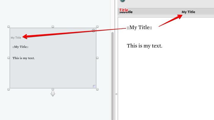
Selecting a note in the left pane and then glancing at the right pane to read its text is not always, perhaps, ideal, but is it arduous? Indeed, if we were to remove the title from the map item view, then you’d need to glance over there (or somewhere) whenever you need to check the name.

If a user were to set the title color to “transparent”, perhaps Tinderbox might reclaim the space occupied by the title and subtitle for the text thumbnail. Would this be some help?

2 Likes
  • The title is not as relevant as the content. Any user would spend more time reading and writing the body a note than the title. You write a short title, and more probably you don’t need to check it constantly. You often need to check the title when you want to reference the note in another note/material.
  • It is not arduous. Having the viewer on the right side has improved things a lot. But, if you want to read sth in note X that you wrote some time ago, you have to click on X, and expose its content. If the content you are looking for is not in X, you have to try on Y, and so on. In the Heptabase types of maps, you don’t need to click around to read/edit the texts. You can read and compare the contents just in front of your eyes. Every paraphrase you wrote is in front of your eyes: no hidden content. You just jump from one note to other and add or remove content; like the white boards. That is what made those types of maps very attractive.

If a user were to set the title color to “transparent”, perhaps Tinderbox might reclaim the space occupied by the title and subtitle for the text thumbnail. Would this be some help?

It is not like the title itself is the problem. The issue is not being able to directly edit the body. Making the parent folder transparent doesn’t save you from navigate to the subfolder. The only way to avoid navigation down the subfolder is to flat your files up in the same plane. That is the what those Heptabase maps do.

A difficulty here — significant, not insuperable — is that Tinderbox texts can be quite lengthy. Yes, I urge people to keep notes small and focused, but sometimes notes are big. The text pane can accommodate, for example, the entirety of Moby Dick . Do we really need that much power in every map item?

But, if the implementation is complicated, you can just keep it in your note. May be one day you will get out of ideas for new development directions, you can pull it out for consideration–may be for Tinderbox version 10, 12 or even 25.

Thanks, this constructional/design PoV is really useful as moves us away from a natural inclination we tend to have (I don’t exempt myself) to think in terms of “why not just add one more boolean”. The most useful incidental gain from (intentional) beta testing is beginning to see how appearance (view from the auditorium) contrast with its construction (view from behind the proscenium arch).

1 Like

That is absolutely true.
It all looks simple from the appearance. I personally don’t know the complicated coding going on under the hood.