I have an agent that collects all my projects. Each project includes a status attribute, which can be one of the following: In Dev, On Hold, or Closed.
I’d like to see a chart based on the status of each project — ideally a simple bar or pie chart that shows how many projects fall into each status category.
What’s the best way to build a chart view from this dataset? Any tips or examples would be greatly appreciated!
Make some agents that collect different values of $Status. Then make a summary note that collects the $ChildCount of each agent and makes a pie chart, Or,
Make a poster note instead. The agents are still a good idea. If you use Claude Desktop, it can guide you to make the poster note.
There is no ‘correct’ way to do this as the method chosen from those above will depend on your existing knowledge and expertise. For a user who has not used posters or AI before, here is one possible solution using native Tinderbox methods. Again, this is but one of many possible solutions:
For my TBX, I added a value for $Status of “Pending” and made that the default value for notes using a “pProject” user prototype. The container holding the project sets that prototype for all new child notes. The values of ‘Demo/On Hold/Closed/Pending’ are also suggested values for $Status.
The point of the ‘Pending’ value is this reminds you this is a project note not yet configured ready to be given a defined status.
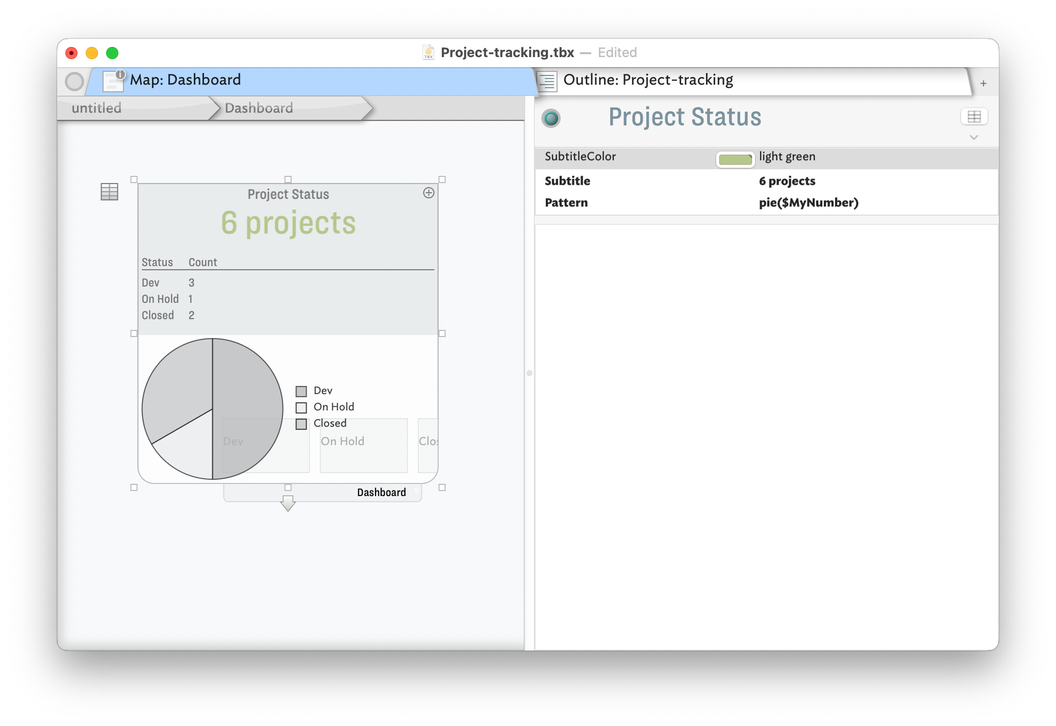
I have used/modified the built-in Dashboard prototype and applied to container ‘Project Status’. Avoiding cluttering the document with loads of alway-on agents, I added child 3 notes to the latter container, whose OnAdd applies a user prototype of ‘pStatus’. The Edict (that runs occasionally but also triggered by affecting events) has this code:
$MyNumber = sum_if(all,$Status==$Name(that),1);
Essentially it sets the note’s $MyNumber to the count of note whose $Status is the same as this note’s $Name.
In the ‘Project Status’ a table expression is used to summarise the value and this counts. The values are then plotted in the container viewport. I used a pie chart but you might prefer a bar chart: see more on container plots.
and all with zero use of AI! But, as noted upthread, AI is there as an approach for those who prefer that approach.
Thank you so much! I don’t have Claude Desktop, so this example file is super helpful. I was also wondering if I only have an OpenAI account, can Tinderbox still work with that, or do you need Claude Desktop to use AI features?
Yes. A number of users are doing just that, working via the AI’s free tier. Depending on the complexity of what you then try, you may find a Pro subscription† is needed if—like at the slots—you run out of tokens.
Hopefully someone actively using Claude can chime in on when that boundary is hit—and how the inexpert AI user might know they’ve hit a limit.
†. …or whatever the name is of the Claude base pay-for tier.
For info: If planning to follow up on the above project, but using AI, please note there is now an AI category for new posts. This is to help focus questions/helpers for AI matters in one place. By all means cross-link an AI-related thread there to this one. That would leaves this thread free to continue—if needed—discussion of the non-AI options as already started above.
You can work quite well with the free tier … and when the time comes that you reach a limit, you are explicitly and unmistakably informed about it … then there is a pause for about 5 hours before you can start again.