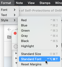
Then, once you’ve thoroughly messed it all up and you want to go back to your document defaults you can go back up to format and reapply the standard font and size (hot keys work geart).
Note: select all of $Text, or a select section before using these. In the Style menu, Standard Font resets the (selected) $Text to the inherited or locally-set values of $TextFont and $TextFontSize.
The original posts screen grab looks like Markdown (or some flavour of it), but not knowing how the highlights were extracted from the Kindle, it’s difficult to know the source format. What app/feature/API is creating the source files. (For my eye, the lack of contrast in the original screenshot and its small size, make the Displayed Attributes values quite unreadable).
If your doc has no export templates configured, add the built-in Hints container and view the doc in Preview mode as the Markdown in the $text will render in a manner you will find useful.