Multiple map arrangements of the same set of notes

It would help me, if I could create multiple maps using the same set of notes.
I want to be able to sort notes in different ways and side-by-side compare two ways I sorted them.

For project management I recently made a map of areas of the project. I made the sizes of the notes reflect overall importance of the parts of the project.
I then realized, that it would be helpful for me to have a map, with the same notes – but with their size representing current importance. Sometimes, a minor issue in a generally not so big and important part of the project becomes very relevant to push forward for a small while. I would like to represent that without disturbing the order with overall importance, that I created in the previous map.

The simplest way would be:
Just add another set of position attributes to the notes for each extra map view one creates.
Like that every map would run on the exact same notes, but just on independent attributes for the position.
But I don’t think that is possible in TBX as of now?

If I just created a copy of the outline, making changes on the content of notes in the one view would never transfer to the other view. It would not be two views of the same notes anymore. They could go out of sync. I’d have to repeat all changes on the one map on the other. If I want to use these two views together in the long run that seems clunky.

Using Aliases and Agents, I could see a way. I’d make an Alias of everything I had in the first map. I then need an Agent that creates new Aliases, when I create a new note on the original map, or a child note under one of the notes on the original map. I was hesitant to try though, because I thought this issue must have come up before.

I think you misunderstand how map view works: it shows the contents of a single container. As you correctly note, the obvious alternative is to make an alias of that container’s contents, turn off the cleanup action and arrange the aliases therein as desired.

Alternatively, if you want alternative settings for the same map in situ, then you need to consider all the attributes in use (Height, Width, Xpos, Ypos, Pattern, Shape, etc.) and save alternate values (in separate (user) attributes for each alternative visualisation. Not built-in, some work involved, but entirely do-able if you have the need.

But I’d also encourage you to read up on the affordances of Map view as potentially altering something like the shape ($Shape) or size or fill/colour might well show the differences you wish to show. I generally find it easier to use what is on offer than invest too much effort in creating what isn’t there, if only to reduce the amount of work involved.

My bad, should have been more explicit: I was thinking „if I were to implement this feature in general, I’d just keep two maps that are seperate from the container and run on different sets of attributes of the notes in that container“. But of course, they are not seperate from the container in TBX, and one can also not just choose which attribute is to be used for position, size, etc. This was just for clarifying the desired behaviour.

That is almost what I meant with

, except for the fact, that your solution would mean I can switch between values I want to use to display the map view. But there would be no side-by-side, I could only write one or the other set of attribute values into Xpos, Ypos, etc.?

What about automatically creating new aliases, when an original gets a new child? Have you done something like that?

Good point! As long as I don’t want to reflect properties that should be visually comparable (comparing placement vs. placement and size vs. size is easy, color vs. size is not) – or just use this to have two ways of ordering something on the map, until a decision for one of the options is made.

Correct. Bear in mind that any map view is broadly defined by attribute values. All map view, regardless of tab/window context use the same attributes. Thus, as a user we might choose to store 2, even 20, variants of $Shape, but all maps of a given container will draw a note’s icon in the shape defined by its current $Shape value. So, whilst we can swap out values for $Shape we can’t tell a map (per tab) to use a different attribute for the value of its Shape definition.

This is why working back from an (imagined) visual outcome may offer rich ideas but ones which imply significant and complex re-design of what you see, i.e. the view. That doesn’t imply such ideas are bad, far from it. But, often those ideas might but not tractable in the current design.

My 2¢ is that the concept here is nice but it would need map view to be re-coded such that some c.50 attributes needed to make the view might need a per-tab abstraction rather than simply use per note values. …And, if they were, what existing behaviour would that break? It’s also easy to overlook that Tinderbox is now 21 years old and has plenty of docs happily still around that were made a long time ago; arbitrary changes for today’s new ideas need to be considered for unintended effect. Lest that appears to be a rejection of the new, I’m currently beta-testing (betas are not public) improvement brought about by user comments within the last week. Some things are easily do-able others far more complex: there’s no antipathy to improvement.

One practical test, that someone wanting this could do, might be to make a document with a developed map, then save a copy and make a different map. Then annotate what changes to the original (attributes, view settings etc.). I’m not sure anyone’s actually done that before. not a 5 minute task by any means but if proposing this change something perhaps useful to try. Though the forum can’t do the first part (maps are highly subjective in layout/meaning), with two different maps of the same data, albeit in different files, experienced users here might be able to help figure how much change is involved.

I think two agent related factors are getting mixed here. What is/is not on a map is controlled by the query. The map is updated every agent cycle: that is a continuous process but can be throttled back pr turned off entirely so the map stopes being (agent) updated. See $AgentPriority](AgentPriority). That is what get on a map.

How agent map contents are arranged is a different and separate process controlled by the agent’s $CleanupAction. It too can be turned off (from the default auto grid layout).

Does that help clarify a bit?

†. Some more recent Tinderbox view types, e.g. Attribute Browser and Crosstabs, define more in the view settings than in note attributes. But, as at today, a Map view is closely tied to attributes of the items shown on it (plus a few from the parent (container) note)

‡. To makes maps dynamically switchable (i.e. same UI area showing a different map render), for N different renders you’d want N+1 attributes for a feature. So $Xpos, the X axis position on the action map, $XposA and $XposB to hold the same for Map version A vs. Map version B. Rinse and repeat for about 50 other attributes. IOW, 50 existing attributes with A and B version of each. For 20 different map versions you’d need 21 ‘versions’ of each affected attribute. At that scale you might make a List-type for each of the 50 with 20 different list items. But it’s all a job for the user at this point. something this process can’t sustain is link line (and link label) placement. Initial layout is auto by the app but many like to manually tweak that but those settings aren 't saved—at least not in a user-accessible manner.

I did try now, as apparently this has not been brought up before.

What I wanted was: Get the note highlighted in red to automatically appear, where the thin red line is. So basically an Agent that effectively acts, as if include() would also pull the children of notes.

Actually what I did not know yet was, that an Alias can never have a child, nor can it be an Agent itself. What confused me for a while was the fact, that an Alias nonetheless has $AgentQuery and $AgentAction attributes I can set.

However, just using an Agent with $AgentQuery set to include(MyTestContainer) got me pretty close to what I wanted: I get auto-updating aliases of everything inside MyTestContainer and in the map-view of MyTestAgent I can arrange them in a new way.
The limitation remains, that only in the original map i can go inside shown containers, as their contents will not be caught by the Agent. But I guess that is what I will decide to call good enough for now. I prefer this way of doing it, because it allows having two TBX windows open side-by-side and comparing the two maps (unlike the “switching approach”).

I imagine it would be causing less trouble (none, I believe) if one would not change how maps work. Instead one could create a new type of view, which is like a map, but is like an “empty shell” – it does not have it’s own notes inside it, instead one would set it up, so that it pulls in the notes of another container. When pulling in notes, the “empty shell” would just disregard the map-relevant attributes from the notes it pulled – those attributes would be the only actual data present in the “empty shell”, so that it can use everything from a target container, except for those map-relevant attributes.

My suggestion is that you set aside some time to read how the app works before experimenting further. most of your problems stem from simply assuming that all apps are alike. Easily done, that’s not to judge.

This has, in fact recently been suggested albeit for a different purpose. A non-trivial ask at is has nothing, in common, bar attribute values, with the current Map view.

Meanwhile, I’ve taken a first crack at a dynamically alterable map. There’s a bit more to do to make the demo usable to a general audience. I’ll post it when done.

I think, that my general assumption atm is, that TBX is capable of anything I’d ever want. Stuff like this is not there in any of the other apps I’ve tried neither.
Nothing I’ve used previously even has the nested maps (does anything capable of that even exist, besides TBX?).

On the forum or elsewhere/private? If on the forum, I’d like a link :slight_smile:

Excited to see what you come up with!

1 Like

I forget. It’s scattered over various conversations. The genesis was making a map and being able to ‘preserve’ a certain presentation. The problem is that as a doc moves from map-based (flat outline) discovery to the likely export phase, where structure (outline) is needed, nested items disappear form the map. Yet the original map (withi visible link lines) is often still desired. This circle is still being squared.

Thanks, I’ll put it in a separate thread (and drop a link here). Almost there, just doing the ‘read me’.

See Dynamically change map styling

1 Like

Responding to the OP, I have wanted to do exactly the same thing for some time. I raised the issue twice I think in the forum, but in the context of having “replicants” or “hard links” that were upgrades from aliases, because they were handles to the same note. On the view I advanced, you could have Map A with a mixture of notes and replicants x,y,z placed in such and such a structure and Map B with a mixture of notes and replicants a,b,c. The key idea was that x,y,z and a,b,c all refer, respectively, to the same underlying note, call each p,q,r. A change to x would be reflected via p in a and vice versa. This is why I say they are a bit like hard links in some Unix file systems.

There was not much support for my idea. One, to my mind valid, concern was that you would still need to mark a difference between intrinsic and extrinsic attributes as you do with aliases. So the implementation would have to draw the line of demarcation differently and whatever that new demarcation it would have to offer enough additional value over aliases to make it worthwhile.

The second concern was that few people saw the use cases. In my case, the use is and was, the desire to make maps of conceptual inter-relations, and more specifically to arrange the same sub-elements in different ways to think about different potential inter-relations. (You could call these different or partially different holisms, if that term helps.)

At the time there was no action script way to create notes, so I trialled an approach in which I had a master container of notes, which several other containers monitored. When a new note was added to the master container, a new note (a copy) was made in each of the other containers. Then I could arrange the map for each container as I liked. It did scratch the itch a bit but the system proved very fragile. Moreover, I had wanted to edit the notes’ text in whatever view I was in when some new insight occurred. Replicating these changes to the original or derivative notes proved far too difficult. I’m not sure it was impossible, but I felt the effort involved would be like trying to eat soup with a wrench.

So for this particular purpose I am back to using paper and pen, which is no great hardship.

2 Likes

Useful exposition here, though you’ll also understand why I placed caveats as to intent on the linked demo above. It’s not because I disagree with the other contingent ideas but because they aren’t tractable in the app as currently designed. For instance, until/unless Tinderbox gains a notion of ‘replicants’ (orriginally a DEVONthink notion?)

The kludge my demo uses is to save, for all affected attributes (the demo only uses some of that possible range), the attribute value(s) per map version in a separate attribute. This allows the a ‘set’ of saved values to be read an applied to the notes in the current map view, bearing mind that for a given container there can only be only one map visual variant at a time. IOW, my demo doesn’t mean you can have N tabs/windows open showing at the same time differently rendered maps of the same notes.

This is very interesting aspect of PKMs. Are map variants each a full-blown thinking space or are we really looking to save diagrammatic snapshots for export/comparison/… ? I don’t claim to know the answer here, thus the question. Plus, despite my moderator/admin role here I say that as just one of many users of the app. It’s different to explore this subject as most PKMs are text-based so, experientially, many users have little by way of practical example from which to work. What’s imagined is not necessarily easily made manifest.

This is not—I think—bad or ill-observed. However, it does start from a different view implementation that the current map view. An entirely innocent error in a lot of map view ‘improvement’ is to misunderstand that the proposal is in reality not an improvement to an existing but rather a whole new view. There’s nothing wrong with the latter, but it better exposes the degree to the work for the developer to ‘just’ manifest the desired change. Most PKMs are not made by corporations and time/resource are finite, which as users of an app we easily forget: what we don’t understand is inherently how easy/simple to those changes are to effect.

I’m not sure if that moves things forward, but is my understanding and I hope the (linked) demo is an indication that new ideas are not ignored here and users are exploring the envelope of what is possible. :slight_smile:

2 Likes

BTW, RE this, I agree. I backstage I’ve been calling for a new view “Diagram View” to accomplish exactly this idea. @eastgate, @mwra, @PaulWalters have been contributing to the refinement of the feature request.

Note my linked demo doesn’t address the latter, or being able to display two different maps of the same notes at the same time. These are all discrete use cases/requests.

Thanks Mark, I pretty much agree with everything you said. You’re right that as currently implemented, what I am thinking of is more like a new view. But the differences may go deeper than that and my own ways of putting it and thinking sort of obscured the difference.

The current way that Tinderbox works I’d say is roughly that there is a single large structure of notes with attributes. Each view offers particular affordances in relation to some attributes of the notes in that structure. So the Map view focuses on spatial attributes and renders those visually. Outline view disregards spatial attributes and gives priority to the order attribute and the hierarchy attributes. And so on. The note is the atom and it is its attributes that are fundamental.

(This is one reason that links do not have an independent existence, each is an attribute of a note. This point has come up in past forum discussions where I suggested they might be made “first class” or independent entities because they were themselves a kind of semantic content.)

What I described and which I think the OP described would imply some kind of duplication or overloading of some attributes which would be indexed to a particular view. So map view A on notes p,q,r would show them according to some spatial attributes (e.g. xpos,ypos). Map view B on the same notes p,q,r would show them according to different spatial attributes. But a note can only have one set of spatial attributes at a time in the present implementation. So what is implied for this to work is that note p in fact has a two-dimensional array of spatial attributes roughly like this p:{[A(xpos,ypos)],[B,(xpos,ypos)]} where A and B stand for map views. In fact, it would have an array whose first dimension was as large as the number of relevant views in which it appeared. My point is that this is non-trivial and in a way more than just another view and there is a serious question to answer about which attributes should/could be indexed to views of any kind. (You can see that replicants as used in Devonthnk are there to solve part of this problem because they facilitate the presence of the same entity in more than one containment hierarchy.)

This connects to your well-observed points about PKM software and thinking-assistance software. If you think of Tinderbox as a PKM tool, then the use case I described is probably out of scope. DevonThink seems to me a clear-cut PKM tool: it stores knowledge and facilitates finding, managing and annotating it. Somehow I’ve never really thought of Tinderbox that way, which I know is a personal view, even though it can be thought of that way. Tinderbox’s appeal for me is that it is a kind of “doing” space where you can do things: think with them, think through them, make connections, and create in a surrounding of contextual content. To make a crude analogy, Tinderbox can be in thought like one of those exoskeletons that people can wear to enhance their strength, reduce their fatigue, even increase their reach.

At any rate, that is a kind of personal hope for Tinderbox (and I am not aware of any other software close to doing what TB does). I’m a second-rate user of TB compared to some people on the forum and its first appeal to me was that it reminded me of Hypercard because of how one could “automate” notes. Hypercard was great but was still mainly, in my view, about traversing a body of content with some dynamism in the content and the traversal. Tinderbox can do that, but seems to me also to hold out the promise of augmenting the thinking about that content.

1 Like

Note quite! The outline is actually the primary view and represents the stored XML structure of a TBX (see The XML TBX format). The order of notes in the outline ($OutlineOrder) is key to a number of behaviours in Tinderbox, e.g. selecting a single match from several where Tinderbox uses the first match as sorted by $OutlineOrder.

Meanwhile, a map only ever maps a single container within the outline. See more on map vs outline considerations.

Actually, this is not so. Unlike many apps that ape the Web style of embedding links into documents, Tinderbox cleaves to the older, more powerful, hypertextual notion of a linkbase. Links are stored entirely separately from the note data. Open a TBX with links in a code editor like BBEdit and look for the <links> element. It will contain a series of <link> elements, 1 per tag.

Thus links are essentially first class objects, even if not obviously so. A mis-presumption likely arises as the app applies/renders any Text/Web links to the $Text area and, in (map view) any Basic or Text links to the view area.

Please forgive my apparent pedantry here: that is not my intent. But, mistaken assumtions can derail well intentioned ideas about possible new uses.

In Tinderbox links are discrete and (uni-)directional. However, they can be traversed/computed across either way or traversed visually in Hyperbolic view. The latter essentially shows those notes in the whole TBX that can be reached from the current note by traversing any type of internal link in any direction (disjoint , unlinked notes are thus omitted). Although not formalised to the extent, say, of Roan, it is possible for basic or text links to link to anchor text. It is little done/seen as Tinderbox design concept is many small notes rather than notes with long screeds of text that inherently require closer addressing to find the needle in the (textual) haystack of the target note’s text. Unstated assumptions both note size and linking can derail our thinking.

A structural limitation for internal links is they fun between two objects. If note BBB has an alias BBB and note AAA links to BBB that link cannot go to both BBB and BBB. At least it can’t without an extra switching function where the human user would need to indicate which of the two possible targets was intended. Such an approach would damage the current powerful ability to query/reason across the network.

Notes and aliases share all outbound links (basic/text/web). However an alias may be given discrete outbound basic links—though this is rarely seen. When exporting, the logical endpoint for much analysis, a link to an included note (i.e. where a note forms part of the exported content of another note) is not sustained. In theory it might be done (i.e. if were to be engineered so) but currently this in not the case.

In principle, Hyperbolic view ought to cover much of what is being sought but it:

  • controls layout
  • does not plot notes not reachable via link traversal.

Yet, in map view we may often build rich layouts with some/no links and using deliberate ‘manual’ placement of notes (i.e. a structure really only reflected by building of {x,y} positional data.

For me Tinderbox is both a PKM and a thinking space. Indeed the two blur. I’d add from context that to me the ‘P’ in PKM releases to scale (desktop vs enterprise), sharing (single-user space) and privacy (personal vs. public). Apart from fixing other people’s TBXs :slight_smile: I primarily use Tinderbox for exploring new problems where the structure is as yet unclear, so Tinderbox’s flexibility and support for incremental formalisation are second to none (at least for me). Still, almost 20 years of looking at/trying to understand other people’s TBX documents shows there is remarkably little commonality in the way we individually use the app. If there is a degree of concordance it tends to be conceptual which thus hides often significant difference and creates confusion in discussion: i.e. we’re doing the same thing … differently.

I think a contemporary problem is we tends to view programs in terms of what they let us do. I think that’s the wrong way round. Rather our tools for thought should assist us. Then as in any collaboration we may need to calibrate pragmatically our approach within the constraints of the possible

Too harsh! We use what we need. Few if any need to use every tool in the box. Though we see some complex/niche things here it is generally because they butt up against the known edges of what the toolbox can do. By comparison, doing close/reading annotation can be both rewarding in Tinderbox but yet use only a few of the tools in the box.

1 Like

I think you may have misunderstood what I intended or imputed more emphasis to certain aspects of what I was describing. That’s not very important.

I disagree though with the idea that links are first class objects logically speaking (and how they’re stored seems to me irrelevant since it is completely contingent). There is no way to traverse the “linkbase” at present except by traversing the notes first. Up until recently, there was almost no way to get at the attributes of links. And there is no way to extend the attributes of links as one can with notes. Indeed, if links were richer, we might have one to many links.

A linkbase sounds a great idea and if it is already latent under the hood of Tinderbox, let’s get it out and have at it.

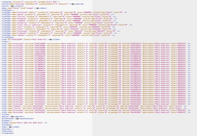
To clarify further, there definitely is a link base. Here is a random TBX on my system—In BBEdit (with XML syntax colouring)—with all except the link type and links collapsed:

The full range of possible metadata in a link is here: link tag. (For storage efficiency, Tinderbox doesn’t store most default settings).

I don’t know which of these you’ve actually used in your Tinderbox analysis:

Have you tried all the above and found them wanting? If so, how? I ask not in combative tone but out of a desire to improve/explain. Clearly, few individual operators answer a complete complex question but rather they must be used in consort to achieve the desired aim.

How are you expecting to interrogate the link base? Put another way, what sort of question are you trying to ask. My hunch is the blockage may be as much approach as it is any functional limitation.

The operators for this were first added in v9.0.0, see here, in December '21. As I recall the feature was added as people asked for it (and indeed not asking for it before then) … and there’s the rub. A lot of possible features aren’t in the toolbox because no one has actually asked the developer, directly, for them. In v8+ there has been a big expansion in the degree to which code can interact with more than attribute values. Doubtless more could be added. But with finite resource it makes sense to effect first those which people have actually asked for with a believable use case (i.e. more than “it would be cool if…”).

Beyond the concept of such affordances, what to you want to add to your links and why? In which PKMs do you currently make such link changes? (Examples help understand the actual need vs conceptual possibility) requirement).

What I enjoy about Tinderbox is it makes me think about my thinking. Indeed, helping with other people’s problems, even more so. Why am I using this approach and not that one? Why did I think this arrangement view would tell me more than that one? Why didn’t this query give me anything useful, against my expectation? Can I structure my view/attributes differently to get more traction on this topic? As so forth…

Fascinating discussion. A few very brief notes might be useful.

  1. I myself don’t think that outline view is privileged or primary. I think of Map and Outline as coequal, and Chart really ought to be — but has never caught on.

  2. In very early Tinderbox, Outline View was given a small boost in priority because new documents opened as an outline, in contrast to Storyspace where new documents opened as a map. This all became academic in Tinderbox 6, with the introduction of tabs.

  3. Tinderbox links are not quite first-class objects. The late Rosemary Simpson (Lisp Machines, then Brown) was a tireless advocate for making Tinderbox links first-class entities. Most notably, you can’t link to a Tinderbox link.

  4. The mention of multi-way links takes us back to Aquanet, whose influence on Tinderbox seems to grown every year.

  5. One important aspect of Tinderbox that we take for granted is that each note really is concrete. It’s a thing, which you can find at a particular place. You can pick it up and put it somewhere else. Bolter calls this “architectonic”, and its importance has been obscured because we’re accustomed to it. In a database, the data aren’t palpable in this way: their Platonic ideals that we perceive through reports. I worry that p:{[A(xpos,ypos)],[B,(xpos,ypos)]} might interfere with p’s thingness.

  6. I also worry that lots of people have a hard time with vectors and matrices.

  7. This fun 1983 paper, with an all-star cast (just look at the list of authors!) wrestled with the idea of filtered, reconfigurable views in an amusing way. https://www.ijcai.org/Proceedings/83-1/Papers/034.pdf. I currently think that the core problem of the reconfigurable, customizable diagram view is actually the problem of telling Tinderbox which notes you want to put into the diagram.

Sorry if I mis-spoke re views & primacy. Nonetheless the (root) outline it the easiest place to see the structure of overall document and unlike the map is is key to understanding (HTML) export. Just as early Tinderbox files opening into an Outline view gave that more apparent standing amidst other views, the Map has the same effect now. My observation is that users, especially those less comfortable with abstraction, can get confused ‘mapping’ the map onto the outline, compared to going the other way. Arguably, it matters not, until/unless one needs to figure out where things are (which isn’t everyone’s problem). Point taken re links. I do think the concern #6 is valid,.

I too would love this. I’m calling this “Diagram View” in the backstage.

Regarding your comments on links, our last meetup went over links “making meaning with links” in some detail. I use links extensively in all my work.