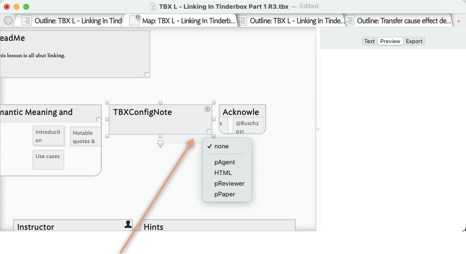
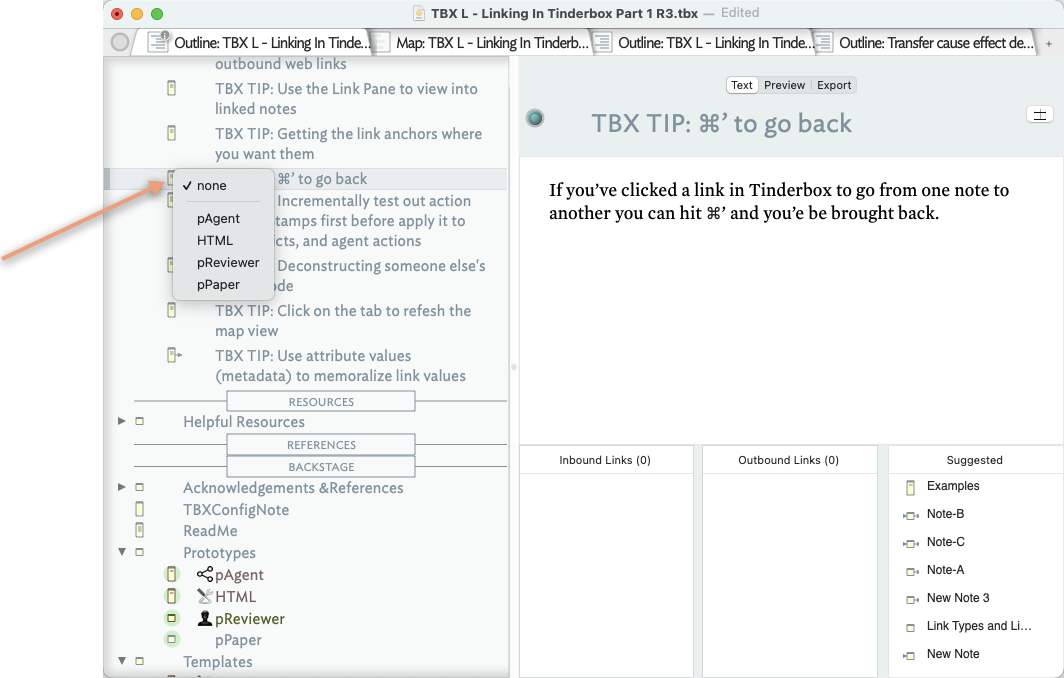
One extremely frequent action I take is to assign prototypes to new notes. At the moment, to do so requires me to hit cmd+2 and then select the appropriate choices from the tab that pops up. To add insult to injury this tab will sty in front of all other windows, even if I switch to a different application.
The latter behaviour is a no-go and a serious infringement on the way I work. I keep several applications on constantly with their windows side-by-side and have not yet seen the light of the iPad way, where all apps have a single window.
The first behaviour is a minor matter, however, invoking a new window to perform a simple and recurring task should not be necessary.
Further to @satiskula’s answer, you can set the current note’s prototypes (or the prototype of all selected notes) using the same method he describes for the Outline view.
Setting prototypes is described in Help, the tutorials on the Help menu and in aTbRef so it’s worth taking a little time out to check through those resources as they will give you further context on this task.
Tinderbox does keep its inspector at the front, even when you switch away from it.
It looks like it’s a design choice (some other apps, e.g. Scrivener, put them behind other programs when you switch away, so the capability exists both ways), but having to move the inspector out of the way every time to refer to something (especially atbref when you’re writing Stamp codes…) can be frustrating when you’re on a small screen.
I’m sure some people prefer it this way, and I’d be interested to hear why, but for me, it’s a (minor) irritation on a laptop where space is limited.
I fear you’re selectively misquoting me! What actually wrote was:
So you can open the Inspector, do a task, and hide it again using the same shortcut. It does not have to remain open. That choice is the user’s.
Within the current session (i.e. app remaining open) the Inspector will (re-open) in the last used position. On multiple monitors (or very/big wide single monitors) the first opening position of a session can be confusing; I presume Tinderbox is trying to pen the inspector so it doesn’t obscure the current document (so might open on a different screen, for example).
Opening/closing the Inspector is no different to showing hiding any other control. My understanding is the Inspector is a discrete window not least as some task require drag/drop outside the Tinderbox document window (think of the single/small screen user). If the Inspector disappeared when the app lost focus, such tasks would become impossible.
At the same time, just today we’ve a request for someone wanting a docked Inspector (for UI fashion reasons, not better UX). I’d warrant it’s someone not working on a single small monitor, where it would be wasteful of limited screen space.
I’ve trained myself to show/hide (either ⌘+1 for current Inspector selection or ⌘+2 for the quickstamp) the Inspector when needed or not. Having done so—I’ll admit it took some deliberate effort—all the annoyance listed have gone away, except the inability of either Inspector or document windows to take focus and set focus where clicked, rather than needing two clicks for the Inspector(set focus on window, set control focus) or three for a doc (1. select window, 2 select correct view or text pane, 3 set control focus. A lot of nugatory clicks if context switching a lot.
That’s exactly the point, though: you’re having to remember to close it, which when you’re swapping rapidly between two programs isn’t convenient on a small screen as it stops you seeing the other material. (It’s not the issue of the shortcut itself, as I use shortcuts everywhere in preference to the mouse.)
The use case is: you’re working in the Inspector and you want to check something relevant to the inspector (syntax for stamps, actions, rules etc).
At the moment it’s either
cmd-2 to close the inspector
cmd-tab to Safari
cmd-tab back to Tinderbox
cmd-2 to reopen the inspector.
…or more often
forget to cmd-2
cmd-tab
remember I’ve not closed the inspector so either
cmd-2, which changes the Safari tab to something different, then go back to the right Safari tab, or
find the mouse to move the inspector out of the way
forget what I was looking for in the first place
cmd-tab and start again…
Of course there are circumstances when it’s useful to have the Inspector on top, and I’m not saying the design choice is wrong, just that it means additional steps.
Have a look at how Scrivener does this with its equivalent (Quick Reference Windows, or the Keyword / Bookmarks HUDs). They can be set to always be on top (‘Floating’), when Scrivener is active, but they don’t overlap other applications when it’s not.
Opening/closing the Inspector is no different to showing hiding any other control. My understanding is the Inspector is a discrete window not least as some task require drag/drop outside the Tinderbox document window (think of the single/small screen user). If the Inspector disappeared when the app lost focus, such tasks would become impossible.
Sorry, I don’t understand: which tasks can be dragged to and from the Inspector window? Do you mean for copy and paste operations?
Sure. i’m describing the status quo, not arguing for no change. Wouldn’t the above be more useful sent to Tech Support as a feature request? As users here, we can’t change the app behaviour. the app generally changes on the case made not on a vote system, IOW, one well explained request is enough.
I don’t have a list. IIRC, colour scheme files were one, but this has changed a bit. I’m unclear if the original justification holds, but I do remember that being explained to me (in another channel) as the background to the current design.
My sense is that the status quo is worth a revisit but I’m drowned in other maters and I’d prefer someone else champion this by writing the feature request (to Tech support - not here).
I’ve no problem with making the request and wasn’t expecting you to do anything about it! I only mentioned it because the OP brought it up…
TBH it’s one of a (small) number of friction points I work around — you get used to things working a certain way and often it’s just a matter of personal preference anyway. I’ve reported a few over the years and some suggestions have been implemented in subsequent versions — I’ve no complaints .
Amen and thanks . I think we’re all in the same broad camp of looking for ongoing improvement.
Though I can’t see ‘behind the curtain’ of app function, I’m involved in separate testing and documentation discussion s to know that—counter-intuitively–the easy stuff tends to be hard and the hard stuff easy. That’s why written out descriptions like yours above are useful as that helps the ‘how’ of getting better and allows hidden assumptions (or constraints) to be identified early.
I fully understand and agree that programming and design is always ridiculously easy as long as a) you’re not the one doing it, and b) you don’t have to take inconvenient reality into account
I think almost everyone in this thread was an advocate of resizable (gigantic) inspector windows as necessary to editing more complex actions. No one — perhaps correctly! — was greatly impressed by my argument that complex actions are a symptom. Now we’ve spent an considerable quantity of quite complex development effort to support this, and we want instead small dockable inspectors.
Bottom line: we’ve got perfectly good ways to change the prototype without using the inspector. In many applications, OnAdd actions and agents can automate most or all prototype selection.
On the inspector (not setting the prototype, which I find easy) I like being able to resize it easily now!
It does stay on top of everything, though, even after changing focus to another app. Am sure pros/cons of that were weighed. I can see how that might be a minor annoyance on a smaller screens with multiple apps running. But in general, for me, the whole thing is an improvement!
Who’s the ‘we’ in ‘now we want’, Mark? I’ve never asked for small dockable inspectors and am happy with the shortcuts and think the new resizability is a welcome improvement. Please don’t conflate a comment about the persistence of the inspector when TBX is inactive with a desire to change the whole kaboodle…
For clarity, I’m not wedded to a particular Inspector outcome. I thought, it appears incorrectly, the reason for non-docked Inspectors was space on small screen and the need to interact with other apps outside Tinderbox. If wrong mea culpa.
As to complex actions, I think there is an understanding to avoid it where possible. But if there is a finite length /complexity of action allowed, surely it just unpacks into lots of of interacting notes holding part of the process making it more complex to follow and likely slower.
The suggestion of wider/longer code boxes falls out from having a floating Inspector. Were the plan to be for a fixed/window edge Inspector I suspect a different solution for longer bits of code would have emerged, but I don’t recall there being any detailed discussion of the two approaches in the context of a zero-sum outcome.
 .
.