Is there a way to reduce the font size of a Note’s display text? I’m fairly sure ‘Display text’ is the wrong term so I’m posting this screenshot to possible help get at what I’m seeking.
I’ve tried to make TB work for me over the years, so I’m trying again. I do understand the basics of Attributes and the power of Prototypes & Agents, however, I’m stuck in knowing where to apply some changes.
In short, I would like to reduce the font size of the text that a note (in Map view) pulls into its display area when one is looking at the Note but has yet to click on it to reveal the Note’s text in the right pane.
Hi @Realpax, welcome to the forums. Only after several attempts at Tinderbox I told to myself – “ok, I don’t master it but I can tame the beast”. And one of the difficulties is to know which string to pull, because there are many.
You need to tweak the InteriorScale map attribute: InteriorScale
Thank you for the fast reply. It all worked as you said, which is giving me lots of hope this is the time I will get my head around TB and its bewitching potential.
Understand that this isn’t an answer to the question you were asking, but should you ever wish to not have this text display at all, this link shows how to do that.
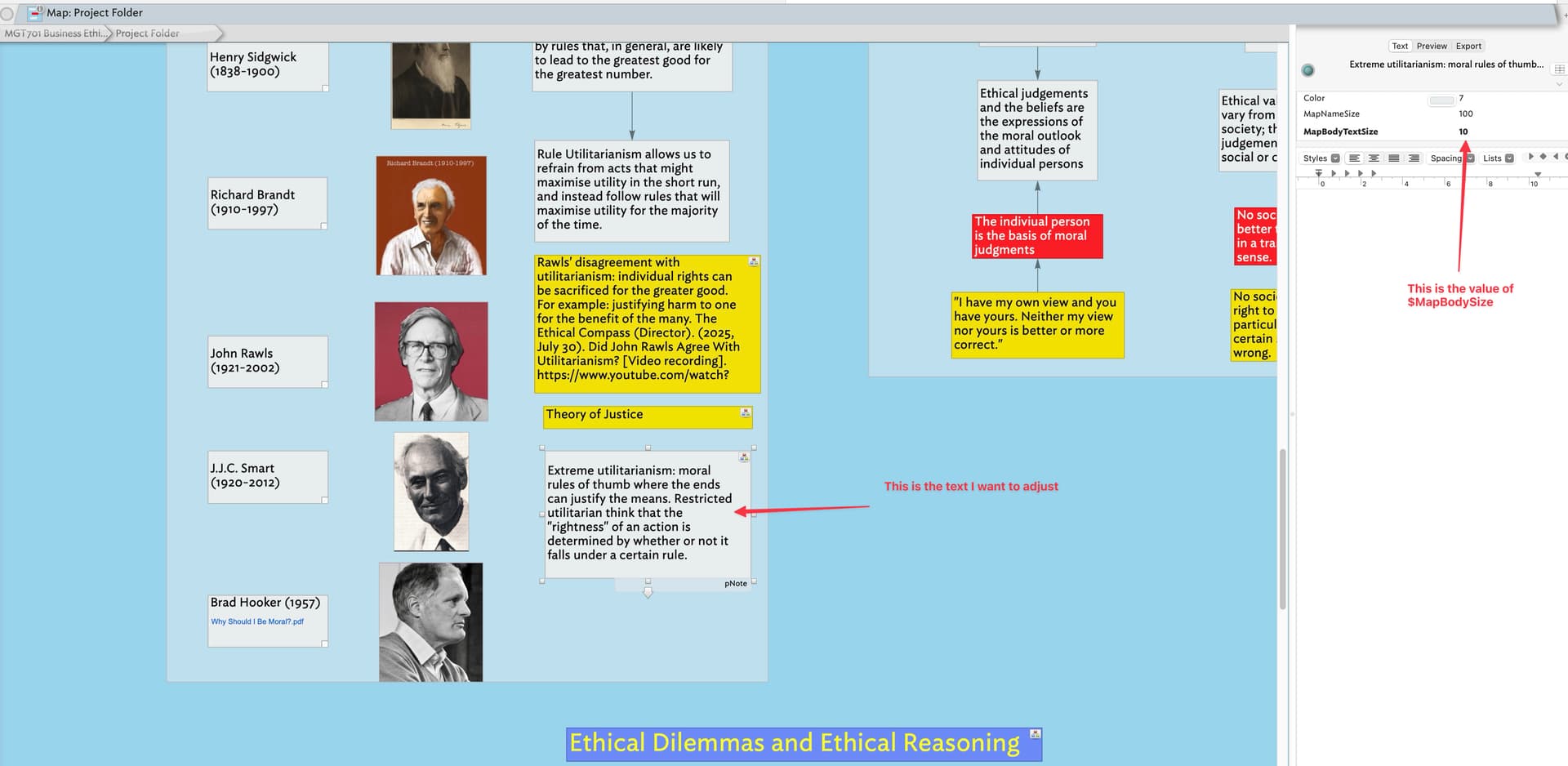
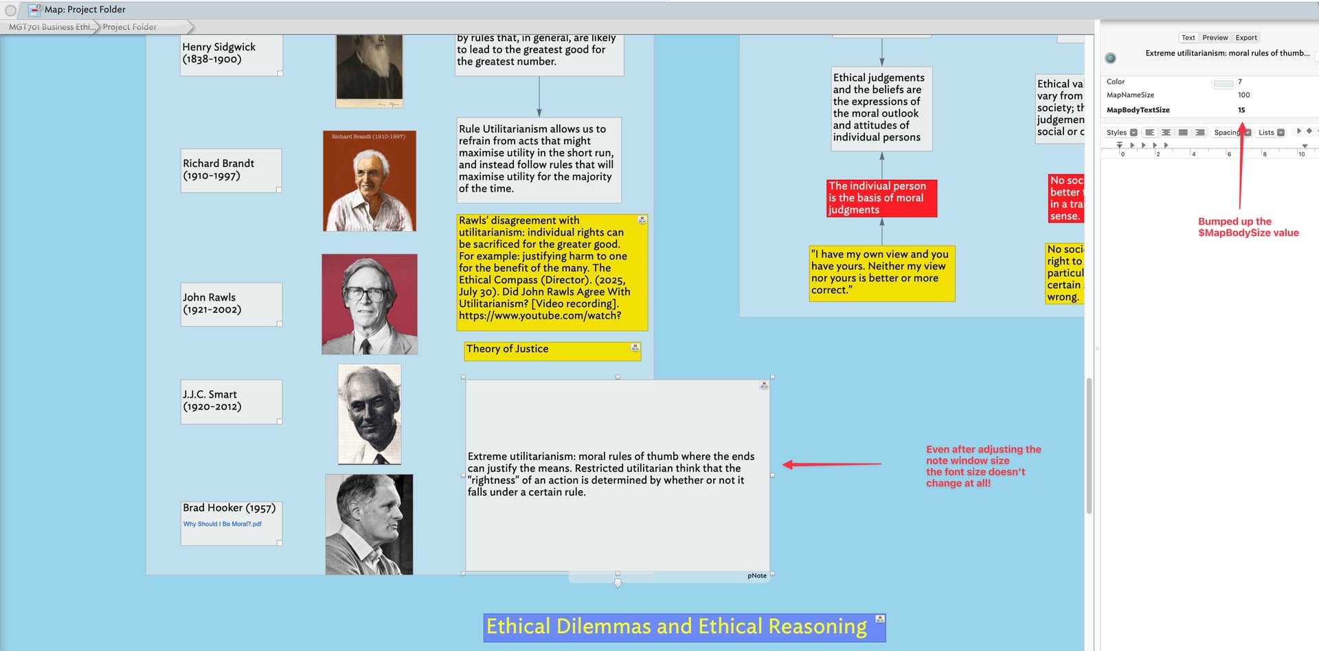
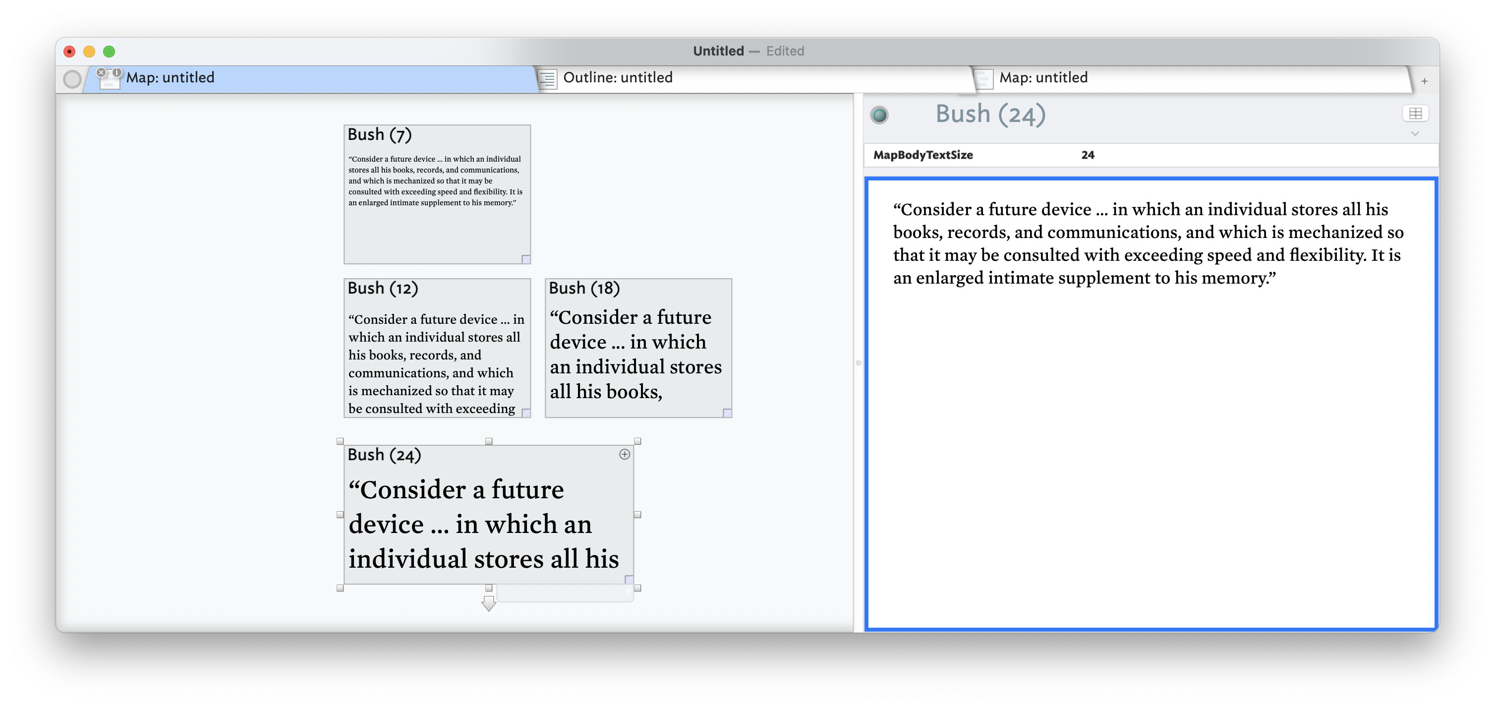
Actually, to scale the note text ($Text) discretely from either the note’s title ($Name) or subtitle ($Subtitle) you should be using the attribute $MapBodyTextSize (as already noted by @bmscmoreira) except it appears to have a bug. In fact there are two (testing in v8.6.2b452):
Altering $MapBodyTextSize increases/decreases the size of the area within the note in which all/part of $Text is drawn. It should also increate/decrease the size of the text drawn within that space: it used to but currently doesn’t.
$Interior Scale is intended to scale the size of notes within a container’s viewport of its child map. It should not apply to the $Text area of of a note with no children. It appears $InteriorScale is being applied to a viewport that isn’t there.
I’ve reported the above. So, and confusingly, $InteriorScale currently works around the bug in $MapBodyTextSize, but I’d expect both to be fixed ere long.
There are a few mis-assumptions in the description above which I’ll work through , hopefully to help you understand the process a bit better (notwithstanding the glitches above, which I’ve already reported).
The outline view, regardless of whether to choose/need to view it is the underlying stored structure of your document. A container is a map with children. A single map shows the children of a single (outline) container. If any of the children is itself a container, its map icon shows a ‘viewport’†. By default a note’s map icon shows just the title ($Name). Originally, this was the only text shown on the icon: subtitles and showing note $Text came later.
The note’s $Text, if displayed, as per the above, if shown regardless of the note being selected. Thus if you start from the premise that you should normally see no/little note $Text in map icons, unless you reconfigure them, the display may make a bit more sense.
Currently, if there is enough room—i.e. the map icon area is large enough, some or all of the note’s $Text is drawn. So it’s less “pulled in” but drawn if there is space, remembering that originally $Text was never drawn and indeed you can turn off if you find it distracting.
† The viewport thus show notes that are grandchildren of the current map’s container, but only those descended from a particular child. IOW, the child’s viewport show’s only its own children and not those of its siblings, which will have their own viewports as appropriate. Within the viewport map, container items do not show a further viewport. This A viewport only extends visibility (of some map features) a further level down.
Lastly, if you do get stuck, do ask here, and your fellow users will try and get you sorted out.
I’m using version 10.1 and it looks like the bug with $MapBodyTextSize still hasn’t been fixed. I’ve just started a project and am using TB to add notes to it. I have a lot of words within each note that I want to display so that I can read them, and I can’t because the font is consistently too small. Adjusting the $MapBodyTextSize does absolutely nothing. Annoying. Is there a workaround for this at all? @eastgate?
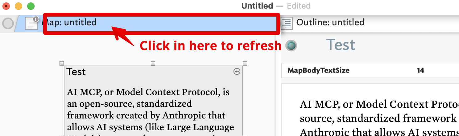
Yes, @gul-iMac is correct. Another simple way is to refresh the view by clicking the label area of the current tab (which will be highlighted: default OS-set colour is mid blue):
Interestingly, after (re-)setting $MapBodyTextSize as a Displayed Attribute, the current map icon does appear to re-draw but clearly the revised $MapBodyTextSize isn’t being used. Thus a broader UI refresh is needed.
So the earlier $MapBodyTextSize issue is sorted but a new related issue (UI not properly updating) has emerged. IOW, the size is correctly reset, it’s just that edits are not immediately reflected in the view so to the user the feature still appears broken
Checking separately on the $InteriorScale issue above, that is fixed so shouldn’t be tried as a workaround as discussed back in the time of v8.
I knew I seen this before (clicking the label) but it had vanished from my mind. Thank you for bringing it up, it is a much better and simpler way to accomplish refresh.
Ok - I see it now. The issue is my complete confusion over which attributes do what. I think what would be helpful (to me) would be some actual visual clues (as you have illustrated above) on the effects of each attribute. Surely there’s something somewhere I can easily refer to? Sure TBRef is a useful doc, but I’m a visual person and would like to see not just an explanation of attributes, but also visual representations of its effects. I’m sure I wouldn’t be the only one to benefit from such a valuable resource.
So my thoughts are: take any TB element and show all the attributes that can act on or be used with that element. Conversely, take any attribute and show all the TB elements that can be acted upon by that attribute. Does this make sense? Bit of a tall order I reckon.
I guess this is one of the reasons why I remain a newbie after all my years of trying to grapple with TB.
Perhaps if there isn’t a single source of TB truth in that regard I could potentially try and find the time to mock something up to share with the forum to see if it’ll be any use to fellow newbies. However, in the meantime, thanks to those who responded and put me on the right path.
Put in context, there are over 100 system attributes affecting the visual display of a note—and that’s only for map view. Plus Tinderbox has 11 views, plus the 3 sub-panes to the text pane. The task of ‘just’ illustrating things doesn’t scale well. Updating every screen grab even for the existing images—bearing in mind many of these require making a TBX to be made in a certain way just to provide the right source—is time-consuming. Doing videos of everything would be unsustainable on top of that.
Recently (for v9.5.0, IIRC) aTbRef has added a ‘fuzzy’ search page. It is available in the Quicklinks bar at the top and bottom of every aTbref content page. I don’t know the exact way the software works (it’s a JavaScript library run by the web page) but to my surprise it works remarkably well.
The map view section of aTbRef is generally image-enhanced, and I’ll be adding some more to image-less articles in the next aTbRef baseline (alongside the next release).
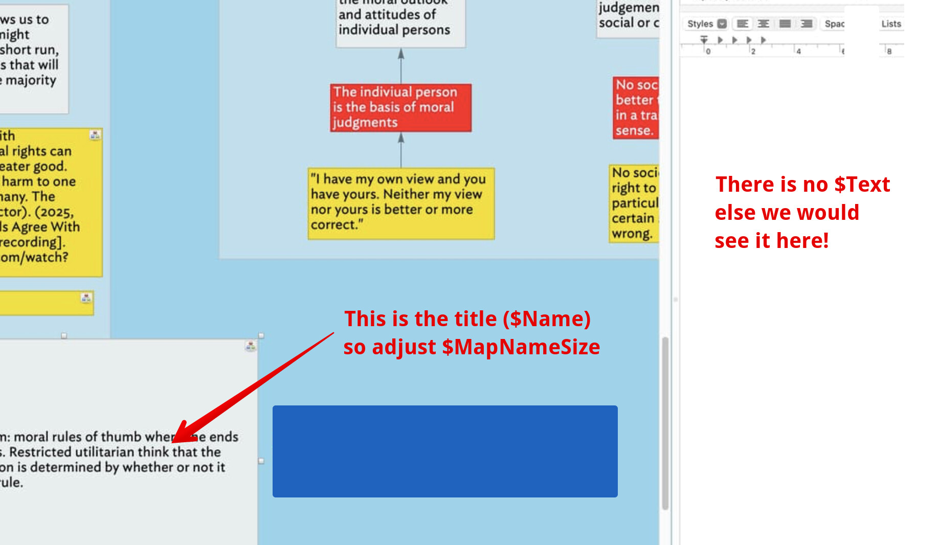
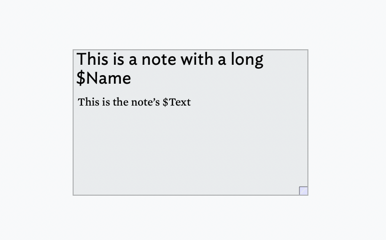
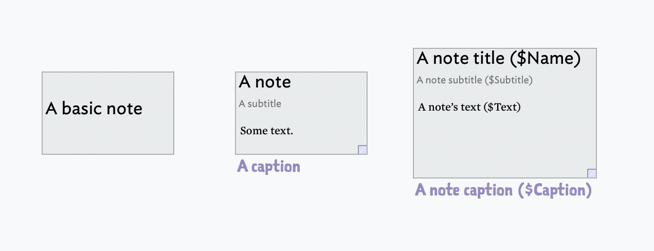
The most basic use is a note with a title ($Name). If the note has body text ($Text) is, and the there is room, some/all of the $Text is shown on the note icon below the title ($Name).
Any note can have a subtitle ($Subtitle) and/or caption ($Caption). The presence of a subtitle trumps $Text display, so if a subtitle is present it lessens possible text space for a given size of note.
As already noted up thread the there are over one hundred discrete attributes at play here, but most users will likely never need to alter more than a few.
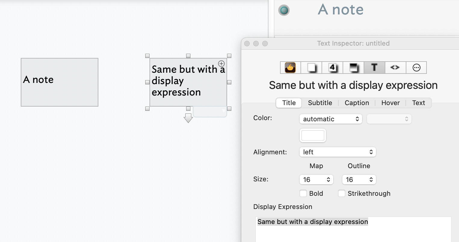
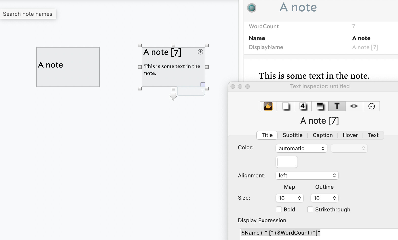
The title is actually $Display Name, not $Name. What? This is to allow for Display Expressions, although many users will never use/encounter DE, so the general description of title = $Name does hold for new users. Here is an example of the (optional) $DisplayExpression:
See the note on the right has the same $Name (as showing at the top o of the text pane) as the left note. The $DisplayExpression is in this case literal text and forms the value of $DisplayName which is why the note icon’s drawn title is not a ‘A note’.
More common use of Display Expressions is not to replace the title but to append info, such as here:
So while the note on the left might look like a box with a label from, say, Powerpoint, the underlying design is very different. Plus, trying to use a map view as if drawing in Powerpoint or Omnigraffle or Illustrator, is always going to be a confusing and hard approach.
The challenge for documenting Tinderbox for the perspective of someone used to a simple drawing or noting app is that there are many of f them all with slight differences. So, the ‘norms’ are less pervasive than one thinks. Our norms are generally formed by the number of apps we use most often: the fewer apps we use the more prone we are to false norms. This is one of the big learning curves I had when starting out with aTbRef—to describe Tinderbox as opposed to Tinderbox through the lens of [some other app].