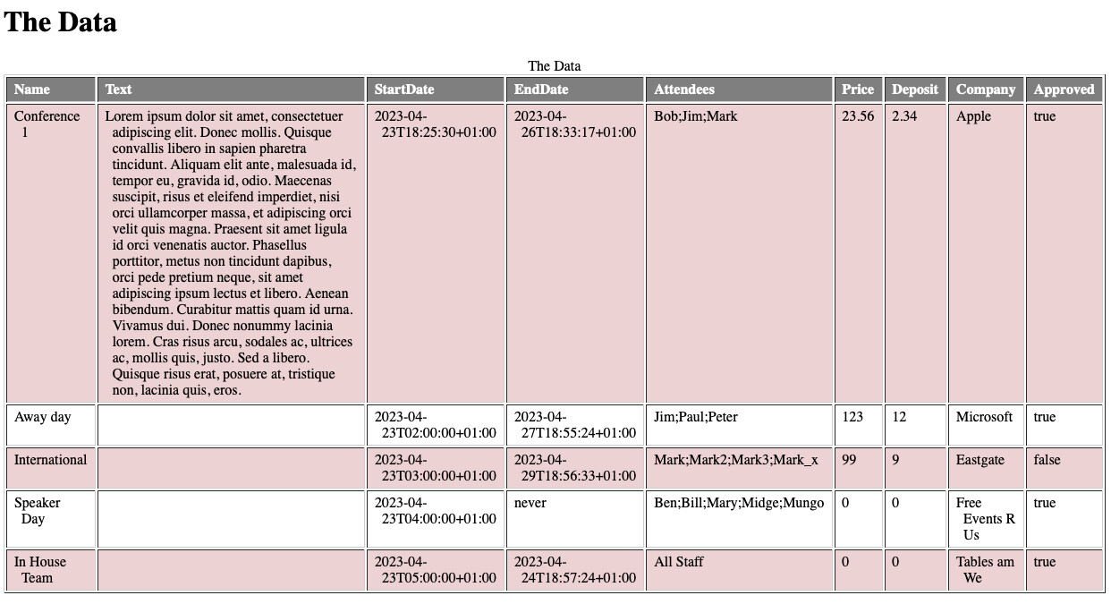
Thanks to @satikusala for the work on the table templates.
I have added some CSS styling and responsiveness for small screens, which I hope is practically useful and informative. README note included for details and template heavily commented.
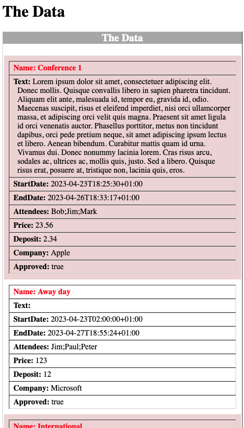
Have to say say, even with your comments it is not clear to me how this is working. Any chance we could hop on a zoom some day and you can show me. I’m missing something. Where in the codes is “small screen” defined?
Update, found it:
@media all and (max-width: 75em) {
            /* Set display properties for table, rows, and cells on small screens */
            table, tr, td {
                display: block;
            }