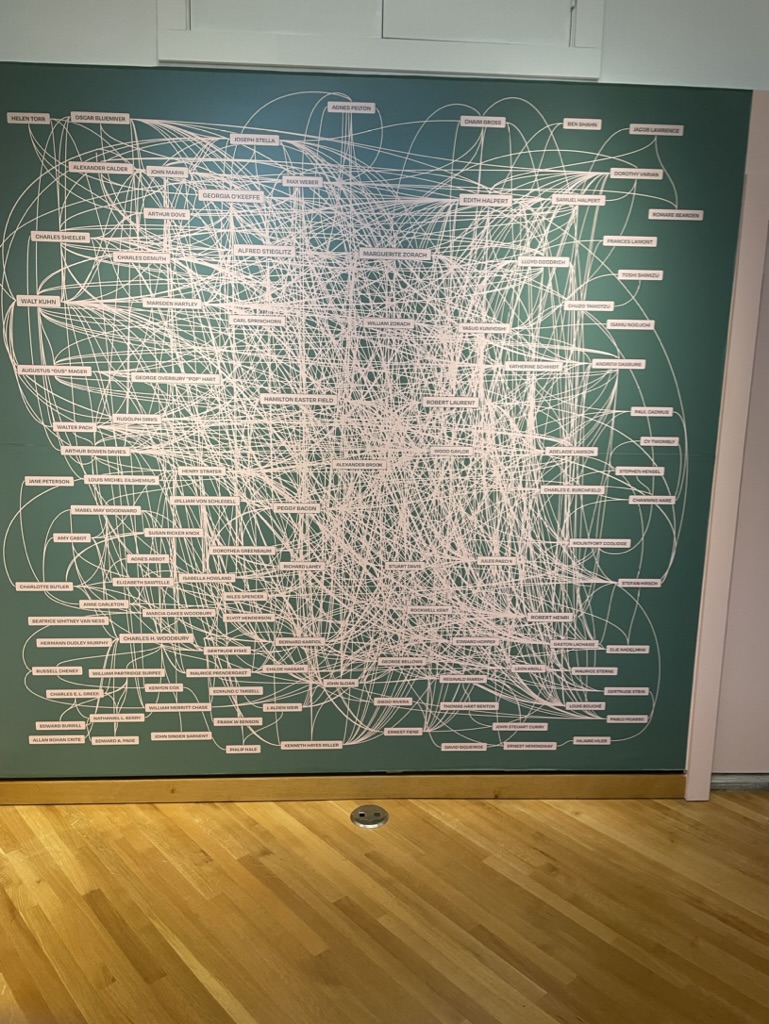
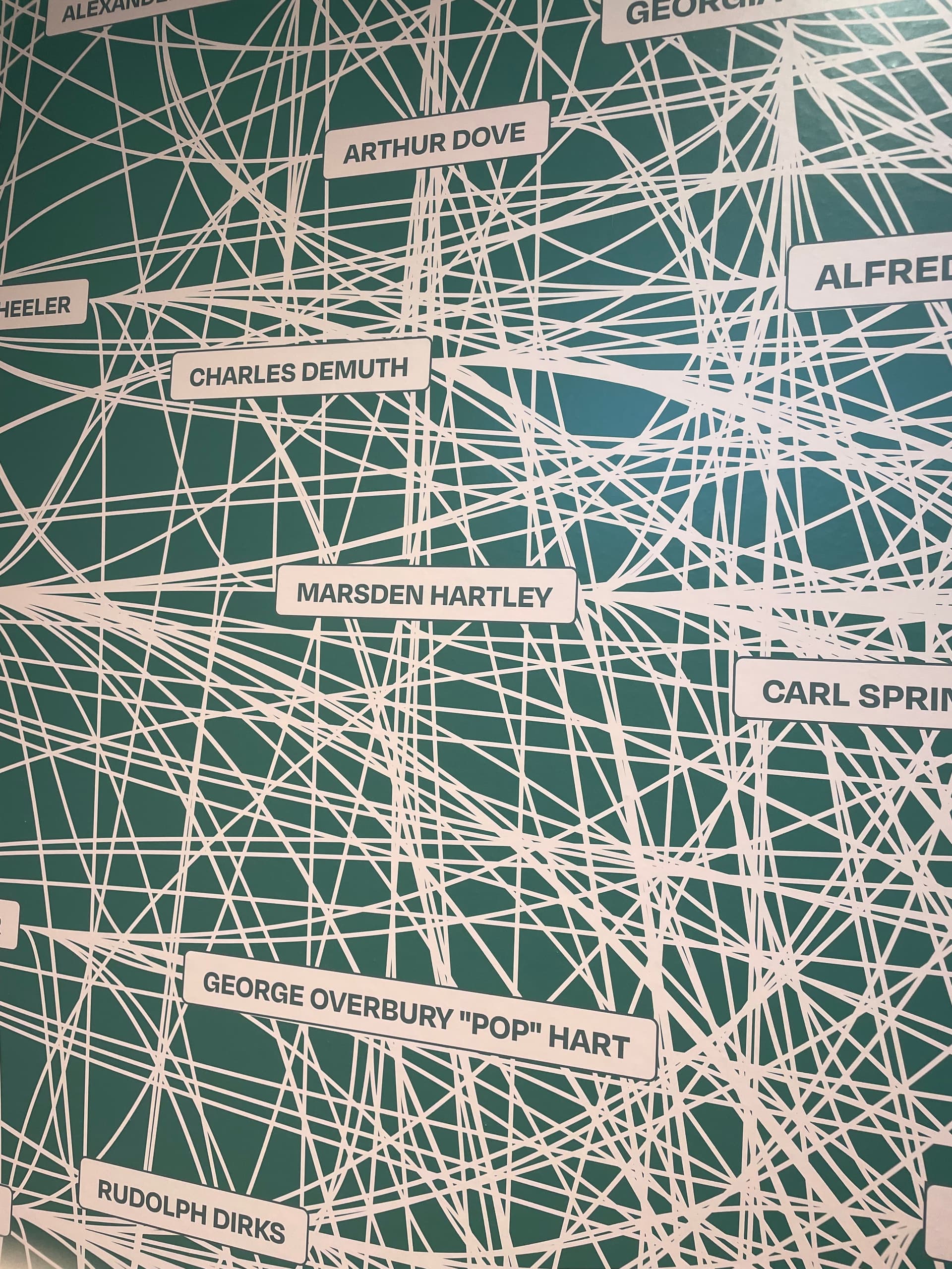
This sort of diagram (‘network’) is exactly the result space where hyperbolic view can shine, allowing now to drill into what is otherwise a big yarn-ball: pretty but no necessarily informative. The latter is a weakness of many visualisation tools/libraries—layout trumps accessible meaning. It’s also why a lot of impressive network images seen online are manually post-processed in a tool like Illustrator (even if that fact is not declared to the reader).
I suspect that since the graphic is a very large piece on the wall, with no interactivity, that’s it’s just meant to encourage the viewer to think it is very clever, as they walk by. It’s like all folks who post massively complex and incomprehensible graphs of their Obsidian vaults in r/ObsidianMD so that others can tell them “great job”.
Yes, considered as a (static) artwork—I’m not suggesting that should change; it’s engaging as is.
I was just thinking laterally, as I see this sot of ‘busy’ presentation a lot (e.g. your Obsidian-based example). I suspect it in no small part reflects the state of evolution of current visualisation tools. We can, albeit with some tech expertise, easily ‘map’ a lot of information. Making that meaningful for oneself or for others is still hard(er). In the latter vein, Ii think Tinderbox’s revamped Hyperbolic view is worth exploring for Tinderbox users that have not yet done so.
Also: it’s an excellent show if you happen to be in the neighborhood (Southern Maine). There’s also a fine small show of Edward Hopper paintings of Gloucester at the Cape Ann Museum, Gloucester.
Husband and wife; Devon and Remy. Devon is the curator.
Yesterday, actually, there was a statement on the site with a link to a video from Devon and a list of the contributors, including Remy. It’s moved, but here it is.