Trying to Use the TimeLine View as a NumberLine View

Hello,

Below is a rather lengthy description of an issue I’m having. But I’ll begin with my question.

My Question:
Where is the “scrubber” for the TimeLine scale?

Some Background:
I am currently working on a project with a Fullbright Scholar from Albania. In addition to the notes that I’ve made in TBX, there are data from a teacher survey that has two parallel sets of Likert-type items with 26 items in each set. We are currently in the process of reconceptualizing the items on the survey. Most of that work has been done in EXCEL and SPSS which has tentatively enabled us to divide the survey into two sub-scales in each set. Based on some comments during a Tinderbox Zoom session on March 13th regarding Edward Tufte’s graphic work, I thought it would be interesting and perhaps useful to create a graphic to visualize the difference ratings among survey items within and across each sub-scale. Of course I could use the Outline view to rank order the mean ratings for items but I wanted to capture the relative locations on a Likert scale that ranges from 1 to 4. And of course, this exercise would no doubt be easier if I were to use an app like EXCEL that is designed to graph data. Nonetheless, as a multi-year TBX newbie who is trying to get a working handle on the software, I have plowed ahead. My first thought was that I could try to figure out how to use x and y coordinate attributes to place each note in a horizontal line in the Map view. But that approach wouldn’t include a ruler/scale on the screen which should be a key component of the visual.

The Semi-Solution:
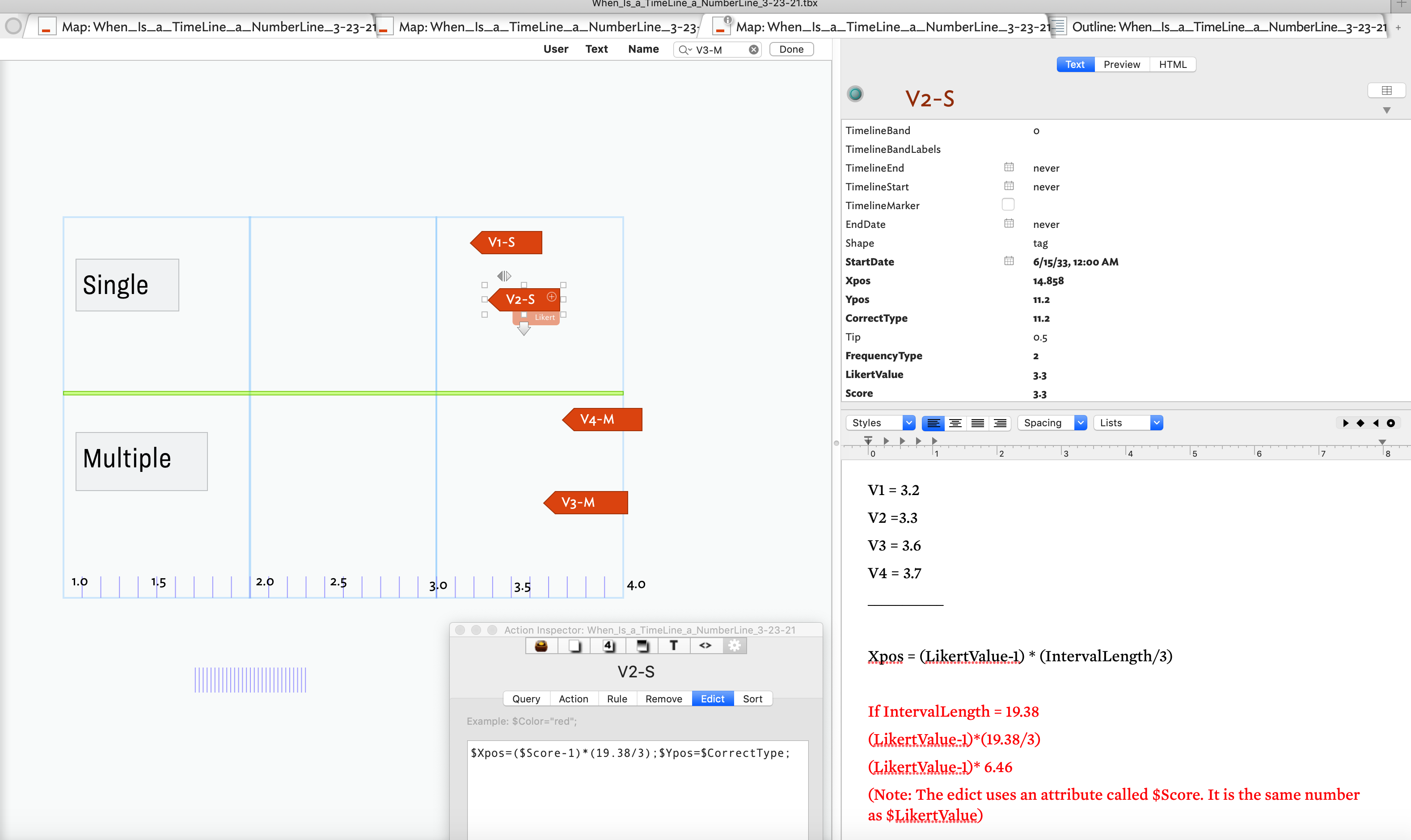
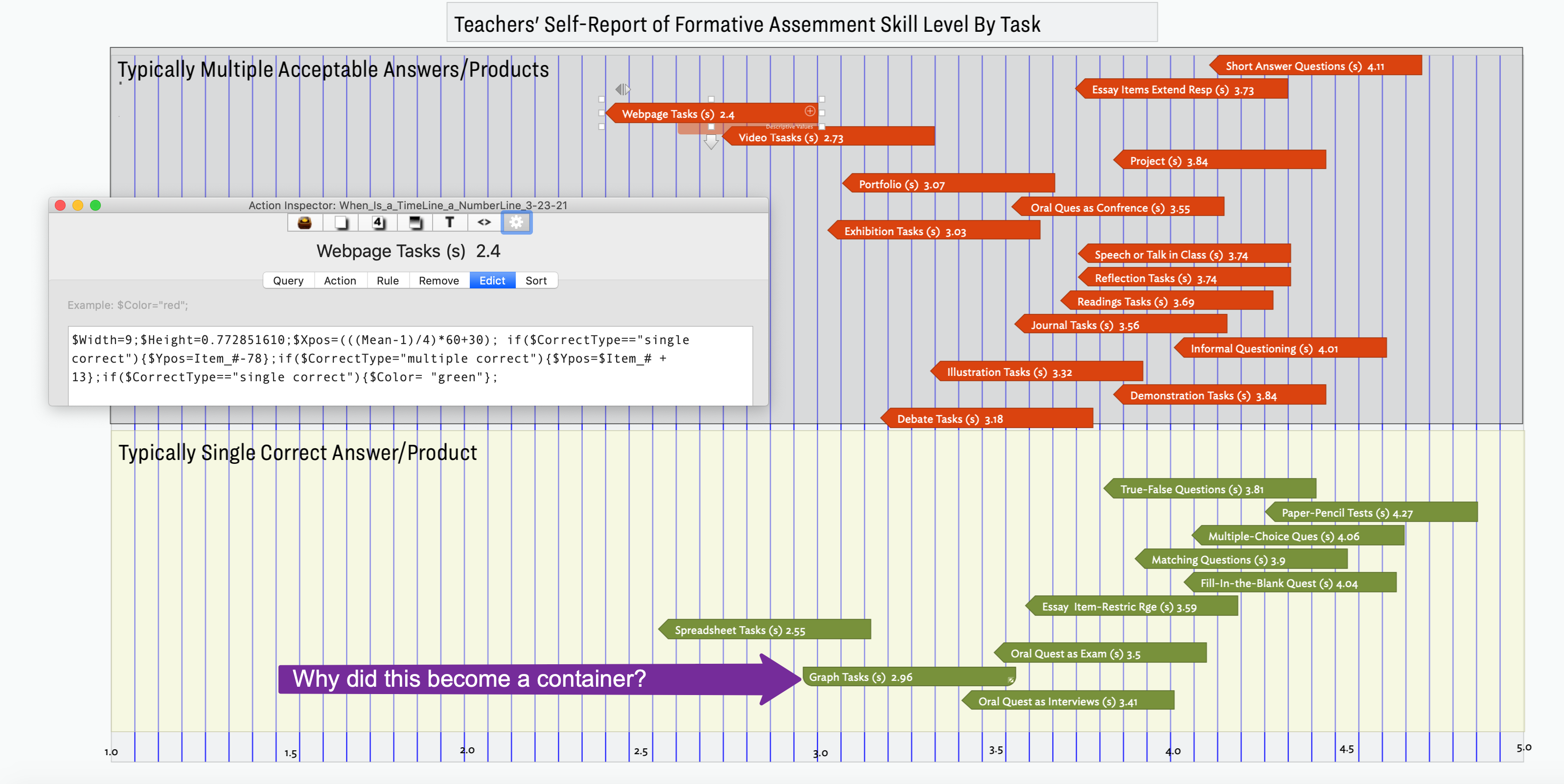
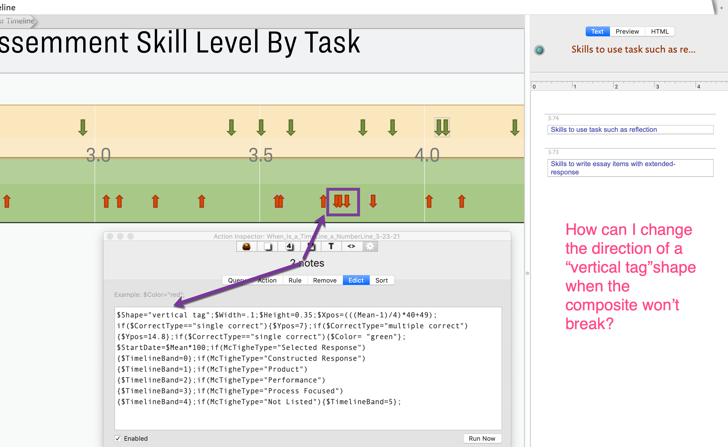
Next I realized that the Timeline view was kind of what I needed but obviously I was working with mean scores rather than calendar dates. EXCEL converts calendar dates into a numeric value so I wondered if Tinderbox did something similar. While I’m not sure about the underlying coding that is used, looking at Mark Anderson’s wonderful aTbRef file, I saw that TBX allows dates to be entered via a variant of Unix Epic values, i.e., sequential integers with 0 corresponding to midnight January 1, 1970. So, the TBX Timeline is really a Number-Line in disguise!

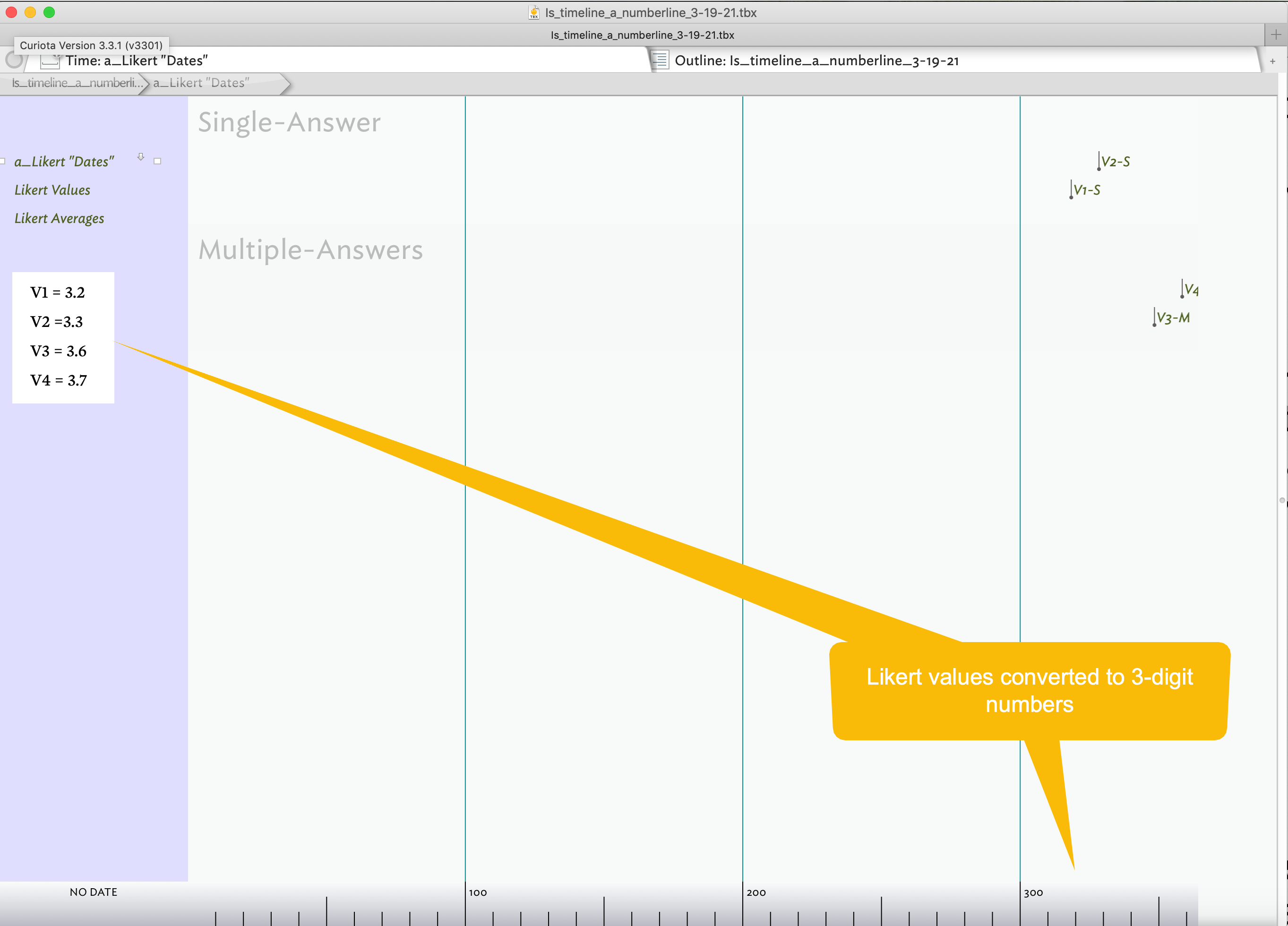
As you can see from the attached screenshots, I was able to get the scale on the Timeline view to display integers rather than calendar values. But you will also notice that the values are not on a scale from 1 to 4. That’s because Unix Epic code “ignores” decimal values - so I multiplied the mean scores by 100 and 10. In Image #1, the notes are lined up and spaced accordingly when I converted the values to 3-digit numbers. The visual problem with the 2-digit version is that the notes appear in the middle of the interval. Thus the distances between notes aren’t precise and can be relatively far off. The items do line up with the 3-digit version since my original mean scores were rounded to one decimal point.

My Question, once again:
Where is the “scrubber”?

At this point my question isn’t a crucial one but before I came up with my semi-solution and realized that the Unix Epic version didn’t handle decimal values, I wanted to try to adjust the scale. Once again, Anderson’s aTbRef file pointed the way - or at least I thought it did. On a webpage where Anderson describes the TimeLine scale, he says “[a]t the bottom of the view is a scale bar whose graduation at labelling will vary as the view scale is changed using the scale scrubber control at top left of the view.” (Timeline scale)

Alas, I can’t find the “scrubber”. There doesn’t seem to be anything on the top left corner, or anywhere else, that would allow me to adjust the scale. There is a “slider” in TimeLine settings pop-out that can be used to adjust the visual spacing of the scale and sometimes the labels but not the scale itself. Is this what is being referred to?

Next Steps;
So coming back to the task I was trying to accomplish, at this point unless there is some way to represent decimal numbers (which is my real practical question!), I’ve hit a dead-end in TBX. However, I have learned a few things and perhaps this notion of TimeLine as NumberLine may be useful for others who have only integer data to display. And in any event, I am curious about the mysterious scrubber! Any leads about where to look would be appreciated. :wink:

p.s. I didn’t enter the means directly into the $StartDate attribute, although I could have. Instead I had a User Attribute named $Likert and I created an agent to move the $Likert value into “StartDate”.

p.p.s. I should also mention that this approach seems to crash TBX periodically although I given the applications ongoing file saving, I didn’t really lose any work.

If you are using a trackpad, a two finger-swipe scrolls the view and also activates a horizontal scroll-bar at the bottom of the view. With a magic mouse, moving the finger left-right atop the mouse invokes scrolling.

If you mean a scale scrubber control, the Timeline view controls are in a pop-over accessed from the ‘i’ icon of the front tab’s label (see image here). The timeline controls are described here. The (horizontal) scale scrubber is labelled ‘width’.

This is a very clever and unexpected use of Timeline, but of course the Timeline View really does expect to use dates, not Likert scale means.

My first thought was that I could try to figure out how to use x and y coordinate attributes to place each note in a horizontal line in the Map view. But that approach wouldn’t include a ruler/scale on the screen which should be a key component of the visual.

I think this would be my preference, too. I think that making a ruler or scale in map view would actually be easier to manage.

Let’s suppose, for the sake of argument, that we have Likert scales that runs from 0 to 4. We’ll put the left edge of the scale at X=0 and the right edge at X=20. We could start with an adornment 20 units wide, with its left edge at X=0, and use the adornment grid feature to show where the Likert scale units fall. Then, arrange each note according to its mean score ($Xpos=$MeanScore5) and its $QuestionNumber ($Ypos=$QuestionNumber3).

Another approach would be to place notes or adornments at suitable places on the map — perhaps transparent adornments would serve.

1 Like

A map was my thought too. The map vertical access ($Ypos) can be used for banding, as in your timeline bands. You could either use horizontally elongated adornments (opcity allows adornments to overlap and still be seen, or use narrow adornments as lines dividing you rows and transparent notes as row labels.

†. Don’t forget ‘up’ on the Tinderbox map axes is a negative value. Thus, 1 is one map unit down from zero, and -1 is one map unit up from zero.

Hi Mark,

Thanks for the very quick reply. I think my problem is/was a linguistic one, i.e., British English vs. American English! I did look up “scrubber” in a British online dictionary before I posted my note but there was no hint that it referred to the commonly used American term for that tool, i.e., “slider”. But now I can see the visual connection between a scrubber type implement and the tool you referred to! It is unfortunate that Google Translate doesn’t enable users to translate between British English and American English! :wink:

HI Mark & Mark,

Ah, I hadn’t thought of adornments. I’ll have to give that a try. I’ve never done anything with XY coordinates either so I’ll have a bit of playing to do regarding both tools.

Thanks.

Here is a video that can help you with X/Y coordinate management.

Hi Michael,

Thanks. I’ll check out that video. Your other ones have been handy,

Indeed, I made the same mistake last night with my $LikertValue attribute. I wasn’t paying attention when I made the attribute and each time I tried to use it in a formula for Xpos I got this seemingly weird result! As you can see below, I finally sorted that out but not before I created a new number attribute, $Score, to use in my formula.

Well, I’ve made progress with the XY coordinates version of a number line. Alas, it is quite ugly but a variant of it will be adequate for my zoom meeting on Friday. I do wish that there was a shape like the downward arrow symbol that is used in the Timeline view but the tag shape sort of works.

Thanks for the help!

1 Like

I’m not quite what timeline shape you have in mind (the timeline marker line?) but using the $Shape value vertical tag you get this:

But by also setting the note’s setting $Direction to true gives you this:

The arrow $Shape can be flipped left/right but not rotated to up/down.

Note: $Xpos and $Ypos plot at the top left of the note’s map shape (or its bounding rectangle). Thus the down arrow point of the shape will be at x-axis of position of:

$Xpos - ($Width/2)

A default note has $Width of 3. So if using a vertical tag shape to make the note point down to point 20 on map x-axis, set $Xpos to 20 - 1.5, i.e. `18.5.

Thanks. I guess that the Timeline shape isn’t exactly an arrow. (See the screenshot below)

Originally for my XY map I was using the “vertical tag” shape. The shortcoming of that shape is that since the Xpos is noted as the leftmost side of the shape, the downward arrow isn’t pointing at the correct location. Your suggestion about adjusting the Xpos based on the distance to the shape’s midpoint makes a lot of sense, If I have time before my Zoom meeting on Friday, I’ll give that a try. It will improve the visual. Again, thanks.

The ‘arrow’ in timeline is not that. It is actually a dot that is drawn when an event has no duration (i.e. no $EndDate:

There is no simple way in the map view to replicate the timeline marker drawn down to the scale.

On map view, if your icons use a prototype, then it will be easy to set the revised position via a rule or edict. Assume for a moment you use $Score to set the X co-ordinate for an item:

$Xpos = $Score;

Instead, to make a down-pointing vertical tag pointing to the score value, do this:

$Xpos = $Score - ($Width/2);

BTW, would crosstabs help with this?

Good suggestion. Alas a crosstab view wouldn’t be a very useful visual in this case. I probably did something wrong in the Crosstabs represented in the attach screenshot. But unless the user would have manual control over ranges specified in the columns, the impact of the visual is lost. (There is something odd/wrong about the column placement of the actual scores but I will leave that for another time.) Also, there is a lot more going on in a Crosstabs view, which is useful in some cases but not for what I need. Actually, early on, I looked at the data using pivot tables in EXCEL and it was helpful. I’m a big fan of pivot tables!

Well, I"ve made progress on the XY coordinates version of a NumberLine. But a few odd things seem to happen on occasion! Perhaps because I am working on a small screen but somehow I end up forming containers with a copy of the item inside. I can fix it by going to the outline view but…

1 Like

Not quite enough info to tell, but best guess is you—our rather your formula has generated two notes with similar/close $Xpos/$Ypos co-ordinates so placing one on top of another which is generally how you signal to the UI (manually) that you wish to nest the two.

My first de-bugging action would be to look at the generated $Xpos & $Ypos and ensure they are not both the same (or very close. If they are you need to re-think you code so as not to place notes on top of or overlapping each other. Thus if, for example, X is the primary axis (based on the Likert scale score) you need to ensure the Y value doesn’t match any other notes Y value (or to a tolerance of ?). I’m unsure how easy the last is to do. worst case you may need to deconflict a few items manually. Bear in mind you are trying to plot a timeline-like display (where items shouldn’t over lap) in a map where they may and different assumed outcomes apply.

Hi Mark,

The problem isn’t my formula but rather my fingers! I think the reason that I was so confused by the container is because I didn’t notice this until much later when I saw that I had one more note that I should have had. I’ve been able to duplicate the oddity. In this case, I must have had the option key pressed as I was trying to select multiple notes to update an edict. I assume that I realized that I had the option key pressed but I guess that I didn’t release it before a copy was made right on top of the original. And lo I had a container. So this confusion is now solved! Thanks. I’m still doing some work to try to automate at least the height of the adornments based on the number of notes and their assigned rights in each sub-scale.

1 Like

Great! Glad the clouds are parting.

I’m back to the well once again but not in a desparate dehydration mode.

I now have a number line that really looks more like a number line (actually two lines). However, the nifty composite feature is not cooperating with my plans! I want to have all of the vertical tags pointing towards the horizontal line at the border of the two adornments. However, there are some notes that are so close together that they form composites. Sometimes the "Break Composite"can be activated but the composite reforms before I can select an individual note to reorient the vertical tag direction. Among other things I have tried are (a) increasing the size of the images in the window, via command-plus, (b) changing part of the formula for the Xpos, etc. I did finally come up with a work-around by changing the attribute that was part of the Xpos formula. Instead of using $Mean which had vary similar values for the notes in the composite, I used $Item_# which differed sufficiently. However, I then had to track down the wandering notes! As a last resort, I was about to create two notes with the relevant information and then just delete the uncooperative composite! Neither the “solutions” is very elegant. So, while my latest glitch is solved, is there a way to (a) “disable” composites, (b) ensure that the “Break Composite” stays “broken” at least long enough to tweak the relevant notes, or © to easily “get at” the attributes that have such similar values?

Thanks.

Set the default value of $NeverComposite to true.