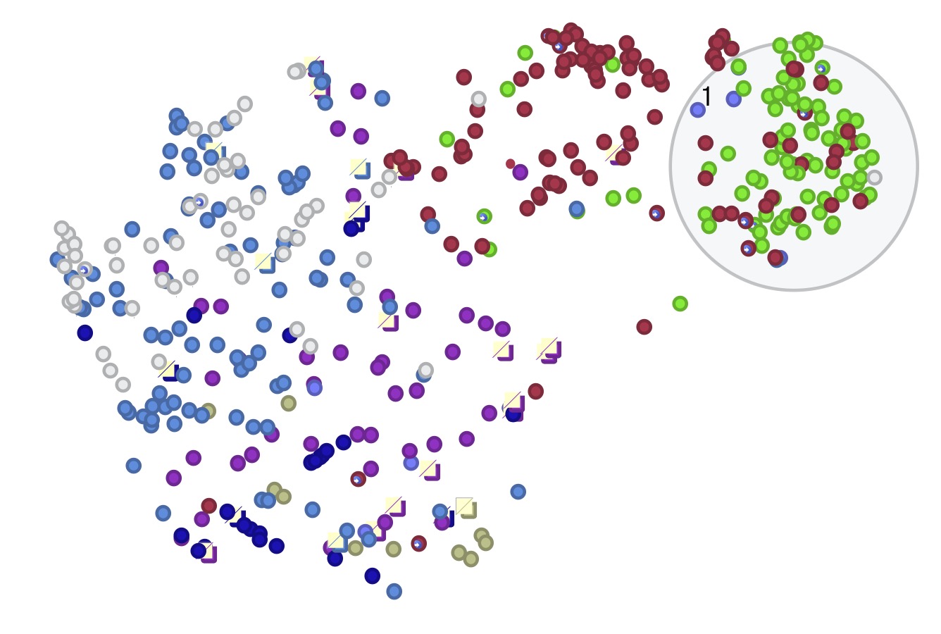
Hi, I’ve got my notes in a scatterplot in map view, and I’m pretty happy with how they turned out. My notes are set to appear as very small ovals (.12x.12). I decided to keep the badges at least for now. Links are hidden.
But I can’t figure out how to get the notes that are containers to appear like the rest. These containers appear with an offset light yellow square with a diagonal red line, and they don’t take the shape assigned to them by the $Shape attribute. I guess this is all normal behavior, but is there a way to override or work around?
Don’t know if this makes a difference, but all the notes on my plot are actually aliases. They are all gathered by an agent and I’m viewing that group in the map. In outline view of course the aliases of containers don’t appear as containers.
I’m not seeing containers in your map view. I believe I’m seeing dog-ears — the indicator that shows that the note contains text.
I’d not thought of doing a map view precisely this way. It’s great!
I don’t think there’s a way to suppress the dog-ears right now, but — as it happens ‚ the next backstage release will have some improvements to dog-ear drawing. I think we could add a bypass for you. If you can share your document for testing, send a copy to bernstein@eastgate.com
Thanks Mark, I didn’t know about dog ears. Every note in that map contains text but only the ones with dog ears have an original that is a container. So I assumed what I am seeing was caused by the alias’s original being a container. I can try to make a version of this file for testing and see if the same thing happens.
Glad you like the scatterplot. Tinderbox makes it easy to explore the data in the plot just by leaving the note pane open and clicking interesting points or selecting whole clusters. I can do that for scatterplots drawn in Shiny or matplotlib, but that’s not where my notes are! Also, with adornments, I can draw a shape around a cluster, give it an $OnAdd, and examine the cluster in an agent. So I’m finding this very useful!
@TomD thanks for looking at my experiment! No, the notes are far from being manually placed! This is a 2d representation of the high-d embeddings assigned to each note by a large language model. Notes are placed closer or further apart based on their similarity. Colors represent different sources like books or articles. Clusters are potential topics or themes.
Tinderbox is a fantastic way to explore how the model is handling my notes beause I can quickly view the content, grab a cluster and examine all the notes, or drop in new content. Especially good for me because I am far from an expert in this stuff and I need to be hands-on and able to experiment.
Allen I LOVE THIS! Would you be open to joining the March 23 meetup and showing up your scatterplot process? I’m sure everyone would love to learn more. We’ll be meeting Saturday at 9:00 PST.
@satikusala Thanks Michael, I’d be glad to if I can do so with the caveat that I often don’t know what I’m doing or saying. No one should mistake me for a programmer or AI expert. And I’d need to hop off around 10 PDT. Also, what part of this are you interested in? Thanks again for the invite!
Although the display issue turns out to be $Text-related content dogears (here only affecting containers) you asked about containers and making them like ordinary notes. So…
[edit: I should add that display of dogears is built-in, the user can’t turn them off entirely. Meanwhile, the developer is aware of the display issue here.]
Your plot is a good example of why on some maps suppressing the container’s viewport (of the child map) is useful. The degree of space given to a container’s title is controlled by $TitleHeight. Note that agents do the same except the title is drawn below the viewport rather than above. The viewport/title division can be controlled manually by dragging the dividing edge up or down. However, in a plot like this a better approach would the to use an action, likely as a stamp:
$TitleHeight = $Height;
This ensures the title area fills the vertical height of the note/container’s map icon thus hiding the viewport. Should you need to reset the containers’ title heights, e.g. for a different type/scale of map, use this code:
$TitleHeight =;
The latter resets the attribute to the app default for the attribute. See more on Container title height.
I would use the Scatter Plot view as a ML presort, give me an idea of the clusters are and how MIGHT they be associated, then use Hyperbolic view to explore the relationships I find. I think of the Hyperbolic view as a schema of my notes
As the OP has explained that the scatter plot shown is using ML-derived high-dimension data, doesn’t this become a chick-and-egg? If we want the scatter plot to show us what ML might reveal, what data values are we using?
It’s not entirely clear this needs a new view, so much as an understanding of the data needed to enable such a plot. Here the notes are rendered as small circles (easily done: $Shape, $Height, $Width) but their location in the plot ($Xpos, $Ypos) is less obviously set.
A problem with much of our informational display practice is we only ever show the result. A good example† is the D3 gallery. We see something we can imagine might help investigate our data. But, always missing is the explanation of what sort of data is needed and where how to connect that to the code. The ‘code’ does the pretty viz bit, but fails on understanding the viz is nothing without appropriate data and most tools adopt the false assumption that everyone is ‘full stack’ and is a master of all the many parts. In microcosm, this plays out here in the forum with threads of “why is it so hard to…”.
So, the issue of dogears aside (dev is now on the case), the missing part is how do you generate the $Xpos/$Ypos for the scatter. I suspect it is not a simple as picking two Number-type attributes, insofar as what sets their values.
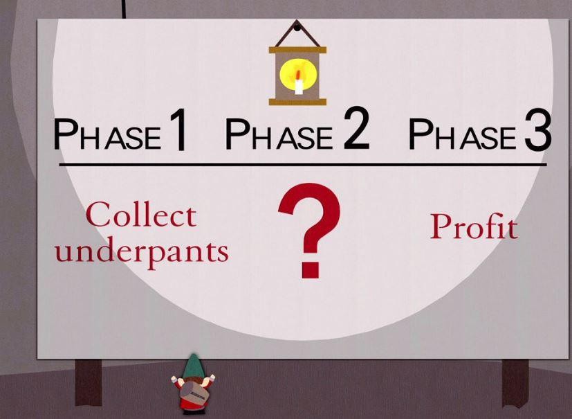
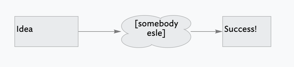
This is the classic ‘underpants gnomes’ business theory. Thus, I imagine the start and the success at the end, all that’s needed is ‘somebody else’ [sic] to do some magic thing in between to make the success happen. As per the original in South Park episode, and as now (sadly) taught to MBAs at Business Schools :
Thanks, Allen. Honestly, we’re all in the same boat. I am not aware of any of us that have all the skills. We’re all numbing around in our own corners. What makes the meetups so fun is that we can share some of our insights together.
I’ve never seen anyone build a scatterplot map view before. I’d/We’d love to hear/see 1) whey you did it (what insights does it help you uncover), 2) how you did (is it manual or automated), 3) how you are using it and where does it fit int our overall thought-leadership efforts.
@TomD, thanks again! I think the whole process will take a much longer post, a new thread, and a ton of disclaimers! FWIW, I think @mwra is right about not needing a new view for this. I originally posted just to ask about cleaning up the map, but I believe that Tinderbox already has all the tools and flexibility to make a good scatterplot. Sorry if I set off some other discussions!
There’s a heavy lift behind what goes into $Xpos and $Ypos, and it all happens outside of Tinderbox. I’m using Python scripts and various modules to run the exported notes through a language model and store them in a database. Another Python script then pulls them out, reduces them to a 2d representation, and creates a dictionary for import back into Tinderbox. TB stores this dictionary with note IDs, and I can pull the corresponding x and y with a stamp. Hats off to TB for implementing these dictionaries and making this last step so easy!
The plot is just one part of a larger experiment of using retrieval-augmented generation (RAG), with my notes as reference documents. The plot tells me things about my project, but I’m also using it to visualize and investigate how the LLM is handling my queries. So IDK if anyone else will find this useful enough to go through the hassle, and I definitely don’t recommend closely following my ameturish coding!
I’ll try to make the time to go into greater detail in a separate thread, maybe next week if there’s still interest?
This is really interesting. Part of the show-and-tell for the general Tinderbox audience is to understand the ingredients to the mix. As @AJayM helpfully notes, there is some ‘heavy lift’ going on to get to
this point (i.e. the original screen grab up-thread) so I’m guessing most of us don’t have suitable ‘finished’ data to hand to ‘just’ make such a plot.
By analogy, Hyperbolic view in a TBX document with no in-doc links shows nothing—as it only visualises links. Even then, without link types (i.e. knowing why notes are/were linked), it can be hard to glean meaning for the view pane alone.
The original Tinderbox Way (2006) has scatter plot examples in Chapter #2. It the data (and metadata) that make the scatter plot meaningful, as the opening of this thread shows. The use of a shaped adornment (above) is a neat (re-)use of $OnAdd in order to enrich the view’s (notes’) data.
I look forward to knowing more about this and the practicalities of the RAG process.
The visualization glitch reported above is fixed in the current backstage build, and will be fixed in the next Tinderbox release. I renamed the thread to avoid confusing future readers.