Basic set up questions for Map project

Don’t be put off. This issue at play is whether we are simply making a drawing (still possible in Tinderbox) or recording the data in a manner aiding further analysis. That might seem counter-intuitive, i.e. aren’t those the same things? Yes and no…

The reason the diagram is difficult to reproduce verbatim is the original sketch flattens all the info into a single 2D picture. Person ‘Lucy’ appears 4 times: as a person, as part of ‘Group’, part of ‘Offshoot Group’ and in ‘Org B’. We can mock this up a number of ways, such as in this example:

I’ve got to head out fro a few hours so I can’t complete the example, but this gives an idea.

But, which view is used and how the data is structured (aliases vs discrete notes, what sue of attributes, etc.) has to reflect what you need to study show.

1 Like

I had thought there was a way to use the informational structure of a well-organized outline to make a map, but it now seems like they’re quite separate – unless I’m misunderstanding TBX yet again.

You also spelled out many reasons why what we’re aiming to put together might be difficult to achieve for the following reasons:

I appreciate your clear view about this, and it does make me question whether we should’ve opted for OmniGraffle (or a similar app) as you suggested.

He’s a friend of my colleague, and one of the reasons why we thought TBX would work for this purpose. We also though there might be a way to create customizable links (which @satikusala referenced in one of his training videos) in which we could label the link as a way of explaining the connects of people and entities (e.g., an arrow that connects one entity to another with a link that reads “flow of money”).

Yes- you can indeed create new link types with different labels, drawing styles, and colors.

A post was split to a new topic: Flattening a map

I had a chance to finish off the TBX used for the earlier image: Bob Lucy Tom and Libby.tbx (159.5 KB)

Like so:

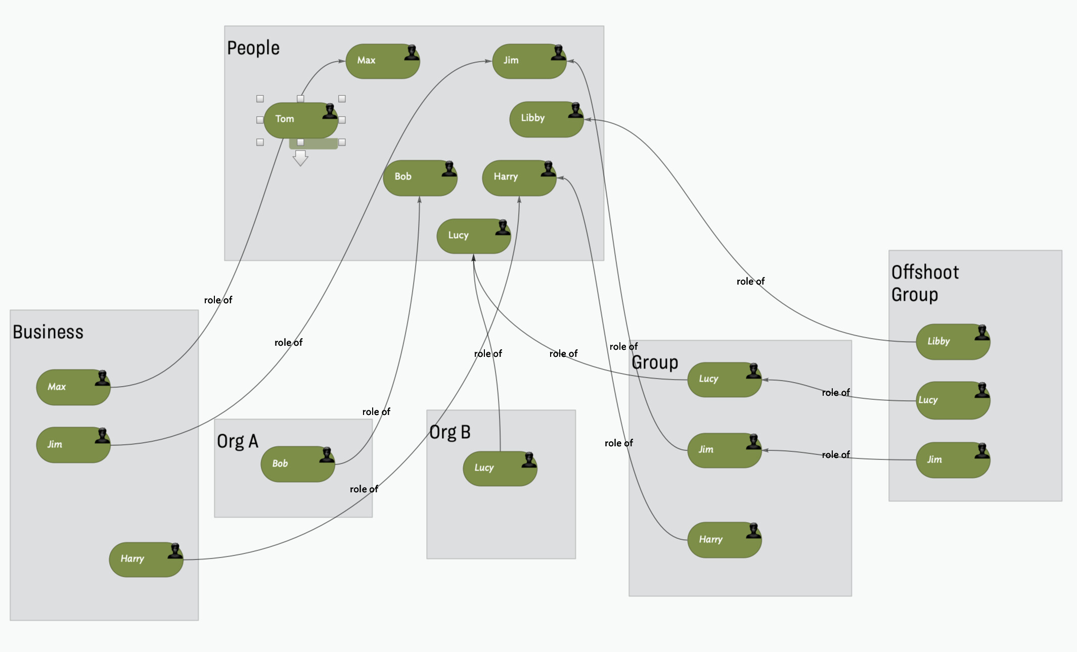
Relationships are captured in a Dictionary-type user attribute:

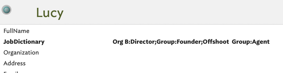
Next, a conditional Display Expression to show the role in each org group.

Update: Bob Lucy Tom and Libby.tbx (156.1 KB)

which gives:

This is just an exploration as the Person prototype’s Display Expression is this monstrosity:

if(inside("Business")){
$Name+" ["+$JobDictionary["Business"]+"]";
}else{if(inside("Org A")){
$Name+" ["+$JobDictionary["Org A"]+"]";
}else{if(inside("Org B")){
$Name+" ["+$JobDictionary["Org B"]+"]";
}else{if(inside("Group")){
$Name+" ["+$JobDictionary["Group"]+"]";
}else{if(inside("Offshoot Group")){
$Name+" ["+$JobDictionary["Offshoot Group"]+"]";
};};};};};

It works, as seen above, but this is not something to do at scale.

The Devil is in the detail. The doc captures the info in the original diagram, but apart from the Display Expression there is little abstraction/automation in a way that would help. Is the visual ‘map’ the key task or understanding the data (e.g. finding all people who have a ‘Director’ role.

Pinging @eastgate, @satikusala for today’s TB meet-up.

1 Like

Having finally made a common reference, we can explore the visualisation problem a little more. In a drawing tool the info has to be on the surface—text or some graphical hint—as the result is a flat image, e.g. a JPG or PNG. Essentially, what you can’t see isn’t there!

Capturing relationships (same person mapped to different roles) has to use lines because of the limitations of a static image.

But, stepping back, why do all objects need to be a person/clone? Why not have named roles (ideally reduced to a limited number) as we can than style those and use a Display Expression to place the person name as the item title, like so:

The colours here aren’t brilliant, but it shows how we can cut the visual noise a bit and not need lines everywhere. Actually, there are links, but with visibility turned off. Why? If I select ‘Lucy’ and switch to hyperbolic view, we see this:

How? Hyperbolic view shows all notes linked (by any link type, in either direction) to/from the selected notes. So, as Lucy is only linked to the jobs she does we see a limited network. In the prototypes used, I stored the job title in $Role: so for an ‘Agent’ job, $Role is “Agent”. Now, altering the $DisplayExpression to $Role we get:

Now we see all Lucy’s roles. Slowly the visual noise of the static infovis is peeled away.

I hope this has given a few ideas as to why a static diagram is not always the most useful approach.

1 Like

Thank you very much for all of this. I’ll give it a closer read as soon as I can. But is the basic conceit that one can show some of the basic linkages with hyperbolic view, but that it won’t allow for Hoover expressions (and some of the other features you regencies in your previous post)?

Also, I think it is necessary to see replicated names in different entities, and think that @satikusala can probably explain why that’s desirable during your call. We’re happy to consider another approach, but he’s already got a handle on the information architecture — and the aims of what we’re trying to do.

Thank you again.

As at v9.1.0, hover expressions are not supported in hyperbolic view. Indeed, the is no obvious rationale that they should be. IOW, it is a feature suggestion for a user with the need to make.

I remain to be convinced in light of the discussion above. A big and recurrent issue, as shown above, is thinking backwards from an idealised outcome best produced in a non-dynamic 2D drawing tool. IOW, trying to design based on an imagined result of an undefined process. Rather like getting a room repainted by only ever stating the result is not as imagined.there is no right/wrong, but there are lazy and self-defeating assumptions. :slight_smile:

1 Like

Thank you for this. I think we’re flexible about another approach, but we’re having a hard time imaging how it would look – and how it would properly match what we’ve conceived of originally.

Also, as someone who has mostly worked on TBX projects in Outline view, I’m not fully grasping whether it would be better for us to work in Map or Hyperbolic view given what we’re aiming to accomplish.

By the way, while looking at the code and examples you produce, I wondered (again, as a relative newcomer to the app) if it makes sense to have template examples and code that new users could use and graph on to their projects. Just a thought.

Sorry if I’m repeating myself here, but this is one question I just haven’t been able to full grasp: Is there some way in which TBX users can set up the organization structure of containers, notes, and links within the Timeline view and have it appear graphically (to a a large extent) in Map or Hyperbolic view? I suppose I had been laboring under the assumption that was possible, but was that thought totally misconceived?

Thank you again.

1 Like

I could be to blame for this, as I also thought it was the case. Perhaps that’s just too much of a leap.

1 Like

Thank you, @satikusala. I hope we didn’t overload you with project parameters that were too complex.

I have to admit that I hadn’t ever added a note in outline view, but when I tried it did behave a little unpredictably. I then went back to an existing project and tried both drilling up and down in map view, and moving from map to outline. In each case the ($Xpos,$Ypos) of the top left-hand item has been set at {0,0}.

With the map centred, moving to outline and back produced this deviation:

But drilling down and back from a centred position resulted in much less movement:

I have no real problem with this, a little curious, perhaps, but all completely manageable.

Well, yes and no. Understanding is key, but I also see it as building up a repeatable asset–terms, people, orgs, etc.–that can be leveraged for future projects. For me, this is one of the biggest benefits of Tinderbox. I have files with multiple investigations in them that leverage common assets. When you look at this type of work through this lens, then having the ability to have a hierarchical structure becomes important. The big question is how can we flatten your notes for when you want to perform association and visual analysis and keep the hierarchical structure when you don’t or can’t.

1 Like

A good thought. This s why I’ve produced so many videos; moreover, you’'ll find tons of “templates” and code all over this forum. Tinderbox is a personal tools that molds itself to one’s personal style fo thinking and interactions, e.g., with the naming and collecting of attributes. Think of a carpener’s toolbox. We all have access to the same tools and reference designs are everywhere, but it takes practice to use these tools to build a house. The tool and sample designs are not enough, we also need a clearly scoped problem, a willingness to explore and learn, and a community like this one to guide us.

The answer is not either or…if you take a step back there are five steps to the process:

  • Collect insights
  • Curate the insight (into discrete individualized units with appropriately populated attributes and link associations)
  • Create new insight, which leads to more collection and curation
  • Collaboration, which brings in new ideas, leads to more creation, curation and collection (visuals here can be important)
  • Contribution–contribute your knowledge. On this now, what actually is your final output? An article? A presentation? A spreadsheet? A graph? A compare and contrast? I suspect it is not the originally provided image? That image will just be one part of the sub-set output I suspect. You may find that there are some interim manual steps in your analysis. You’ll find that in the end you’ll want to build a template the let’s you write you article, a process that will help you accumulate all the pieces. I think that one’s thought can be constricted when you just focus on the output image and not all the pieces you’ll need for your final output.

Not sure I understand the question. To be clear–there is only one data set–your notes. All the views are used to evaluate and work with these notes. So, saying set up a Timeline and then appear somewhere else does not make a lot of sense. You create notes nearly anywhere and analyze and edit them in different views. For example, Timeline is used to map out notes that have dates–typically $StartDate and $EndDate.

Not at all. The parameters are actually pretty simple: You want to map the relationship between people, organizations, and the roles and activities these people and organizations engage in with each other. You want to then be able to find hidden patterns in these relationships and activities.

Per this thread’s original point, you might just start in Map View with adornments and see where that takes you. Couple things I thought of in the process. Create discrete notes that capture the different roles that an individual has with different companies. This will help with expanded not taking and visuals. Use link types and .link operators to pass values back and forth between the notes. Be prepared to get messy and spend time moving stuff around. Trust that necessity is the mother of all innovations. Once you hit a block, we’ll find a way around it. Key is to get started. Also, I’d suggest you have the Relationships Folder sorted by $Prototype, that way all the similar notes are together in outline view.


TBX L - Visual Mapping.tbx (168.9 KB)

1 Like

Yes. This is exactly on point. I couldn’t have said it any better.

I understand and appreciate this, and think that you, @eastgate and @mwra have developed amazing tools and resources for users – including the breadth of this forum, and the generous help provided by fellow users, which is quite something.

But I think users would benefit if you went a step or two further by producing some templates and sample code. I see that some of this exists in " A Tinderbox Reference File," and that’s wonderful – as are your terrific video presentations. But I find it easier to refer to an actual file and code examples so that I can analyze it closely, tease out how things work and better understand the mechanics. It’s just how I work best, and I’m sensing – based on some of the back and forth discussions here – that others might from benefit from this approach, too.

Thank you for all of the bullet points you’ve provided here. My colleague referenced your discussion about this process, which seems like a strong approach. I’m only responding to this last part, to answer your question. The short answer is we’d like both a contextual image that we can share with our team, but also want to continue to build on the informational structure you helped us set up.

I understand the concerns that you and others have raised about scaling, which are perfectly valid. I’m not yet sure how to consider how to manage that going forward, however.

I apologize. I believe in that context I meant to write Outline view.

To step back for a moment, and explain my misapprehension about TBX: I thought that if we assembled the structure of containers, notes, and links within the Outline view, it would be fairly seamless to view it graphically in Map or Hyperbolic view.

I suppose I’m trying to form a better understanding of how to create a bridge in TBX that takes bet from that organizational structure in TBX to the graphically one Map or Hyperbolic view. Since it’s not as automatic as I expected it to be, what are the sequence of steps I need to take to get there? That seems like the main question I’m trying to understand at this juncture.

Hence my suggestion (request) for some kind of template that could help. Or maybe even a checklist of some sort.

Exactly correct. What a pleasure it is to be understood.

I thought of this, but then felt that would be a poor decision since it would just show the graphical relationship without the organizational structure of the project, would it not? My concern was that taking this route would make it even more difficult to grow the information (i.e., add containers, notes, and links) since adornments only appear in Map view.

I’ll have to look into that more. Question: would you suggest I continue to work in Outline to fill out more notes, and form links, and then toggle into Map or Hyperbolic view to adjust the graphical output?

Thank you very much. It’s rather overwhelming, but it looks like it’s starting to take form.

I’m very interested in understanding how you think we could be better structuring this graphically, and am wondering if you could provide more information or examples. I don’t mean to trouble you further – you’ve already provided lots of insight – but I don’t quite follow how your envisaging the ways that people and roles are represented in Hyperbolic view. And how that’s preferable to the way we’ve originally conceived of the structure, as it relates to the sketch I produced.

Thank you.