That is definitely within the scope of maps. Alex Strick’s study of the Taliban was larger, and back in the Tinderbox 5 era we had a talk from a lawyer who was using Tinderbox to track participants in a big product liability suit; it was of similar scale.
Really looking forward to tomorrow’s conversation. Per our original thread, map would work find with a smaller number of notes…but thinking ahead it does not. For example, when I started with my industry analysis I thought I’d be dealing with 20 or 20 companies and items, I’m now dealing with over 1,000 companies and 4K~5K items. I would love to find a way to be able to illustrate this map view/hyperbolic type of view on a subside of the largest set. We could have a great conversation around how to scale this type of analysis and what are the inflection points that impact strategy and scale. One more thought, when I’m doing this kind of work, I’m not just looking for the visual, but also the report I can publish.
Finally, it would be nice to figure out a strategy so that once your work does hit that inflection point and you need to reorganize all your notes into containers and sub-containers that the original map view work would not be lost.
Part of the issue is the initial step isn’t clear either. As drawn, the @Roma’s diagram does not lend itself to exact replication. In part because:
One group (people) also represents the main focal. IOW it is a group and the primary identifier.
There is a desire to display (view neutrally) additional per-person dependent in an as-yet-view-undefined manner
Given this, worrying about scale is premature formalisation and thus an unforced error as that makes it harder to tease out the data-to-visualisation (view type) mapping. The easy bit is to work out the key strand - a person, and to capture their various roles/titles either as per-attribute or dictionary-type attribute per-key values. The harder part is figuring out a view strategy to give the degree of visual tell -back in the opening illustration.
I can see map-based and hyperbolic versions of this that both have flaws in that they use one of more of:
multiple same-$Name items ( → problematic for later action code use)
multiple manually generated aliases ( → problematic for action use)
need for Hover Expressions (no available in all views)
need for conditional Display Expressions which are a known bad choice for scaling ( document performance.
insufficient detail about the relationship of groups, e.g. orgs vs. group or business, group and offshoot group.
If I were implementing the diagram as presented, but in a clearer form, I’d simply use OmniGraffle, Visio or illustrator as it’s a static picture. What’s unclear is which aspects of the network need to grow. Understanding that, is the key to avoiding applying an approach the scales but not to a useful outcome.
Apologies that I can’t engage more fully at present. I’m on leave in rural Cornwall with limited/slow data connection. Personally, I’d suggest those trying to help make a Tinderbox with minimal (outline) structure but which captures every nuance in the OP’s diagram (and some others revealed by that process); even if the values are made up, the range/form of the data is important. That moves us from informed guesswork to more grounded incremental formalisation. I write that form the perspective and experience of making such mistakes in the past. HTH.
@mwra I agree, there might be a better tool to draw the final output, but to get to what the final out is we need to collect and curate the insight first and see what emerges.
Not sure I agree with this point. As a researcher, I don’t want to invest in a tool unless I’m confident I can gather insights and get my insights out. I think this is where @Roma is stuck. Once you can trust that there is a path to contribution then it gives the researcher confidence to start collecting, curating, creating, and collaborating where needed. Again, we don’t want to be too pedantic at the early stage, but I think it is fine to ask the questions…"What are the scale inflection points? 100 notes? 500 Notes? 1000 Notes? And what will change as I scale up? Early on, it would be nice to have a general idea as to what will generally happen at each inflection point. It is like running a company. Managing a startup is different than an SMB or bigger company. Experience has touched the industry the type of leaders that are needed at different inflection points. It would be nice to draw on a similar experience here for this type of QDA and publishing.
Not today. As a community, we’ll discuss it tomorrow and see what we come up with. I understand the project and can represent your interests. Your interests along with mine on this front; I really do want to find a practical and scalable approach.
It’s never lost. Your understanding is the point. If you see at some point that you could proceed more smoothly with a different view or with more automation, that’s easy enough.
In principle I agree. But experience has taught me that whilst desirable as an outcome it is often over optimistic in desire; we mentally elide complexity as simplicity feels more comfortable. This project, to me, feels exactly the sort of case where over-eager solution selection likely returns a sub-par solution. I can’t prove that, only cite some years of experience. Yet, in doing so I don’t want to discrete competing views.
Thanks for this clarification. I should perhaps have been more precise by saying that so far, using the {0,0} method, I’ve found that at least part of any given map remains visible when I return to it. This does then require some adjustment, but at least the map contents haven’t disappeared into some far-flung corner.
I’m interested that you mention the $MapScroll function. I remember reading somewhere that this could be used, as you suggest, to stabilise the view. At the time I couldn’t get it to work, hence my resort to the $Xpos/Ypos solution. It seems like time to give it another go.
You’ve just articulated the many reason why I was worried about jumping in with TBX for this project. My colleagues thought it would be a useful tool for not only advancing the graphical aims that I mentioned – illustrated in my sketch – but to also apply its tools for furthering the complex research connected to our project. I feel like the latter part is on its way, but I worry about the many serious concerns that @mwra has detailed here. And I’m now ever more concerned about what to do now.
The likely explanation is that as the attributes MapScrollX and MapScrollY are Number-type. Thus their default value is, conveniently, 0 (zero). So, for any new, unused, map the co-ordinates of $MapScrollX and $MapScrollY will be {0,0}. I’ve just tested verified that in v9.1.0.
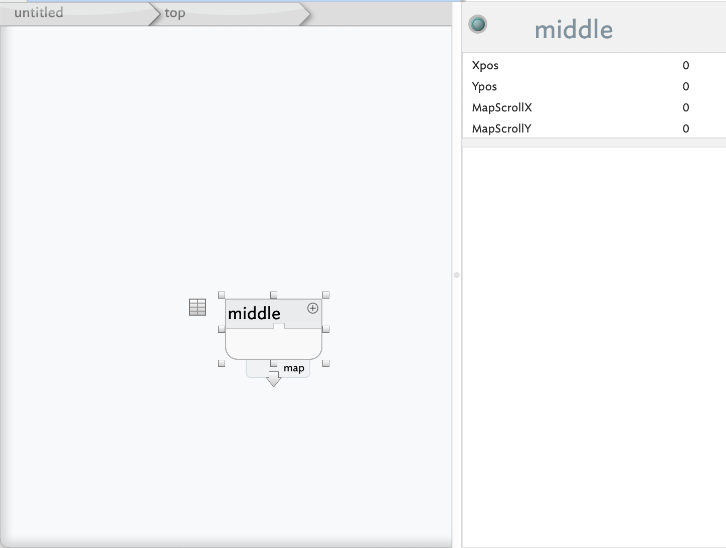
In v9.1.0, I added a note in outline and switched to map. The note is effectively hidden and the default map view places {0,0} at the bottom right of screen and the {$Xpos,$Ypos} is {0,0} (or sometimes {-0.1,-0.1}). I think this strange placement is a hangover from the different way the very original version of the app drew maps:
Drilling down from this root-level container, it’s child displays in the middle of the map:
… odd. So in this case top left of the map is {-6,-7} whilst the container ‘middle’ is at {0,0} and its paren’t map scroll was set to {0,0}. So the chid map doesn’t open with map scroll co-ords at top left but rather at centre. This is confirmed if I drill down to another child map with a note, or to an empty child map.
Root map in a new doc draws {0,0} at top left corner. But, if the first note is added in outline view, switching back to the map view it appears just off the bottom right corner if the map and the map view now shows {0,0} at bottom right. Strange.
Don’t be put off. This issue at play is whether we are simply making a drawing (still possible in Tinderbox) or recording the data in a manner aiding further analysis. That might seem counter-intuitive, i.e. aren’t those the same things? Yes and no…
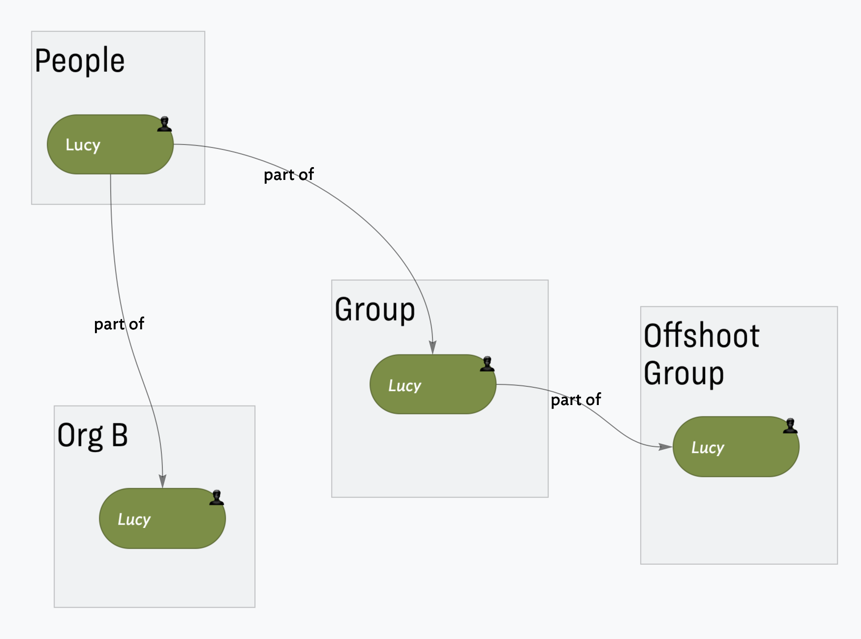
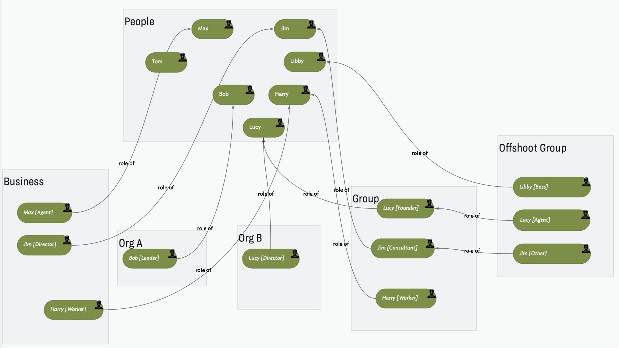
The reason the diagram is difficult to reproduce verbatim is the original sketch flattens all the info into a single 2D picture. Person ‘Lucy’ appears 4 times: as a person, as part of ‘Group’, part of ‘Offshoot Group’ and in ‘Org B’. We can mock this up a number of ways, such as in this example:
I’ve got to head out fro a few hours so I can’t complete the example, but this gives an idea.
But, which view is used and how the data is structured (aliases vs discrete notes, what sue of attributes, etc.) has to reflect what you need to study show.
I had thought there was a way to use the informational structure of a well-organized outline to make a map, but it now seems like they’re quite separate – unless I’m misunderstanding TBX yet again.
You also spelled out many reasons why what we’re aiming to put together might be difficult to achieve for the following reasons:
I appreciate your clear view about this, and it does make me question whether we should’ve opted for OmniGraffle (or a similar app) as you suggested.
He’s a friend of my colleague, and one of the reasons why we thought TBX would work for this purpose. We also though there might be a way to create customizable links (which @satikusala referenced in one of his training videos) in which we could label the link as a way of explaining the connects of people and entities (e.g., an arrow that connects one entity to another with a link that reads “flow of money”).
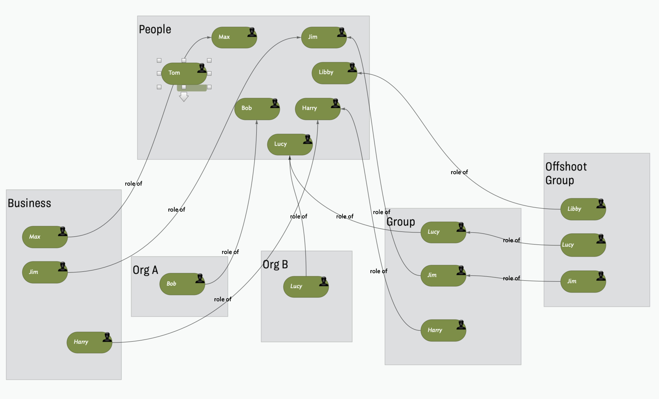
It works, as seen above, but this is not something to do at scale.
The Devil is in the detail. The doc captures the info in the original diagram, but apart from the Display Expression there is little abstraction/automation in a way that would help. Is the visual ‘map’ the key task or understanding the data (e.g. finding all people who have a ‘Director’ role.
Having finally made a common reference, we can explore the visualisation problem a little more. In a drawing tool the info has to be on the surface—text or some graphical hint—as the result is a flat image, e.g. a JPG or PNG. Essentially, what you can’t see isn’t there!
Capturing relationships (same person mapped to different roles) has to use lines because of the limitations of a static image.
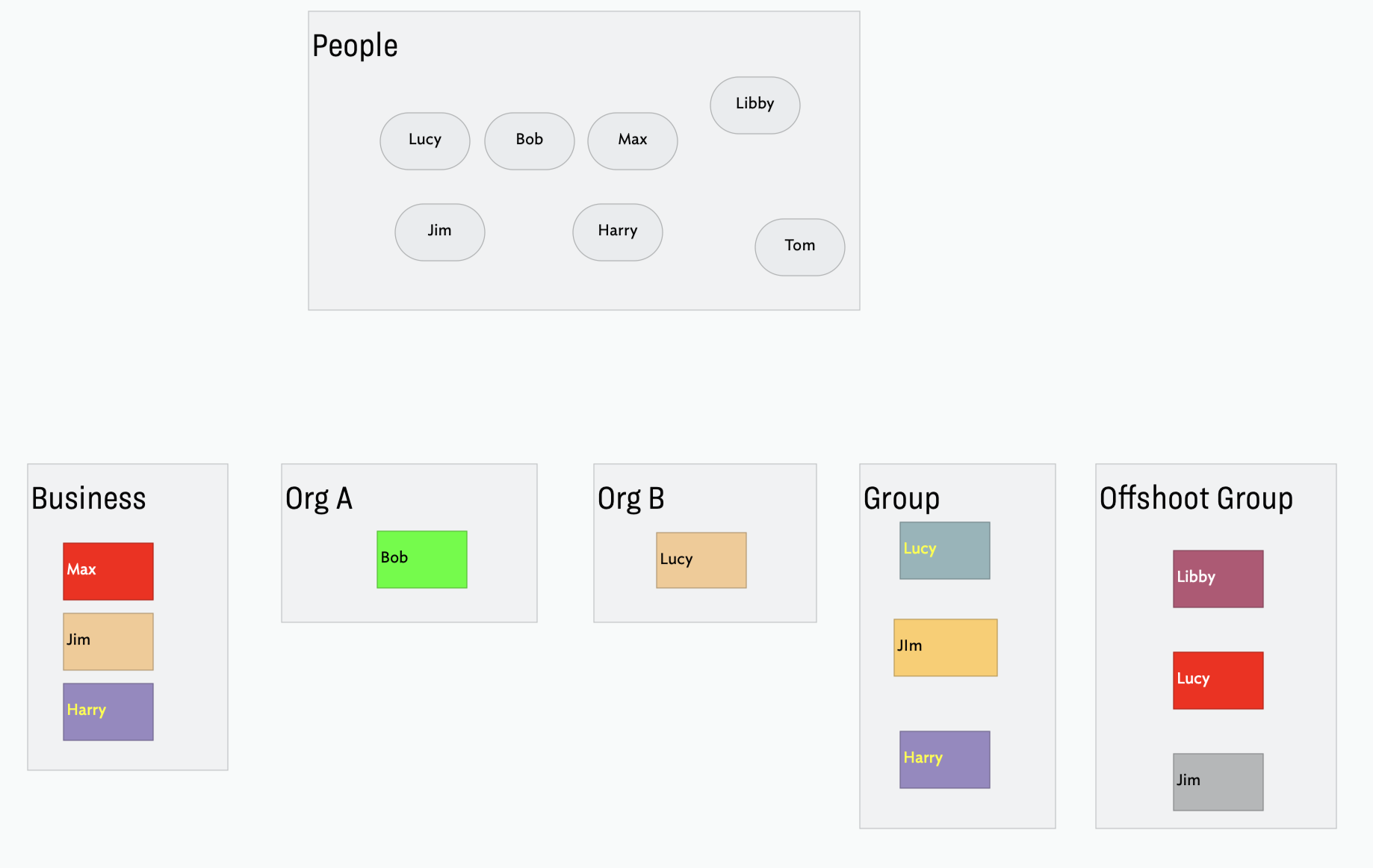
But, stepping back, why do all objects need to be a person/clone? Why not have named roles (ideally reduced to a limited number) as we can than style those and use a Display Expression to place the person name as the item title, like so:
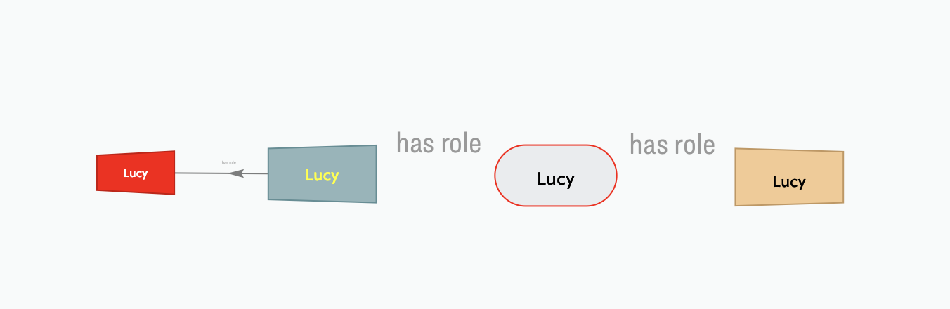
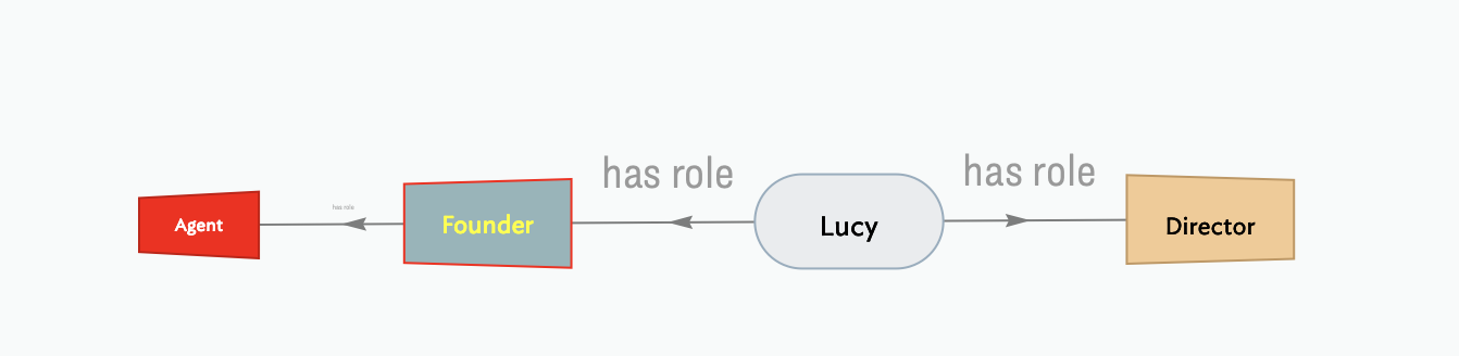
The colours here aren’t brilliant, but it shows how we can cut the visual noise a bit and not need lines everywhere. Actually, there are links, but with visibility turned off. Why? If I select ‘Lucy’ and switch to hyperbolic view, we see this:
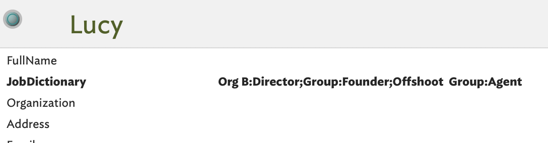
How? Hyperbolic view shows all notes linked (by any link type, in either direction) to/from the selected notes. So, as Lucy is only linked to the jobs she does we see a limited network. In the prototypes used, I stored the job title in $Role: so for an ‘Agent’ job, $Role is “Agent”. Now, altering the $DisplayExpression to $Role we get:
Thank you very much for all of this. I’ll give it a closer read as soon as I can. But is the basic conceit that one can show some of the basic linkages with hyperbolic view, but that it won’t allow for Hoover expressions (and some of the other features you regencies in your previous post)?
Also, I think it is necessary to see replicated names in different entities, and think that @satikusala can probably explain why that’s desirable during your call. We’re happy to consider another approach, but he’s already got a handle on the information architecture — and the aims of what we’re trying to do.
As at v9.1.0, hover expressions are not supported in hyperbolic view. Indeed, the is no obvious rationale that they should be. IOW, it is a feature suggestion for a user with the need to make.
I remain to be convinced in light of the discussion above. A big and recurrent issue, as shown above, is thinking backwards from an idealised outcome best produced in a non-dynamic 2D drawing tool. IOW, trying to design based on an imagined result of an undefined process. Rather like getting a room repainted by only ever stating the result is not as imagined.there is no right/wrong, but there are lazy and self-defeating assumptions.