Thank you for this. I think we’re flexible about another approach, but we’re having a hard time imaging how it would look – and how it would properly match what we’ve conceived of originally.
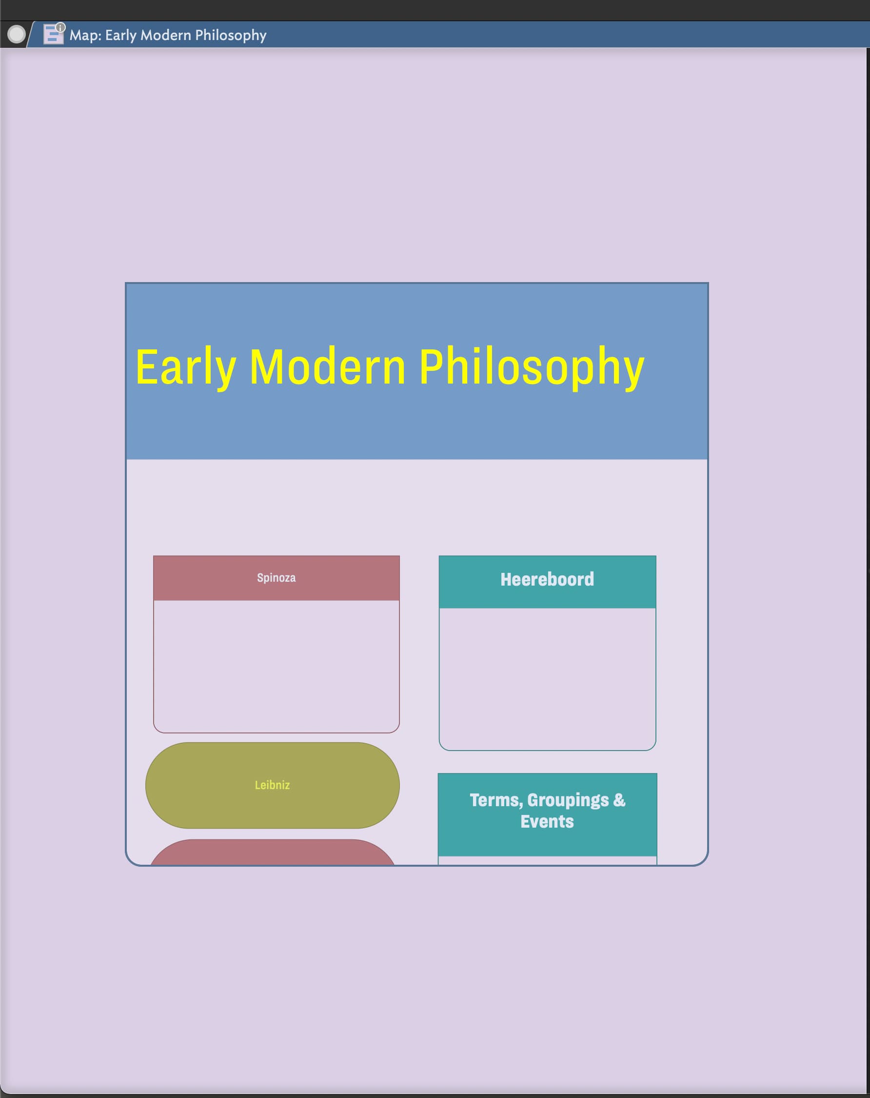
Also, as someone who has mostly worked on TBX projects in Outline view, I’m not fully grasping whether it would be better for us to work in Map or Hyperbolic view given what we’re aiming to accomplish.
By the way, while looking at the code and examples you produce, I wondered (again, as a relative newcomer to the app) if it makes sense to have template examples and code that new users could use and graph on to their projects. Just a thought.
Sorry if I’m repeating myself here, but this is one question I just haven’t been able to full grasp: Is there some way in which TBX users can set up the organization structure of containers, notes, and links within the Timeline view and have it appear graphically (to a a large extent) in Map or Hyperbolic view? I suppose I had been laboring under the assumption that was possible, but was that thought totally misconceived?
I have to admit that I hadn’t ever added a note in outline view, but when I tried it did behave a little unpredictably. I then went back to an existing project and tried both drilling up and down in map view, and moving from map to outline. In each case the ($Xpos,$Ypos) of the top left-hand item has been set at {0,0}.
With the map centred, moving to outline and back produced this deviation:
Well, yes and no. Understanding is key, but I also see it as building up a repeatable asset–terms, people, orgs, etc.–that can be leveraged for future projects. For me, this is one of the biggest benefits of Tinderbox. I have files with multiple investigations in them that leverage common assets. When you look at this type of work through this lens, then having the ability to have a hierarchical structure becomes important. The big question is how can we flatten your notes for when you want to perform association and visual analysis and keep the hierarchical structure when you don’t or can’t.
A good thought. This s why I’ve produced so many videos; moreover, you’'ll find tons of “templates” and code all over this forum. Tinderbox is a personal tools that molds itself to one’s personal style fo thinking and interactions, e.g., with the naming and collecting of attributes. Think of a carpener’s toolbox. We all have access to the same tools and reference designs are everywhere, but it takes practice to use these tools to build a house. The tool and sample designs are not enough, we also need a clearly scoped problem, a willingness to explore and learn, and a community like this one to guide us.
The answer is not either or…if you take a step back there are five steps to the process:
Collect insights
Curate the insight (into discrete individualized units with appropriately populated attributes and link associations)
Create new insight, which leads to more collection and curation
Collaboration, which brings in new ideas, leads to more creation, curation and collection (visuals here can be important)
Contribution–contribute your knowledge. On this now, what actually is your final output? An article? A presentation? A spreadsheet? A graph? A compare and contrast? I suspect it is not the originally provided image? That image will just be one part of the sub-set output I suspect. You may find that there are some interim manual steps in your analysis. You’ll find that in the end you’ll want to build a template the let’s you write you article, a process that will help you accumulate all the pieces. I think that one’s thought can be constricted when you just focus on the output image and not all the pieces you’ll need for your final output.
Not sure I understand the question. To be clear–there is only one data set–your notes. All the views are used to evaluate and work with these notes. So, saying set up a Timeline and then appear somewhere else does not make a lot of sense. You create notes nearly anywhere and analyze and edit them in different views. For example, Timeline is used to map out notes that have dates–typically $StartDate and $EndDate.
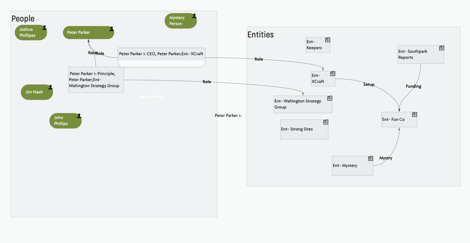
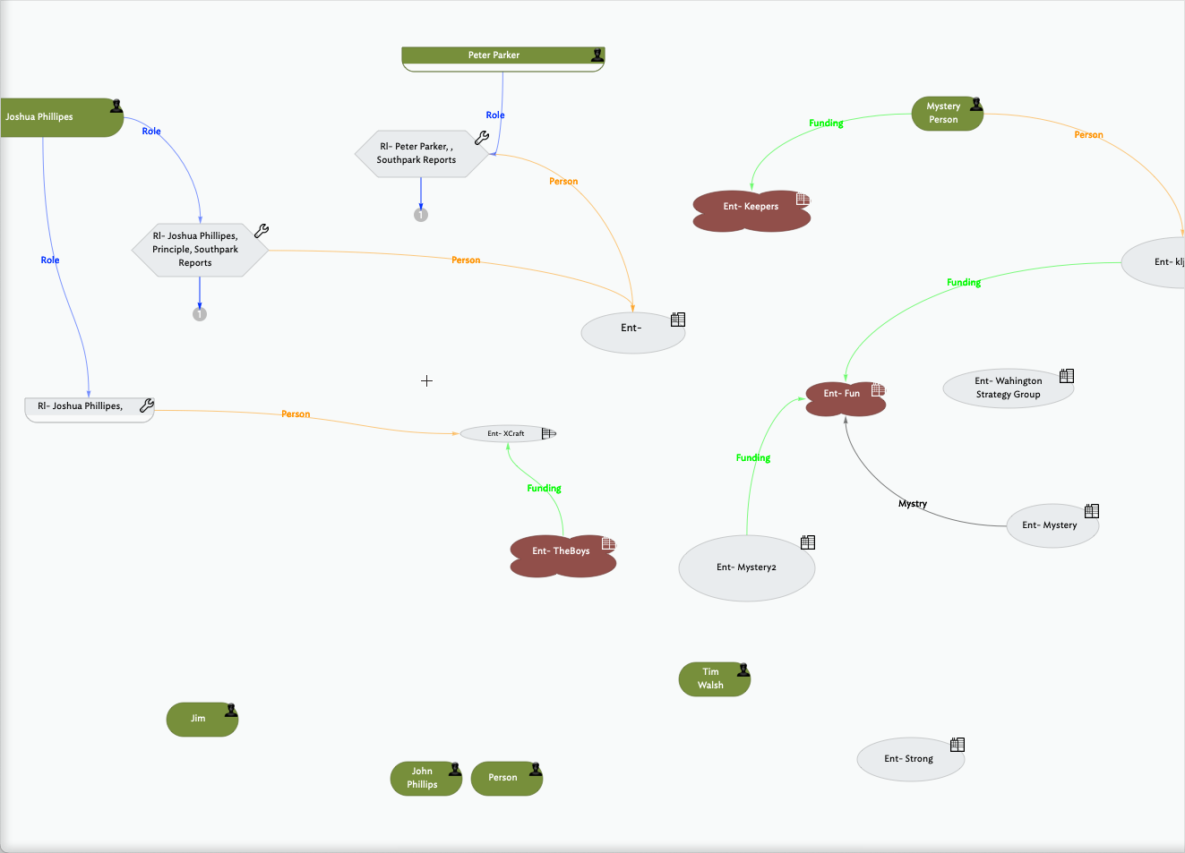
Not at all. The parameters are actually pretty simple: You want to map the relationship between people, organizations, and the roles and activities these people and organizations engage in with each other. You want to then be able to find hidden patterns in these relationships and activities.
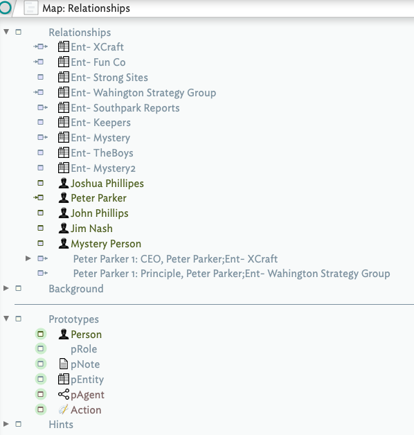
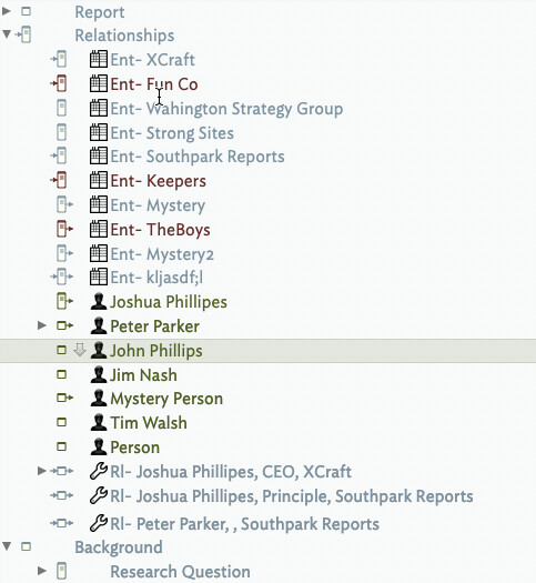
Per this thread’s original point, you might just start in Map View with adornments and see where that takes you. Couple things I thought of in the process. Create discrete notes that capture the different roles that an individual has with different companies. This will help with expanded not taking and visuals. Use link types and .link operators to pass values back and forth between the notes. Be prepared to get messy and spend time moving stuff around. Trust that necessity is the mother of all innovations. Once you hit a block, we’ll find a way around it. Key is to get started. Also, I’d suggest you have the Relationships Folder sorted by $Prototype, that way all the similar notes are together in outline view.
I understand and appreciate this, and think that you, @eastgate and @mwra have developed amazing tools and resources for users – including the breadth of this forum, and the generous help provided by fellow users, which is quite something.
But I think users would benefit if you went a step or two further by producing some templates and sample code. I see that some of this exists in " A Tinderbox Reference File," and that’s wonderful – as are your terrific video presentations. But I find it easier to refer to an actual file and code examples so that I can analyze it closely, tease out how things work and better understand the mechanics. It’s just how I work best, and I’m sensing – based on some of the back and forth discussions here – that others might from benefit from this approach, too.
Thank you for all of the bullet points you’ve provided here. My colleague referenced your discussion about this process, which seems like a strong approach. I’m only responding to this last part, to answer your question. The short answer is we’d like both a contextual image that we can share with our team, but also want to continue to build on the informational structure you helped us set up.
I understand the concerns that you and others have raised about scaling, which are perfectly valid. I’m not yet sure how to consider how to manage that going forward, however.
I apologize. I believe in that context I meant to write Outline view.
To step back for a moment, and explain my misapprehension about TBX: I thought that if we assembled the structure of containers, notes, and links within the Outline view, it would be fairly seamless to view it graphically in Map or Hyperbolic view.
I suppose I’m trying to form a better understanding of how to create a bridge in TBX that takes bet from that organizational structure in TBX to the graphically one Map or Hyperbolic view. Since it’s not as automatic as I expected it to be, what are the sequence of steps I need to take to get there? That seems like the main question I’m trying to understand at this juncture.
Hence my suggestion (request) for some kind of template that could help. Or maybe even a checklist of some sort.
Exactly correct. What a pleasure it is to be understood.
I thought of this, but then felt that would be a poor decision since it would just show the graphical relationship without the organizational structure of the project, would it not? My concern was that taking this route would make it even more difficult to grow the information (i.e., add containers, notes, and links) since adornments only appear in Map view.
I’ll have to look into that more. Question: would you suggest I continue to work in Outline to fill out more notes, and form links, and then toggle into Map or Hyperbolic view to adjust the graphical output?
Thank you very much. It’s rather overwhelming, but it looks like it’s starting to take form.
I’m very interested in understanding how you think we could be better structuring this graphically, and am wondering if you could provide more information or examples. I don’t mean to trouble you further – you’ve already provided lots of insight – but I don’t quite follow how your envisaging the ways that people and roles are represented in Hyperbolic view. And how that’s preferable to the way we’ve originally conceived of the structure, as it relates to the sketch I produced.
Nearly all my videos have a sample file associated with them on the forum.
A very good questions…I don’t think we’re there yet. I’ll give this a think.
Not necessary, since you can use action code to sort the outline view to help you keep the notes-somewhat organized. In fact, you really don’t need folders at all if you think about it. As long as you have values in attributes youc an run agents to give you a top-level folder of different results. Different agents can generate different nestings and results. In fact, this could be a really great way to go. We can discuss.
Actually, given that what you’re really after is visual, personally I think you should stay focussed in map view and let the outline view store itself based on a value in the attributes, e.g., but $Prototype in my example. Given this approach, you absolutely DO NOT want to burry notes into containers as this will destroy all the map view work you’ll have done. In summary, do your work in map view and just have one big container called Notes within your three primary objects, People, Roles, and Organisations. You can then put notes and references, e.g., your thoughts and references, in each of the individual people, roles and organization notes. This is the direction I would take. We can then take it from there.
#One Final Point
I have thoughts on how you’d then produce you report–you’d have another file called “Report” or “Article” and you’d use a combination of notes, aliases, and action code, e.g. `^include()^, to assemble your report. You’ll also want a solid markdown template. And, if you want citations in your final report your best bet will be to leverage Pandoc. I have a VERY clear idea in mind how you’d pull all this together.
Good point. I was thinking that there could be something like a gallery of templates that would compliment @mwra 's “A Tinderbox Reference File” and your video presentation – sort of a compilation of ready made files that could refer back to both of those resources. I understand that both of you have invested much time and energy already; it was just a thought.
Thank you. That would be enormously helpful.
That sounds like quite of work to set up. Is that a fair assessment? Happy to have you discuss it with one of our team members. Thank you.
I won’t quote the remainder of what you wrote, though I’ve been registering every word of it. I suppose we’re not fully grasping:
Which TBX file should we focus on as we plot our path forward? You and @mwra have both made terrific files that are very useful, but seem to pull us in different directions.
Should we hold off on porting over more information (notes, and the links between them) at this junction until we’ve got a more clearly understood and resolved path forward?
The larger, over-aching question I need to resolve – and that we need to better understand as a team that’s working on this – is how best to toggle between the information collection and linkages (which we’ve been doing Outline, as you know) to Maps. That back and forth has created much confusion. But it sounds like you’ve got a suggested approach, which we’re eager to hear.
A lot of work is relative. I could set it up in about 30 minutes. The issue is not the setup, the issue is doing the working to navigate your data to find insights and think through how you ultimately want to report it all out.
Does not need to be and and vs. or, you can take the best from both.
I reluctantly toss my oar in here. Without knowing enough about your project to express a real opinion, my inclination is to avoid worrying too much about the friction. Back-and-forth between visualizations may create confusion, but it may also create insight. If that insight convinces you your current representation is wrong, its not very hard to correct it
All of you have provided enormously helpful input in response to our questions raised in @Roma’s original post – and I thank you very much for all of that.
But I have to give @satikusala a huge shout out for his extraordinarily generous help putting together a file for us. It’s a remarkable example of Tinderbox’s power and capabilities, and will certainly advance our research. I’m excited to see how we can build on this further, and what it will ultimately yield…
I’d like to echo my colleague’s statement. The file, and what it does, seems remarkable to me. I’m trying to learn more about Tinderbox, and am appreciating it’s potential for research work.
I certainly appreciate the points that you’ve raised. For me, it’s about gaining a better understanding about how to navigate effectively through the app and it’s views. I’m still learning my way around, and was fearful that changes I made in Map view would adversely affect those in Outline (and vice versa).
I’m trying to convince our team that we ought to also work concurrently on developing the structure for the Timeline view, since we also need to show the timeline of events, actions by people and entities, and so forth.
There’s some discussion here about first developing the data that we’ve got and sorting it out in Map view versus setting up the prototypes and code so that they can primed for Timeline view when the time comes.
Does the community feel that there’s a better approach for handling this?
We, to be clear, you should still have this fear…what ever you do, DON’T put the notes under “Relationships” into sub-containers…you’ll completely destroy all the work you’ve done in Map view (be sure to keep backups of your file–I use Arq.)
As for Timeline view, it NOT a big deal: For now, just be StartDate and $EndDate in and Timeline view will work with no additional effort. Later, you can add timeline bands and other affordances.
Once we got it all set up, the team can not collect, curate, and create their insights, while collaborating with each other. When they’re ready, they’ll circle back and we’ll help them pull their report together (aka the contribution stage of the 5Cs of knowledge management).
This is, for me, gaining a better understanding of “Link Action, and $Rules/$Edicts” is easily the most challenging part of the equation, and something that will take me time to use with confidence and aptitude.
Thank you for all of that advice. I’ll abide. And I feel like I’ve got a decent fear of the process, albeit not crippling fear.
Thank you. I suppose it’s the “other affordances” that I’m trying to include in assembling the Timeline view for this project. It seems there are a few other steps to consider in putting together notes in Timeline view, and I didn’t see that you made an instructional video about Timeline. While it doesn’t seem as complex as Maps, it still feels like it takes some time to understand how things function and put them into effect.