Block diagrams with associated information

I’m not sure that Tinderbox can actually do this, but nothing else seems to be able to either.

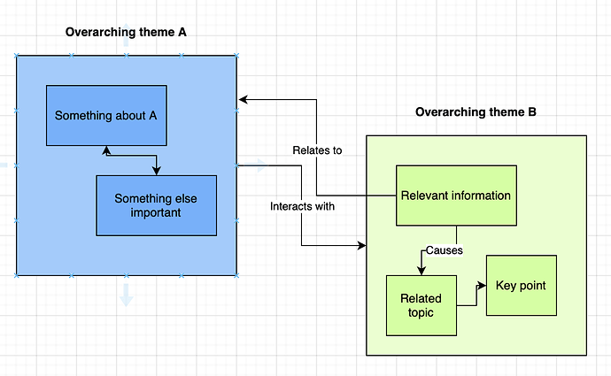
I’m working with block diagrams as a map of interconnecting concepts. There are so many ways to make these kinds of diagrams, from PowerPoint and Visio to draw.io and so on. This kind of diagram is a great way to organize very complex interacting bits of information.

But all of those tools are mainly appearance-focused, and I’d like to be able to combine appearance and information. What I’d like: a “nice-looking” block diagram that at first glance has a reasonably attractive appearance, but also contains all the references and annotations for each element of the diagram.

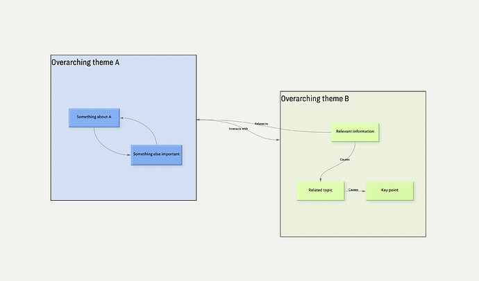
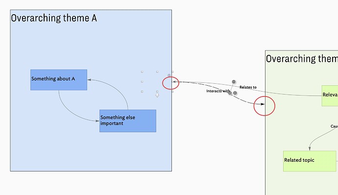
Here’s a simple example.

Seems like a potential use case for Tinderbox with map view and outline view and notes?

Where I’m running into trouble:
Map containers don’t reliably show the same view. Which makes sense for main Tinderbox use, but not if I want a top-level diagram view, and if I nest more than one level the interior items aren’t easily visible. I didn’t put a third level in my example before closing draw.io, but imagine more boxes within boxes.

Adornments would do the job for grouping items, but they can’t be linked as far as I can tell, and they also don’t appear in outline view so associated information isn’t as readily available.

I don’t care a lot about cosmetic details like shape of connector lines or whatever, but I do care a lot about being able to see the overview of the information and also dive into the details.

I’ve done things previously like make a concept map in other software with a link to a separate file for each topic and subtopic, but that’s unwieldy, and it would be more useful to have everything in one place, and particularly to have the power of Tinderbox available.

I tried to make a TBX file showing what I’ve tried, but Tinderbox crashed and deleted it.

I’ve searched the forum and couldn’t find anything quite like what I’m trying to do. If Tinderbox isn’t the right tool, I’d like to know that before spending more time fiddling. (Although if there’s a more appropriate tool I’d very much appreciate knowing what it is!)

I know I’m mixing form and function here, but it would be so very useful.
A side issue, but should be noted. If you experience a crash in Tinderbox then open the macOS Console app, check for the Tinderbox crash log under Crash Reports, click the “Share” icon in the Console toolbar and send the crash report to support-at-eastgate-dot-com, along with a note about the circumstances of the crash and a copy of the .tbx file if one exists.

Is there a reason that your notes need to be nested? For your use case outline order in notes is not necessary useful.

But if an outline is a must have, then consider creating an agent that finds all the notes (or the desired notes) in the outline and make your map on the map view of that agent. Along with image adornments or other adornments.

Be sure to read Re-arrangable Agent Maps for more information.

As far as seeing the contents of multiple levels of containers on a map – this is not the current design. @eastgate can explain why it might be difficult to provide the feature.

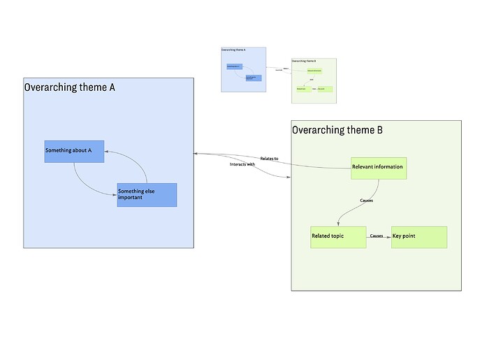
What about this one?

And using Copy View As Image, a Tinderbox functionality, you can easily copy and paste your picture and use it in a presentation.

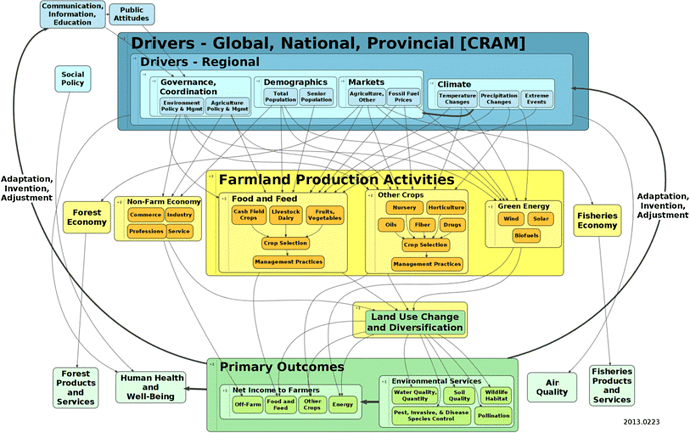
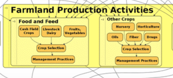
Why nested? Because I’m working with extremely complex information. Thinking through material like this diagram from Waldick et al 2017 is my actual use case. I want to be able to store my thoughts on where this is and is not the best representation of the concepts involved, to associate citations and case studies with both nodes and links, and to eventually produce modified version(s).

An outline isn’t a must-have, I suppose, but for me it facilitates understanding to have multiple views available. The map and the associated information are what I am trying to find more effective ways to manage.

I understand that Tinderbox isn’t designed for this exact thing, and that it isn’t possible to view nested containers. I just haven’t found anything that actually is designed for my task. I’d like to be able to work with both the information and the connections, including hierarchy and links.

Copy view as image is helpful, thank you.

I might have to give up on being able to see everything at once, though, and instead work with single levels at a time, and use some other software for presentations. Tinderbox is good for visualizing information in certain ways, and certainly for working with that information, but I will still need something else for drawing the full figure.

This sounds like a worthy topic and use-case for Michael Becker (@satikusala) to include in one of his regular Tinderbox online meet-ups. What say you, Michael?

To the person with a hammer, everything is a nail. This same could hold for box-and-line (B&L) tool. B&L apps like Visio, Omnigraffle, both—if one digs deeper—offer scriptability and deeper metadata. It’s just they don’t reveal that data in the way Tinderbox does.

The challenge here is whilst the Tinderbox map view may look like a B&L diagram, it comes from a different place. It is, at heart a hypertext tool, albeit less focussed on literary/creative scope of its progenitor Storyspace. Notably, Tinderbox has (at last count) ten different views though sadly most only use Map and/or Outline view. But, all these views are different ways of viewing the same underlying notes/data, a point which is often overlooked.

In the B&L tool lines are just that, even if they imply linkage. In Tinderbox though, links are more than lines—and don’t even need to be visible to exist at all.

Which begs the question, why is not exploration being made of hyperbolic view, or treemap, or attribute browser, etc. A Tinderbox file supports multiple tabs allowing different views but most users get bogged down in a single view working within the constraints of the view rather than explore the feature set as a whole.

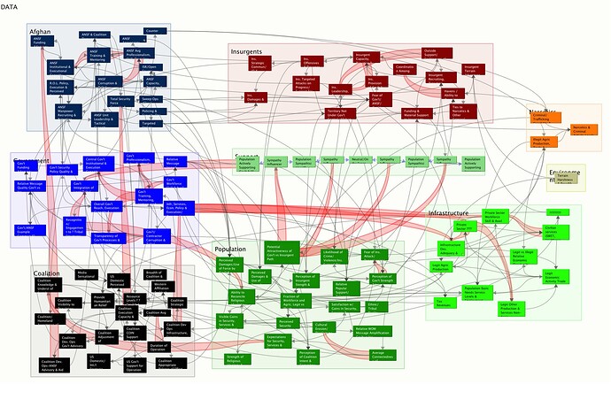
The problem with seeing everything at once is it isn’t always informative in the manner hoped for. [Rhetorical question] What does this tell us:

Hint—not very much. The image doesn’t really show the text, but for those who’ve seen the text, it doesn’t help much.

The problem with the B&L approach is it fails for complexity. So either we bend the reality to fit that constraint, i.e. arbitrarily elide necessary data in the pursuit of visual clarity, or we end up with a bundle of lines and no clear indication. Here we are ill served by our general education which assumes visual clarity == insight. After the fact, yes. But en route to discovery, it gets in the way.

So, trying to make Tinderbox maps more like B&L apps is an exercise in futility. Two immediate points to bear in mind:

  • Tinderbox links are directional, i.e. one-way. Direction arrowheads can only be drawn at the target end.If you want a bidirectional indication you need to add two links, one each way. Also, links in Tinderbox don’t have to be visible to be present and actionable.
  • Map adornments can be drawn to give the appearance of nesting but in fact this simply reflects the z-order (front-to-back axis) of drawing the object. But adornments do not accept links: you cannot link/to/from an adornment. As in B&L diagrams the background box is just another box, not such stricture apply.

A limitation of B&L diagrams, and a reason I moved away from such is that whilst the diagram may foster insight, it is hard to move that on for use in meaningful communication (papers, essays, etc.). For all their apparent ‘lack’ of B&L features, I find Tinderbox Maps more tractable to the overall process of sense-making.

More, but I’ll start a new note …

1 Like

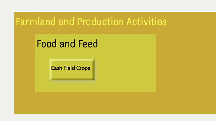
This:

Block diagrams with associated information - Q & A - getting started with Tinderbox - Tinderbox Forum 2025-01-06 12-02-38

… cab be ‘mapped’ in Tinderbox like so, using a note atop two stacked adornments:

But recall adornments can’t support links (though these are seemingly not needed. Also, by convention, adornments don’t have a text ($Text). In fact, it can be used and is shown in the text panel when an adornment is selected.

Meanwhile, the relationship of the two enclosing concept (adornments) could be captured in the note ‘Cash Field Crops’ as attribute values. Exactly which attribute(s) is detail for consideration within the context of the project: there is no one ‘right’ way. The best outcome is the one best facilitating the later use of this data. also consider storage in terms of how easy is is to query. Things you know you’ll want to query are, in my experience, better saved as discrete terms in attributes, even if still present in the notes main text ($Text). Such abstraction avoid search becoming an exercise in regular expressions: I’m aware the UI find box allows literal string, but it’s regex underneath and as the project scales it’s just easier to match known field values.

@mwra: adornments can’t support links

There is a trick to do that nevertheless, but I’m aware that it is just an « as if » solution and not a system functionality: creating a transparent note and link it to another transparent one as if it was an adornment.

Yes, I’d considered that, but it’s a case of last resort. I’d not start a complex mapping project that relied on extensive use of that trick. As happens often, it turns out it is easier to work with Tinderbox’s design rather than work against by trying to fake the affordances of a different app deign. The point isn’t a good/bad judgment of any given app, but instead a reflection that apps’ designs vary and so thinks that merely look alike may be constructed in different ways.

A point I didn’t bring up earlier is the implicit point that links/relationships need to be seen to be understood. That might hold true for a B&L app (even then I’m not 100% convinced), but isn’t the case for Tinderbox with multiple views and all sorts of textual analysis tools. But if we convince ourselves that only what is seen on screen is true, then we pre-emptively cut ourselves off from all sort of insights.

That said, perhaps we lack a simple demo that shows someone used to only box and line of how much richer the analysis can be in Tinderbox. I’m immersed in other things but it might be a nice demo for one of the community to make as the potential (analytical/illustrative) aspects available in Tinderbox aren’t immediately obvious to someone who has only ever used mind-map or box-and-line tools. IOW, we don’t know what we don’t know, so a demo to help bridge that gap might be useful. Perhaps there’s already one from the past?

1 Like

@phiala I’ve been wanting something akin to this for quite some time. The backstage, I call it a “flattened map view.” As noted in the discussion, nesting is important. For me, the biggest need was the ability to flatten the map view while retaining the nested container of the note so that I could write a report on the diagram. The closest I’ve gotten to be able to do this was using an agent and working with adornments and aliases. If you go this route, it is critical to set $CleanupAction to “none” so that the aliases do not get moved around when the agent reruns.

Politely, I’m not sure raising this “flattened map view” is helpful to a new user trying to understand how maps differ from basic B&L and mindmap apps.

The idea is a concept not yet resolved into a formal feature request AFICT and has been at this idea stage for >10 years. If taken forward it won’t be Map view but something else due to the design issue implicit in such a thing. So I suggest we don’t discuss this further on this thread as it doesn’t help with a new user’s problem in the present day.

Note that B&L apps don’t ‘nest’, but simply draw a larger box, in the background (think z-order) behind a current object. The Tinderbox way of this, using adornments has already been discussed.

Agent-based maps should be considered with caution for the new user as there are a fair amount of small Tinderbox details to understand (I noticed aliased & italicised text wasn’t mentioned). Perhaps a demo for a meet-up?

Let me clarify.

I’m not a “new user,” having been using Tinderbox for about ten years. Although I’ve only been a member of this forum since 2020, and am not generally an active participant, so I can see how someone might make that assumption. Maybe the Q&A section was not the best place to discuss this, but it seemed similar enough to many of the other posts.

I also don’t feel like I am suffering from any confusion about the difference between mind-mapping tools and Tinderbox. I’m sorry if my first post, specifically about a desire for a tool that merged appearance and information management, gave either impression.

Under the principle of Don’t Repeat Yourself, I have been pondering if it would be possible to use Tinderbox for form and function, rather than function alone: I need the presentation-quality block diagrams, and I need to be able to manage the information underlying that visual representation. It’s tedious and error-prone to keep all the knowledge in one tool, and the visual representation in another, and to manually update one or the other as new insights and new references become available.

Multiple levels of hierarchy are important to understanding.
Directional links are important to understanding.
The references and the supporting data (associated with boxes and with links) are important to understanding.

Tinderbox is great at managing the information aspects, so I wondered if anyone had experimented (more successfully than me!) at ways to tweak Map view to achieve both form and function, or if I was best served by continuing to use multiple apps. Like @satikusala I need to write reports incorporating this information and visualization both.

It’s nice to know that I’m not the only TBX user who’s pondered this question, and “flattened map view” would be pretty similar to my use case. But it sounds like there isn’t anything currently that will meet my (admittedly unicorn) needs, so I’ll continue with what I’m doing now.

3 Likes

I wondered if anyone had experimented (more successfully than me!) at ways to tweak Map view to achieve both form and function

Are you suggesting a Tinderbox presentation-mode?

No… That would certainly be one way to approach the task, but also a way that has been roundly dismissed on this forum a number of times.

I would like a map or map-like view that supports the organization and understanding of the information I’m working with in a way that I haven’t been able to achieve in Tinderbox so far, and which is illustrated by the block diagram I shared, with all its hierarchy and links across multiple levels.

If that map-like view can be saved effectively as an image, that would be fantastic. But even if it can’t, and I need to tweak the formatting for presentations and reports, I think it would still be an improvement over trying to keep separate visualization and knowledge management tools in sync.

I’ve tried a bunch of other things as well, but that’s mostly irrelevant in a Tinderbox forum. Tinderbox is the closest I’ve come to what I’d like.

1 Like

Sincere apologies for the misassumption! Here is just fine to raise this issue—it is worth discussing.

One angle to consider is whether the image is the place to start. this might sound totally counter-intuitive. But if the ‘map’ is constraining, I think the data is signalling to use that we aren’t using the optimal selection of tool(s) (i.e. in-app , not different apps, though that is also possibly true). I’d reiterate the point about exploring other views beyond map and outline. The default Tinderbox gives one something to start with and more than one view to indicate both that other views exist and the a document can have multiple (tab-hosted) views available for the sake of a tab switch. note: background tabs are not doing extra work so they aren’t a background load on the app.

Thought experiment. If for some reason we couldn’t use a map view, how might we explore this problem space using other views?

I should note, in the term ‘B&L’, there’s no disparagement of such tools. I was a happy buyer of Visio v.1 (I was on PCs back then) and used it a lot in the 90s and then Omnigraffle on the same role after moving across to Macs. A hard transition when first making heavy use of Tinderbox was to not try and treat ma preview like a B&L space—natural as that seemed. I think what got me out of that rut was thinking one step ahead about the info I was trying to generate from the drawing activity. In turn that shifted my perception of how i approach the map views.

A common cycle here with new project is “I want …”, “That is not possible, because valid reasons…”, “I don’t care, I just want…”. People aren’t being lazy or difficult as at outset, the assumption can be that they just aren’t pressing the right buttons. Breaking out of this cycle is hard and there’s no one size-fits-all answer. However, focussing on what comes next probably ought to be useful to all (most?) even if in different individual ways.

[Now having happy memories of just how impressed I was by Visio even in its v1.0 guise]

I admit, I’m not very familiar with some of the other views. I do mostly use Map and Outline. I am very willing to explore any other directions, which is why I brought my question to the forum. (Also willing to be told that this is not what Tinderbox is good at, although there are so many ways to do things that getting close seems plausible.)

Maybe further background would help? I’m a senior research scientist (agricultural landscape ecology) and at this point in my career I’m mostly focused on synthesis and application and turning knowledge into actionable recommendations that farmers and other land managers can use. Climate change, environmental impacts, food security, etc. Tinderbox: great for assisting with that kind of synthesis, particularly with helping me to organize my thinking. I go back and forth with it, and am by no means a power user, partly because I’m limited by my employer as to what I can officially use. (Frustrating!) But I use that and other similar tools on my own time and own computer because they’re so helpful.

Anyway, given that background and expertise: The literature is full of complex block diagrams like the Waldick et al 2017 one I shared above. That’s not my work, and I disagree with some of their decisions, but need to justify my changes based on both prior research and usefulness. The overall framework is very useful, both for thinking about multiple complex interactions and for guiding further work. What do we know, where are the gaps? What studies support particular interactions and hierarchies?

That’s the kind of information I’m organizing in Tinderbox, but I’m starting from a block diagram. Which, yep, is almost but not exactly like Map view. That I’m starting from an existing diagram in this case has probably constrained my thinking, as have many years of Visio and similar. In Map view, I can look at sections of the information in detail, keep all kinds of metadata about what I’m changing and why, what parts I’ve finished annotating, etc. But I can’t see the whole thing, because of the deep hierarchies and because it’s challenging to view links usefully across hierarchies (made via link parking).

Not being constrained to block thinking / visualization does let me create much deeper hierarchies, which is useful for thinking, if not for making legible diagrams.

So maybe a better (and more interesting?) question is: is there a more effective way to use Tinderbox to organize and visualize interconnected hierarchical information? How else can I explore exploring this problem space?

As noted, I have gone down the alias route. I take a screenshot of the map and put it on my hard drive. I then pull the image into the report via my media template (something I’ve reviewed several times in meetups). I’ll be reviewing the media handling process in my upcoming class and will make a download available sometime in the next couple of weeks.

2 Likes

It would be great if you could join us in a future meetup. I’d love to revisit this with the community. It is something I’ve been working through now for a couple of years—the system is not perfect, but getting there.