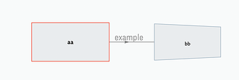
Block diagrams with associated information

I’ve wanted a flattened map view for years. Just search the forum for “flattened map” and history will show others have too. @Eastgate over the years explained many of the issues involved. The alias-map view does work – which is why I suggested it at the top of this thread – but it’s a PITA to deal with in practice with a complex file.

Because of the desire to both gather and work with notes and present them, using the same document, I adopted other apps and have been on a personal quest for the perfect app for notes + nested visualization of my notes.

I hadn’t hit on “flattened map” as a search term until this discussion.

I’m curious about the other apps you’ve tried, although that may not be an appropriate discussion for this forum.

Out of curiosity, desire to learn more about TBX, and perhaps be helpful, I looked up the paper and found it here. (Update: Probably not the right paper, but the right chart.)

With the pdf opened to the system diagram (Figure 2), I created an outline in Tinderbox that tries to capture the hierarchical structure of the diagram. It’s not perfect fidelity, because I don’t understand some of the thinking for how the diagram was laid out. But I think it’s close.

I did not add any links, because I have never used links within Tinderbox, and I’d probably make a mess of it.

But, from the outline, I wanted to look at Chart View, and Tree Map.

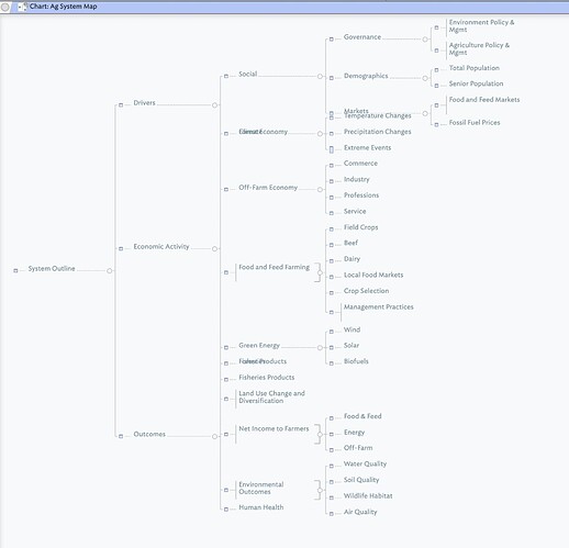
Chart view has some artifacts that seem to limit its utility (screenshot below):

Overlapping text in some areas (column 3), and some odd wiring. This is an expanded view on a 27" screen.

Tree Map seemed to render correctly, but without some color applied, seems to obfuscate rather than clarify anything. It might be more useful with color applied to related notes.

I don’t know how links render in either Chart or Tree Map, or if they do at all. (I should have checked aTbRef before writing this.)

What piqued my interest was that I was once a member of a Soil and Water Conservation District board, organizations that were created in the wake of the Dust Bowl era, where poor land use practices and a drought created a human, economic and environmental catastrophe. Hugh Hammond Bennett is a major figure from that era.

Anyway, if anyone wishes to play with this outline to see if there’s a way where Tinderbox can present the essential elements of the Figure 2 diagram, I’ve uploaded it.

Finally, it just occurred to me to ask if there might be some utility in rendering adornments as separators in Outline View? Probably can’t link to them. Likely also already covered in aTbRef, but I’m lazy and just doing this on the fly.

My apologies if it just adds to the confusion.
Ag System Map.tbx (475.6 KB)
1 Like

I was thinking we might be able to pull this offer with posters.

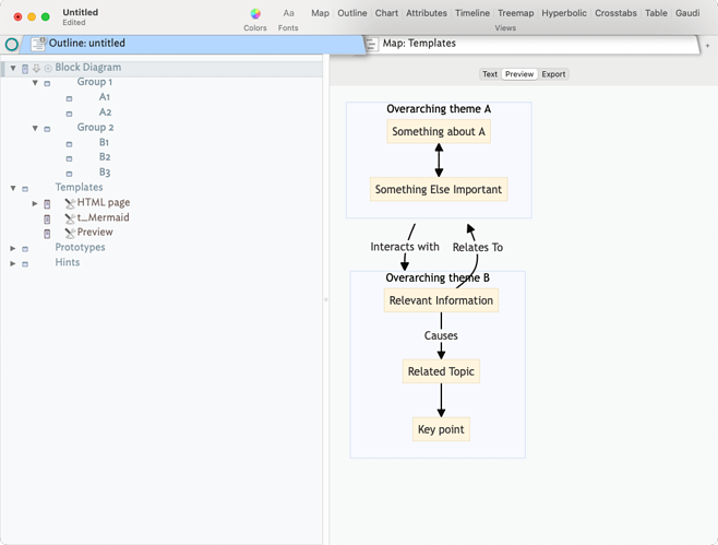
here is a graph with Mermaid 10.

graph TD
  %% Group 2 on the Right
  subgraph Group2[Overarching theme B]
    B1[Relevant Information]
    B2[Related Topic]
    B3[Key point]
    B1 -->|Causes| B2
    B2 --> B3
  end
  %% Group 1 on the Left
  subgraph Group1[Overarching theme A]
    A1[Something about A]
    A2[Something Else Important]
    A1 <--> A2
  end
  B1 -->|Relates To| Group1
  Group1 -->|Interacts with| Group2

  %% Style for Invisible Spacer Nodes
  classDef spacer fill:none,stroke:none,stroke-width:0;

I’ve not written the action code yet that would produce the needed text for the output, but something like this should be doable.

Becker_Mermaid_BlockDiagTest_07JAN25.tbx (179.4 KB)

2 Likes

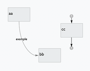
Links are only fully drawn onto the view in Map (links not fully in the map use stubs, see ‘cc’)

Timeline view uses the Map’s convention for drawing links.

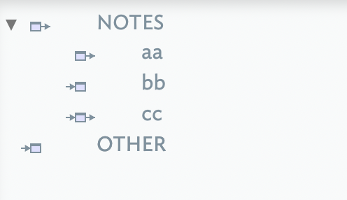
Attribute Browser and Chart views share the Outline views icon method for indicating in/outbound links:

link-viz.tbx 2025-01-07 16-03-03

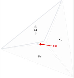
Gaudí view shows in-view links if room between the tiles:

Hyperbolic view uses available links to construct the link-based app-controlled Hyperbolic view:

HTH clarify the link display differences.

Outline, Chart, and views using the Outline type
Hyperbolic view uses available links to generates

1 Like

Most of this conversation has been happening backstage, with the first citable post around 2015 (which notes that the idea has been around for a while). I think I resurrected in January 23, and here we have it again. :slight_smile:

It would be fun to find a solution. For the solution and software architecture diagrams that I write in my reports, having them all in one place would be really helpful. Again, the best I’ve come up with in is an agent with the $CleanupAction off or the JS visualization, and in both cases, I take a screenshot, save it on my hard drive, and then pull the image into the report. The notes, since the have the text, nicely fit into the report either through the hierarchy or with ^include()^.

1 Like

In order to avoid doing anything I actually ought to be doing today, I’ve been playing with this some more. I don’t wish to highjack the OP’s thread, but it gave me a reason to play with Map View.

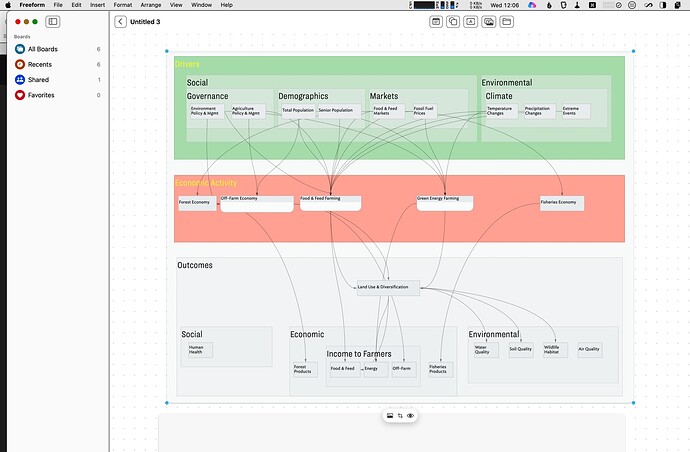
This isn’t 100% faithful to the diagram in the pdf. For blocks that only link to other blocks within a container, I’ve put those blocks in a container with the relevant links (they don’t link to anything outside the container). There are two feedback links (“Adaptation Invention Adjustment”) that don’t appear. I may try the invisible note trick, but this is where I chose to stop for today. And I’ve made some editorial choices regarding how to organize the grouping and flow. I’d say it’s 85% similar (except for the “missing” boxes a level below).

As kind of a kludge, I’m thinking of adding a User Attribute called Adornment, and then creating an Agent (Perhaps as a Separater to keep it from appearing in the Map View.) and re-fashioning a more hierarchical Outline View, reflecting the Adornments as containers. But I’m done for today. Not sure how that’ll look in Outline View, but it crossed my mind as something to try.

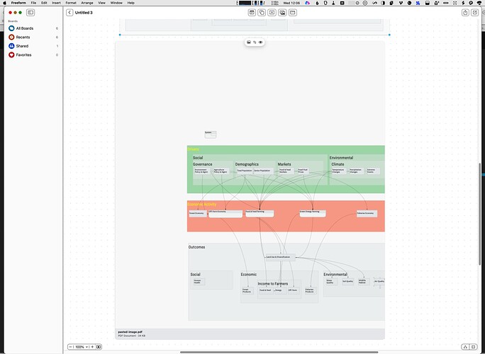
Edit=>Copy View As Image didn’t give me a satisfactory map view. I pasted it into Freeform, and it seems to cut off the view at the right side of the furthest note, ignoring the size of the adornments. It also includes a lot of extraneous white space in the upper left corner of the map.

Pasted into Freeform, it acts like a bitmap, not a PDF. It gets pixellated as you expand it.

A much better result was obtained by doing a screenshot and inserting that into Freeform. (And presumably any other app that accepts images.)

Examples attached.


Copy View As Image, pasted into Freeform.


Screenshot inserted into Freeform.

Now I have to learn how to move those link arrows around so they’re not hiding behind notes and giving the misleading impression that they’re originating from them.

If anyone wants to play with the file, that’s attached as well.

My apologies if I’m wasting the OP’s time and attention. Mark, you can split this off to a new topic if you think that’s appropriate.

Thanks.

Ag System Dupe.tbx (993.2 KB)

3 Likes

@dmrogers This is a really nice image and a good use of map view. There is one consideration that I’d like to raise, however, is that this approach will enable one to write a well-formed and organized report, which is one of the two primary objectives of this problem set: 1) create a reasonably pretty diagram, a diagram where you can write in the $Text of each box and define the elements, and 2) produce a report for the elements in the diagram.

The reason the reporting element fails is that all the notes in the map view are in one container and cannot be nested in a logical hierarchy that one can expect from a report. Now, there are some workarounds for this, e.g., 1) categorize some notes and have your templates perform some pre-olympian gymnastics to get everything into the right spot, and 2) use the alias approach with some adornments I’ve described above. In both cases, you need to take a screenshot and use a media strategy, like the one of shared several times, to get the diagram into the report.

I appreciate this experiment. Your comments about reproducing the source also chime with a hunch (sorry no experiment to back this) that B&L diagrams often rely, unintentionally, on some human assumptive/associate parsing. IOW, when you try a logical/structured re-construction the ‘map’ falls apart. That was certainly the case with the Afghan-COIN map (my pic up-thread from v5 days—and years of consulting in data render similar experience)). Essentially, to understand the map you had to flexibly just imagine parts of it. We don’t recall this as the imaginative part is so innate to our reading of the map.

For the usual reasons, I’ll stress I’m not making a zero-sum good/bad argument here but rather am reflecting that capturing hard-edged structure in a map is art as much as science. This is an uncomfortable truth we’d rather avoid.

2 Likes

I’ll defer to your experience, @satikusala. But I’m not trying to write a report. I’m trying to discover something about the Map View in Tinderbox, a feature I’ve seldom had occasion to use.

It’s simply a happy coincidence that I find the topic interesting and so I don’t mind drawing and labeling the adornments and creating the notes and the links, and seeing how all that works out in Outline View. It’s more of an exercise than an effort to produce a particular (desired) result.

May not get much accomplished today, though. Some compelling distractions have appeared. But I’ll be back!

1 Like

Agree.

“The map is not the territory,” and so on. But the exercise of re-creating it does raise questions about why some things seem omitted, and what do other things actually illuminate?

No criticism of the original authors’ is implied. I suspect that trying to re-create the diagram may stimulate more questions than merely looking at it.

But I do like this diagram, and I think it, and the paper it appears in, are relevant to the region I’m relocating to this summer. So I’ll be mucking about in it for a while. Apparently my incipient decrepitude hasn’t entirely extinguished my sense of curiosity just yet.

One of those serendipitous things that happens from time to time. :grinning:

I do so agree. My point being that a more explicit view like Map view forces one to surface the implied but not visualised aspects of a simple box and line chart.

In noting the above, I’m not trying to be proscriptive about the ‘how’ of this. If a map suits me, it’s good enough for me. The challenge in the overarching problem is mis-matched assumptions about how drawing, links, etc. ought to work. That’s an area where ideas are bound to differ. :slight_smile:

Thanks for your TBXs on exploring this—most useful.

This is all fascinating. Thank you all for such an interesting discussion, and I’m sorry I wasn’t able to engage yesterday.

@dmrogers wrote:

“The map is not the territory,” and so on. But the exercise of re-creating it does raise questions about why some things seem omitted, and what do other things actually illuminate?
No criticism of the original authors’ is implied. I suspect that trying to re-create the diagram may stimulate more questions than merely looking at it.

That’s where I started: I disagree with some of the original decisions about arrangement and relationship, and have been making my own version with references and my own annotations.

Given that it’s impossible to represent the real world completely with this or any other kind of diagram, it’s still useful to think deeply about how decisions about the map shape our understanding of the thing it’s representing, and vice versa.

I appreciate the example TBX file and will take a look. Thank you for engaging with this! And if you’d like to chat about the original paper, my take on it, or related questions, you are welcome to DM me - that seems wildly off-topic for this thread. :slight_smile:

@mwra added:

In noting the above, I’m not trying to be proscriptive about the ‘how’ of this. If a map suits me, it’s good enough for me . The challenge in the overarching problem is mis-matched assumptions about how drawing, links, etc. ought to work. That’s an area where ideas are bound to differ.

Definitely. There’s the unmappable set of concepts and relationships, there’s my interpretation of how a map can be used to make sense of them, and there are the constraints of how the software encourage or force that map to appear onscreen.

I have a TBX file with all of the nodes (somewhat tweaked from the original), but I don’t have all of my notes or all the plausible links included yet. I’d been pondering how to do the latter effectively when I started this thread. I do think one of the strengths of Tinderbox is the unidirectional links: many kinds of connections are not bidirectional.
I also ran into the problem with Chart view where lower hierarchy levels overlap when plotted, but it’s otherwise a useful kind of view for seeing complexity at a glance.

Yup, I understand and applaud the effort. I find this kind of effort really valuable. I just want to point out that the desired requirements of the initial request (as I understand it, and have myself) is NOT to just get a map but to be able to get a map, work with information, and, as such, generate a report.

This type of dialog helps us tease out the edges and see what happens or what we hope to have happen as we push on different edges of the product.

3 Likes

Such a cool idea.

You might also be able to combine layering functionality with indexing on attributes, so that you get something in map view roughly equivalent to using a filter in outline view.

1 Like

I think it would be helpful to sketch a mockup of how this might work.

So every discrete (outline container) has a layer. If my document has 20 containers in total (at various outline depths) the model above describes a need for at least 21 layers: the root map layer and then one per container. Am I understanding this right?

Currently in Tinderbox each $Outline level N map is a discrete map, so I can use a single layer for all the maps as all use a common set of co-ordinates whilst also being discrete non-contiguous maps.

So assuming all layers are visible we draw our map as we might at present—a single visible view. However, each items can be ascribed to a different layer. If, as in some drawing apps the layers are nest-able, then I can see one could essentially replicate the outline from within the view (or accessible as a pallet whilst the map is current. I’m not clear how we’d assign parent layer. Drag drop to the layer outline means dragging between windows (possible), or perhaps a context menu could allow one to navigate down the layer hierarchy to assign the current note to a new/different layer.

The new ‘map’ could retain the current maps’ look & feel but my hunch this would require a different underpinning so a different view in engineering terms. But does that matter. Do those wanting this layered map care what the view is called if it does what the existing map does and more. IOW, if I have to open a file and re-open a legacy map in a new-type map does this matter. I’m thinking in the round about all users and how this impacts those not using the new feature as all are affected.

A complex side-issue is switching from an outline to a new style map. Where is the default new-map position of new item on its layer? Currently, IIRC making a new outline note causes Tinderbox to allow for a non-collision position amongst is siblings (only), i.e. the current ‘map’. now, would the new item have to de-conflict with every item ion the doc (possibly 1000s or 10,000s of notes) all whilst 'just adding to the outline). I don’t note this as a negative against the above but an issue that arises from it.

Here’s the bit I’m having trouble with.

Suppose CONTAINER 1 is a 5x5 rectangle with three children, and CONTAINER 2 is a 6x6 rectangle with four children, located just to the right of CONTAINER 1 and just above CONTAINER 3.

Now, we add a new note to CONTAINER 2, but at the current size of the container, the new note won’t fit. Do we:

  • Make CONTAINER 2 taller — overlapping with the container below it?
  • Make CONTAINER 2 wider, perhaps overlapping with CONTAINER 1 to its left?
  • Make CONTAINER 2 larger, and pushing any adjacent containers out of the way?
  • Reject the new note with a warning to make more space?

Feels like some variation on the Gaudi View approach would have a great place here; especially in situations where say this cluster of Containers are bounded by other objects. This is possibly a moment when a bunch of new Notes may be added, as ideas emerge. It would then make sense to jostle a few Notes around to make room for new ones.

I’ve retracted the “layers” suggestion. Clearly neither feasible nor wanted.