Surely not? Anything is going to have some issues to work through but it seems early to adjudge it unfeasible or unwanted.
I think it’s the core of an interesting idea. It would be good to pin down some of the ways we expect it to act.
The logical dead end, that I failed to consider, is the portrayal and management of link lines. If layers are metaphorical sheets of glass, and objects on one layer are to be linked to objects on another layer, including movable link lines if an object is moved by the link line, then how to programmatically cause the link lines between layers to move.
Link lines that “penetrate” the barriers between layers? If we have two notes:
Note A at (444,150,3)
Note B at (501,562,1)
Where z=1 is the bottom layer of a display, and z=3 is the top layer of a display, there is a need to solve complex parametric equations for the link line between Note A and Note B. Putting aside the major problem of “how do we tell Tinderbox to draw a line between Note A and Note B, in 3D space – parallel planes”, as soon as we populate the layers with multiple link line relationships (as in the example at the top of this thread), we’re going to need a lot of fancy GPU work to have a smoothly operating map.
There are libraries available to manage drawing in 3D space, but the programming is a lot of work. Is it worth it?
I wonder if there is not a simpler idea that captures some of the promise I thought lay in your original idea.
Imagine a map mode toggle: layers on/off.
Imagine a note attribute: $Layer that takes positive integer values
When layer mode is toggled on, any note with a positive value for $Layer is toggled on. Tinderbox renders the notes in their original positions, using the values in $Layer as the z value for ordering purposes only. NB This means that $Layers need not be sequentially numbered, because the order need only be sequential, e.g. 3 notes with $Layer = 1, 3, 5 can still be determinately ordered. This might entail overlapping notes.
For link lines, use the current map affordances. When the target or source of the link is not now visible with layers toggled on, then draw the “runt link” indicator that is used today.
In the UI, a control might be available that collects all current unique values of $Layer, and allows each layer to be toggled on off with a checkbox. In other words, one can set different layers to visible or not here.
Finally, something like “Use Filter” from outline view might be implemented as follows. When this is toggled on, anything that matches the filter query, is virtually assigned to a unique/special $Layer value, layer mode is toggled on, and the visible layer is set to this special value.
I guess this feature could also be called X-ray mode, because it is a bit like the layers in a CAT scanner or similar.
Perhaps there is a case for (semi-)automatically giving every container a $Layer value. For my own part, I would see layers as an additional affordance of map view, rather than necessarily something with semantic value. But I could see how others could use it more semantically.
Link stubs would be useful for preserving the semantic value of a map, but for those who want the presentation (which I believe is part of the initial problem here), they would be confusing.
E.g., copying a map as an image and using the image elsewhere might be confusing to the reader if the map had stubble all over it. (I couldn’t resist using that word, sorry ![]() )
)
(Brilliant use of ‘stubble’.)
You’re right, I was not thinking so much in terms of presentation, but in additional ways to use the map view for thinking through Tinderbox. I would certainly value the x-ray view I described and map filtering.
There may be some ways to achieve useful “depth visualisations”. One difficulty is that since notes’ bounding boxes are not uniform, there would be no way to shrink them uniformly to achieve a foreshortening depth effect.
One possibility perhaps is to use a color screen for each layer to indicate relative depth. For example, a light grey screen for the layer after top most, a slightly darker grey for the next layer, etc.
Another one, but computationally more expensive, would be to introduce a slight visual tilt to the display. What I mean can be understood by reference to a Necker cube, which you can think of as a 45 degree isometric presentation. Imagine something more slight, say 15 degrees, but enough to create a visual guide for the eye that permits seeing notes in each of their own planes/layers.
I am no expert in visualisation, so these are just terse presentations of first thoughts.
Two thoughts:
- Let go of map view. The one view that does use notes from across the document regardless of the underlying outline is Hyperbolic view. I realise it does a different thing, but perhaps starting from that PoV might help give traction, rather than starting from the notion of the Map. We know the latter can’t extend to the functionality asked for due to existing design so exploring the new view a map +/- seems only to seed confusion.
- There seems to be more than one new diagramming method. Also seeding confusion is that whilst people want more/different from the map including a less direct attachment to the doc’s outline, not all needs are the same or don’t conflict with one another. I’ve spotted two different approaches to nesting and several different needs for variation of the normal note inheritance model. The same goes for linking. I don’t believe all these are simply boolean switches. IOW, it might need more than one new view. Or, a new view but with certain constraints/configurations that need to be set before use (though such proscriptive usage seems to chime poorly with Tinderbox’s incremental formalisation support.
Perhaps, to escape the “like the Map but with…” perspective it might be useful to list what a map can’t do. It doesn’t matter why—the map is just fine as is for other existing purposes. Such a list might help indicate what a new view might do and and inherent conflicts in the starting shopping list of needs. Such an exercise might also help surface background assumptions that at present are flowing in from individual’s own (differing) work and which helps set their perspective on what is needed.
I’m almost afraid to float this, but the impulse towards layers points in the direction of a VR view. Given that, we could be moving notes and adornments back and forward between levels in perspectival fields to our hearts’ content, links stretching and shrinking accordingly. Hand controllers designed to let us type at the same time and … But probably not realistic in terms of ROI, at least for now.
FWIW, but as I’m involved in some research into work in XR (VR/AR/MR), I’d note that the whole (software) environment is much less mature than other areas so nothing is easy and much is not yet built.
But, sure, an XR space—essentially a holodeck†—is inviting as an information triage space. That said the extra dimension, from early experiments, doesn’t add as much as we think. The difference between the imagined XR and which you get is stark: not because of the immaturity of the tools but due to the way we imagine the extra environment will look. For instance, focal distance is fixed, whereas in the real world our eyes constantly shift focus (for distance) as needed. In XR essentially you have to stand where the focus is.
That isn’t to say that a 3D-projection view within the app (i.e. in a view pane), might not aid exploration. Even within a 2D display, the ability to explore a problem space from different angles may be useful. From experience, I suspect the gain will depend both on the subject matter and personal preferences as to how to interact with data.
Bottom line: it’s a bit early to think full VR. The gains, IME, are less than imagined at present.
If you have an Oculus, you might try out the apps Softspace or Noda.
†. Though if sci-fi teaches us anything, it is that the holodeck is a health & safety nightmare.
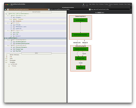
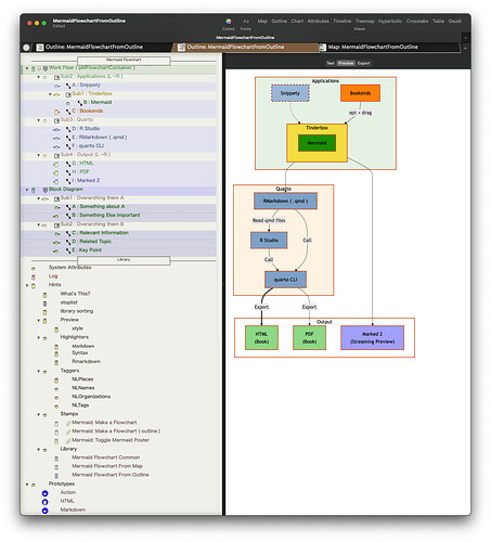
I have improved the Mermaid Flowchart tbx I created before. (Mermaid Flowchart Example
) It can now be generated from the Outline. Subgraphs can also be nested. There may still be some bugs.
MermaidFlowchartFromOutline.tbx (622.3 KB)
How to Use
1. Apply the pMFlowchartContainer prototype to the root note that will serve as the base of the flowchart.
2. Apply the pMFlowchart prototype to all notes under the root.
3. Configure attributes such as note color, links, direction of flowchart and attributes related to R chunks.
4. Select the root note and execute the Make a Flowchart stamp.
5. Notes with child notes will automatically be assigned the pMFlowchartSubgraph prototype. Mermaid code will be added to the $Text of the root note and copied to the clipboard.
6. Execute the Toggle Mermaid Poster stamp to toggle the Poster on or off.
Generated Code of Mermaid Flowchart.
flowchart TD
    A["Something about A"] <--->  B["Something Else Important"]
    B["Something Else Important"]
    C["Relevant Information"] -->|"Causes"| D["Related Topic"]
    C["Relevant Information"] -->|"Relates To"| Sub1["Overarching them A"]
    C["Relevant Information"] -->  D["Related Topic"]
    D["Related Topic"] -->|"Causes"| E["Key Point"]
    E["Key Point"]

 subgraph Sub1["Overarching them A"]
    A
    B
end

 subgraph Sub2["Overarching them B"]
    C
    D
    E
end

    Sub1["Overarching them A"] -->|"Interacts with"| Sub2["Overarching them B"]

%% Styles & Links
    style A fill:#009900,color:#000000,stroke:#dc490b,stroke-width:2px
    style B fill:#009900,color:#000000,stroke:#dc490b,stroke-width:2px
    style C fill:#009900,color:#000000,stroke:#dc490b,stroke-width:2px
    style D fill:#009900,color:#000000,stroke:#dc490b,stroke-width:2px
    style E fill:#009900,color:#000000,stroke:#dc490b,stroke-width:2px
    style Sub1 fill:#eeebe9,color:#000000,stroke:#dc490b,stroke-width:2px
    style Sub2 fill:#eeebe9,color:#000000,stroke:#dc490b,stroke-width:2px
Since fine-tuning is not possible, it might become difficult as things get more complex. However, with a moderate number of notes and links, it should produce a reasonably good diagram.
Impressive @sazanamix ! Thank you.
Love it, thanks!!!
Arising from a question elsewhere, I’ve updated some aTbref pages to re-emphasise that when using posters your should start with the Prototype: Poster built-in prototype for your poster notes. You can alter the latter or make new prototypes that use the Poster prototype in their own inheritance.
The main issue this routes around are issues about how $Text, or rather $Text, gets styled as HTML as you don’t want code blocks, e.g. JavaScript code, rendering with <p> tags. Or, turning of OS type coercions of straight quotes to curly or double hyphens to en-dashes, etc.
Bottom line, if starting on poster use, add and em[ploy the built-in Poster prototype as your baseline for building.
Yes, but…
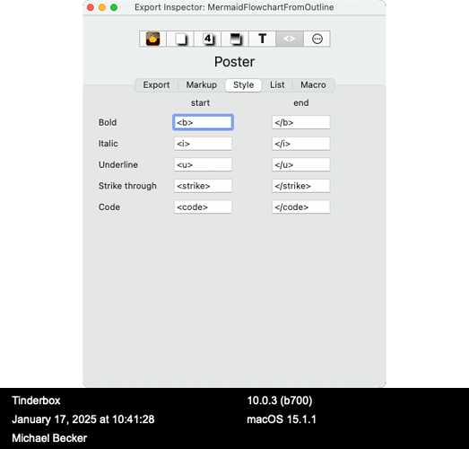
Not all of the murkup is fully cleared on the poster prototype, e.g.,
List too.
For some posters, this markup may interfere with the code of the poster. Best to clear these attributes too.
There’s no need to put bold or italic text in your javascript.
But yes, if you want to do that, you’ll want to change your prototype to get rid of these markup tags as well.
Ok, this is cool. I did not know this about mermaid. Inspiring example. ![]() @echuck, this may help us.
@echuck, this may help us. ![]()
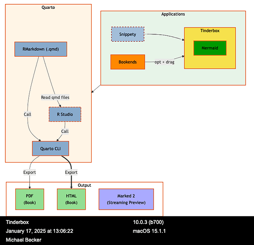
You can use the direction parameter to show how graphs align. For example, by adding the following you can get the diagrams to sit next to each other .
subgraph Sub2["Applications"]
    direction LR
    A
    Sub1
    C
end
Example Code
%%| fig-width: 5
flowchart TD
    A["Something about A"] <--->  B["Something Else Important"]
    B["Something Else Important"]
    C["Relevant Information"] -->  D["Related Topic"]
    C["Relevant Information"] -->|"Causes"| D["Related Topic"]
    C["Relevant Information"] -->|"Relates To"| Sub1["Overarching them A"]
    D["Related Topic"] -->|"Causes"| E["Key Point"]
    E["Key Point"]

 subgraph Sub1["Overarching them A"]
    A
    B
end

 subgraph Sub2["Overarching them B"]
    C
    D
    E
end

    Sub1["Overarching them A"] -->|"Interacts with"| Sub2["Overarching them B"]

%% Styles & Links
    style A fill:#009900,color:#000000,stroke:#dc490b,stroke-width:2px
    style B fill:#009900,color:#000000,stroke:#dc490b,stroke-width:2px
    style C fill:#009900,color:#000000,stroke:#dc490b,stroke-width:2px
    style D fill:#009900,color:#000000,stroke:#dc490b,stroke-width:2px
    style E fill:#009900,color:#000000,stroke:#dc490b,stroke-width:2px
    style Sub1 fill:#eeebe9,color:#000000,stroke:#dc490b,stroke-width:2px
    style Sub2 fill:#eeebe9,color:#000000,stroke:#dc490b,stroke-width:2px
Still, this does suggest the ‘Poster’ prototype be updated to clear all those styling tags as they have no immediately useful purpose.
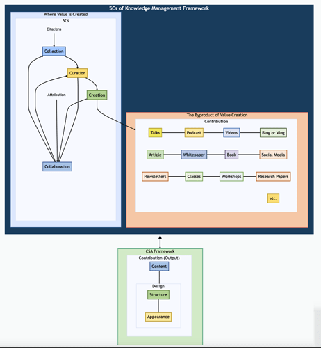
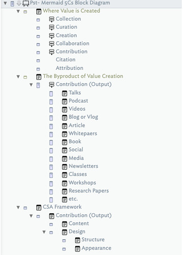
Inspired by @sazanamix I got my first mermaid block diagram working for the 5Cs flows. ![]()
There still a lot to learn about Mermaid, and to implement in my TBX, but getting there. ![]()
If you are interested in learning Mermaid in more depth, I suggest Mermaid Chart from several of the original Mermaid developers, which offers a free level that includes a nice playground mode and access to a Mermaid documentation library.
It is easier to learn Mermaid in a playground environment with a live editor and instant rendering, and port the diagram into Tinderbox.

