Use of Suggested, similarTo, and AB for book editing

Task

I have roughly 100 notes together comprising a (very) ‘Old’ draft of a book, and another 100 or so notes comprising a ‘New’ draft written years later. I got the notes into Tinderbox by exporting as markdown from Scrivener and importing and exploding the text using ## headings as the delimiter.

The wording and organization vary significantly between the two drafts. I need to relate notes in ‘New’ to the closest corresponding notes in ‘Old’ to check for consistency and voice. And I need to go through each note in ‘Old’ and understand whether its material is included in ‘New,’ perhaps adding back omissions.

Now using:

Tinderbox is helping! The ‘Suggested’ pane with popups into text window(s) is handy. But the pane includes all similar notes regardless of container. For my purposes, that generates too many unwanted results to sift through and curate.

I encounter the same problem with export: ^similarTo("this”,10)^ . There seems to be no way to limit scope. Or is there?

Needed:

Collect only notes from a specific container, or exclude notes from certain container(s), e.g. ‘Old’ notes to only include names of similar notes from ‘New’, and vice versa. From there I will manually curate.

Attempts with action code:

Agent query: similarTo($Name(agent),10)&inside(/Drafts/New);

   … where the agent’s name is the same as the target note.

Seems to work! But I need to get from there to an attribute in each note listing similar notes.

So I managed to come up with the following:

-Stamp for notes in Old:

$MySet=collect_if(all,similarTo($Name(that),10)&inside(/Drafts/New),$Name)

- Stamp for notes in New:

$MySet=collect_if(all,similarTo($Name(that),10)&inside(/Drafts/Old),$Name)

Questions:

1 - Can there be some consideration given to providing some control over scope for ‘Suggested’ pane assuming that it doesn’t already exist?

2 - Is the above proper usage of similarTo action code? Or are there better ways?

3 - Is the order of results significant (order is different in Suggested pane and from the order from code)?

4 - Why the unexpected results (from the stamp, but not in export) when I change the 10 to a small number, say 3? To test this, I viewed ‘0-Tehran’ and noted a large number in ‘Suggested’. Then I appled the ‘Similar=collect_if-container literal string’ stamp to ‘Test note to apply stamp’ and got one result (when set to 3).

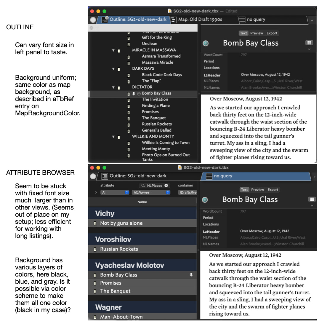
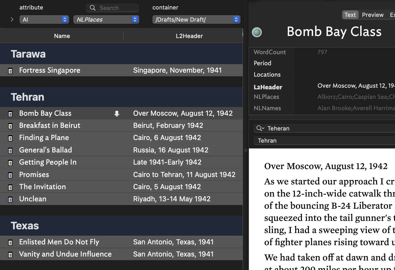
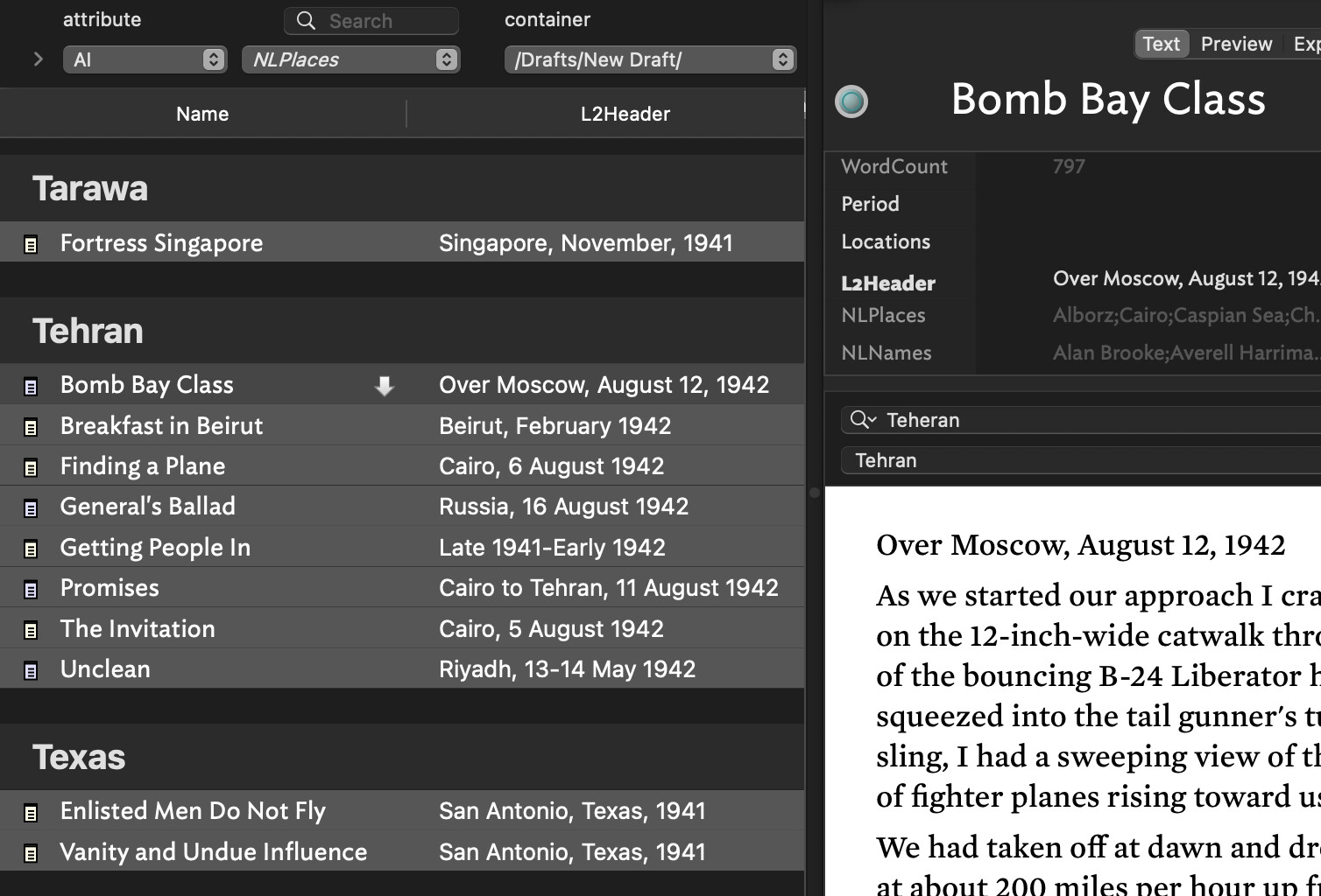
5 - Once I have a curated set of related notes in an attribute in each note, I have high hopes for Attribute Browser. It will also help (I am hoping) in constructing a simple index of Names and Places, starting with NLNames and NLPlaces.

a. Is there a way to change the background color in AB? It seems to follow different rules from other views. (I use dark mode with Dark Coral or another dark theme and the appearance of AB is off).

b. Is there a way to reduce the font size of the headers in AB to be more consistent with other views and give me more information on the screen?

c. (Most important) Is there a way to get results from AB for use elsewhere (as a start to construct my indexes)? If not, are there other ways to get the output I need?

Here is a test TBX file with a few made-up notes to illustrate:

Test-similarTo.tbx (199.7 KB)

#1 I guess that amounts to a feature request. AFAICT, the similarTo functionality, whichever route used (action, aport, Get Info, etc.) is fixed a document scope. Likely so, as I don’t recall this particular need being raised before, but there also ways has to be a first time :). So, that’s the status quo, for now…

#2 The code methods only to let you set two parameters, an item and and a match count. The item can be defined via a designator or find() query thought must resolve to a single note. Not 1005 sure but if the scope returns 2 or more items likely the first by $Out;lineOrder is taken as the (expected single) target.

#3. That is undocumented, but i’d hazard a guess the the list is in order of ‘similarity’ howsoever that is calculated, i.e. likely most-simiar’ is listed first.

#4. I don’t fully understand, but at that point you’re add the ‘just trying things’—we’ve all been there—so it’s hard to guess if the effects are real, errors or odd edge cases.

#5a. Nona I don’t call the ever being asked for. But there are lots of other visual affordances (attributes) you can use to give you don’t work. In such a corner, I stop trying to ‘fix’ the desired path and use something else. For instance, in AB view matched notes are drawn in $Color. Or consider badges, $NameFont, Flags, etc., etc.

#5b. No that part of the view is not user configurable in terms of font. I don’t see the header labels at notably different. Have you go the listed items drawn in either very large or very small foont. Is part of the problem a lack of screen space for display. My experience is fiddling with content display size is normal a tell for some unstated issues re the overall visualisation and space for it. If so, this should be stated as part of the problem, as if the issue is trying visually to squeeze a quart into a pint pot a different view/visualisation might be needed.

c. AB view is a report, set via the controls at top of the view. What, in less general terms, are you trying to copy. The items in one category, etc.? It isn’t quite clear.

Thanks for the test file!

1 Like

File ▸ Export ▸ As Attribute Browser might help

The Suggestions list is sorted by descending similarity. $MySet maintains its own sort ordering.

I wonder what Claude would make of this task?

1 Like

Once similar notes are in $MySet, if you use an action to link the ‘new’ note to all the ‘old’ notes in its $MySet with a new link type such as ‘check’, then you can open a Hyperbolic view on any such old note, filter for link type ‘check’ and you should see something like a map of all the new notes considered similar to he old note. As old notes can link to more than one now note and vice versa, such a view might also indicate where several old notes feed into the same new note.

Be aware ‘similarTo’ is quite subjective, i.e. we think “show me the results I’d expect if I did this slowly by eye”, but the underlying algorithm isn’t necessarily ding that. Two notes might be similar because of the presence of the word carpet, yet there be no real relationship as one is about carpet inventory and the other an anecdote about something funny related to a carport. As note, we overlook the subjectivity of ‘similarity’, as in-brain that is assessed and managed for us. The algorithm doesn’t have that advantage.

FWIW, my recollection is similarTo in-app uses:

  • the text ($Text) of the note
  • the note title ($Name)
  • any text contained in user attributes (i.e. attributes of String type or which are string-based—so including lists, etc.)

If taking a very broad-brush approach of word co-occurrance, I’d concur that AI might be a better route (if you have/want to use AI—not all do) as the LLM may have the advantage of a better set of similarity weightings for words.

1 Like

Thanks to both for the great responses.

#1 - Feature request: optionally exclude specified container(s) in addition to the (I think) already excluded Hints, Templates, etc.

#2 - For the item parameter in my working examples I’ve used:

$Name(agent), or $Name(that), or a literal string.

Tinderbox seems smart enough to find the right note for the item parameter. But are you saying I should use find or do something different?

#3 - Noted. The ‘Suggested’ pane order is significant. The $MySet order is internal.

#4 - I understand now what my code was telling Tinderbox to do: get a limited number of hits and then further filter by the second condition, as opposed to getting a specified number of hits that satisfy both conditions.

#5 - Attribute Browser (questions in reverse order)

c. File ▸ Export ▸ As Attribute Browser is JUST THE TICKET!!! Thanks for pointing me there!

On the cosmetics of the AB, here is a view from the dark side:

The Outline View appearance is very close to what I see in Apple Mail, Scrivener, and DEVONthink. I’ve been trying to make AB similar:

  • adjust the font size in the AB to be similar to other views and apps
  • reduce the size of the large headers to conserve screen space
  • change the unwanted blue and gray background colors in the left pane to boring black (boring, but my eyes would be grateful)

b. Some control over font size (as exists in other views) seems to be a user request. It would be useful for me to somehow scale them down a bit.

a. How about colors?

I have a long history of trouble relating the different colors in color schemes to specific parts of the interface. So maybe this is possible? (In any case, the aTbRef note on MapBackgroundColor might need revising to note that the AB view pane is an exception)

#6 - Asking Claude for similar notes is an interesting thought. I’ve chatted with Claude about book-length documents in DEVONthink (via the api) with useful results. The pay-as-you-go api has a 1 MM token context window. A plan with Claude Desktop offers only a 200K token context window (so Claude tells me), which may or may not be enough. I’m vague on all this. So my questions:

a. I’ve been assuming in Tinderbox the Claude Desktop/MCP approach is more about controlling the app, different from the DEVONthink approach. Am I wrong?

b. Is access via Claude api from Tinderbox currently possible? If so, would that be useful for a case like this?

#7 - I’m having trouble finding a simple .tbx example illustrating Hyperbolic View. Would be grateful to be steered in the right direction.

I’ve got a paper currently under peer review that describes using Tinderbox and AIs for reading challenging fiction and nonfiction. I find it very helpful; the AIs are very well read.

We don’t currently use the API, though you certainly could through runCommand or fetch() and JSON parsing.

The size of the context window is, in my experience, an annoyance and a distant limitation. It seldom gets in the way, it just interrupts things now and then.

Export as Attribute Browser exports as a .rtf with spaces in between attributes - I would rather have csv or as MarkA has suggested tsv or json export ideal for column view and data exchange.

Is there a way to change the Export as an Attribute Browser as csv with ‘quoted text’ as a default for better i/o operations - AB to other programs?

maybe a future, feature request -

I only say this becase I think AB with its column is more suited for table/attribute and data needs with a csv - imo - my use case.

Lastly, my workaround right now is to use selected Notes with a predefined csv template instead of export as AB

Thanks
Tom

There will be a new note on this are long, linked from several pages, as $MapBackgroundColor is only one of several places one might look for this and I’ve learned from experience it is more maintainable to keep $Attribute articles short and put their functionality—if complex—in a discrete note.

Anyway, the gist of the matter is this:

  • Views making prominent use of $MapBackgroundColor: Map, Outline, Chart, Hyperbolic
  • Views making limited use of $MapBackgroundColor:
    • Timeline. Only for the main part of the view. The no value and out of scope sidebars have a fixed colour assigned. The bottom scale tint colour can be customised.
    • Treemap. The background is only seen as thin band around the root object.
  • Views no using $MapBackgroundColor: Attribute Browser, Crosstabs, Gaudí, Table, Information City.

Views using a visible Control Panel (AB view, Crosstabs, Gaudí, Hyperbolic, and Table) use OS-style controls and use similar colours for selection highlights, etc.

Report style views (AB view, Crosstabs, Table) have no controls for background colours in the main text area. Likely this is because they are constructed a different way to older views.

If this does go ahead I’d suggest offering CSV and TSV. Why? CSV is not generally recommended for data work (unless constrained by downstream legacy systems constraints).

It also begs the question whether (in the age of AI) a Markdown table format ought to be offered. JSON sits in the wings but that has the nested issue of the data structure in the JSON and I’ll warrant no two user will want the same. But a JSON offering might still be useful.

1 Like

The that designator is designed for use in a query used by find(query). Elsewhere it works or doesn’t as expected … accidentally.

Operators with a scoped ‘item’ argument want the argument to resolve to a single item (normally a note). If you look at the item-scope designators, you’ll see find() though for the latter the item vs. group scope of resolution is down to the query you code not the find() operator as it can service time and group scope.

If you encounter yourself nesting compete queries, e.g. a find() within an agent query, likely you haven’t properly analysed how to find the items needed (i.e. imagination != reality). No fault there, but still worth noting. Using agent, it normally resolves to using 2 agents with agent B referencing the contents of agent A. In an action, the norm is to use a query to make a list and that test items within that list.

OK, new aTbRef article at View backgrounds, following on from above.

1 Like

The Attribute Browser does respect $OutlineNameSize which is a percentage of the nominal 16pt. You and also use View ▸ Magnify and View ▸ Shrink to change the magnification

1 Like

As it happens, the previous is already described in Attribute Browser view. I’ve just added links for $NameFont and $OutlineNameSize to aid further exploration.

That helps! Thanks. Is anything available for the user to directly control the size of those big “headers” (the names of the attributes) in AB View?

Assuming not, I tried increasing $OutlineNameSize to 110 and then View ▸ Shrink. The relative sizes in AB View then looked better for me. Of course, names in Outline View were then too large, but Shrink did the trick there.

I had always associated Shrink and Magnify with Map View, not realizing they controlled the left panes of other views too (while leaving the Text Pane as is).

Thanks. I didn’t realize Main Color/MapBackroundColor did not affect Crosstabs and Table either. In dark mode it seems no matter the color scheme they are always black, which is just the way I like it! (And similar to other apps when the System is set to dark mode)!

Attribute Browser seems to be the biggest outlier, with those different colors (per screenshot above) that (apparently) cannot be changed by the user.

Since writing this, I found there is some control over the color in the left pane after all. After finding and reading through this thread on colors, I realized the significance of the reference above to “OS style controls” (which I didn’t fully understand). In System Settings > Appearance you can change the color under Theme. This affects the appearance of the left pane in Attribute Browser. I think the map main color is what sets those black bands. The background color behind the listing under each attribute, I’m not sure. It doesn’t seem to be an OS setting.

I eventually would like to be able to set all the bands to black to be a little more like the other views (understanding there necessarily are differences) but now that I understand better what can currently be done AB has become much more usable for me in dark mode. Thanks for the pointers!

Yes, the background the data area (and control panel) of AB view, Crosstabs and the like is as per your current OS setting. Default: white (as in light mode). The per-‘category’ summary bar in the AB view listing uses the OS background (default: white) with a tint of the highlight colour from the OS theme. The default OS theme is ‘multicolor’ which uses a blue for highlights. So, the default category bars use a tint of blue on white.

Short of rebuilding the whole view (ROI?) it seems the feature request needs to go to Apple for more settings in the OS UI colours. Also if the category pars and the note lines use the same background how do you quickly see where the categories splits occur. Bearin mind the view depots uses only one column ($Name) so the present of column info isn’t a reliable tell-back.

Sill, it’s good to see the ‘graphite’ OS theme helps. Note that changing the theme colour doesn’t change the OS ‘Text highlight colour’ which seems to stay at the default blue but can be changed to other colours.

The whole light/dark approach still feels like something Apple’s marketing got excited about and then lost interest before it was fully implemented. Howard Oakley’s blog has highlighted a number of the unfinished corners—in Apple’s own apps, that ought to show the method off to its fullest. But if Apple have walked away from the experiment I doubt any breakages in the model will get fixed (think: ROI).

I’ve updated articles Attribute Browser view and View backgrounds to reflect finding up-thread.

That might be true. I’m a little weak on colors esthetics so I’m not sure. I can speak from my few years of experience “on the dark side.” At first I didn’t like the dark side. But now I can’t escape!

When in dark mode many apps (Mail, DEVONthink, Scrivener, App Store, among them) seem to adhere to the Henry Ford principle: you can have “any color you want as long as it’s black.” And of course white on black. And shades of gray (the color, not the book!).

Side panes tend to be dark with white text. Places for lots of text to edit tend to be white with dark text.

Tinderbox offers a lot more choice. But generally (after a bit of fiddling) it can be configured that way too. By default AB departs somewhat from the pattern. But I’ve got it now much more to my liking, and it’s fine for my purposes. I’m happy I don’t have to come back out into the light just for AB.

Lots of useful stuff going on in AB view that I plan to use more. Thanks for the pointers!

1 Like

I’m working on this.